|
Alphabetical List |
|
|
|
|
|
|
|
County List and Topics |
|
|
|
Please sign my Guestbook and leave feedback |
|
|
||||||||||||||||||||||||||||
|
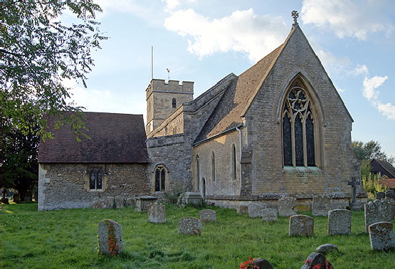
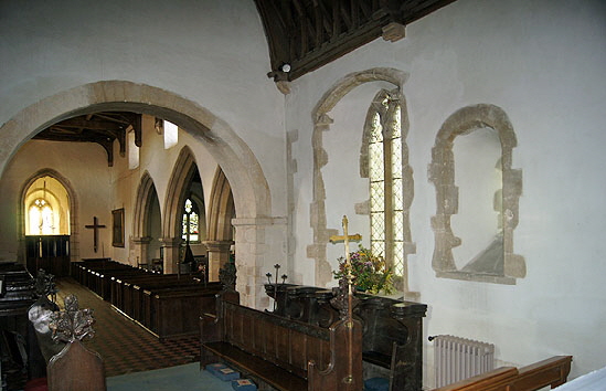
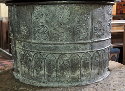
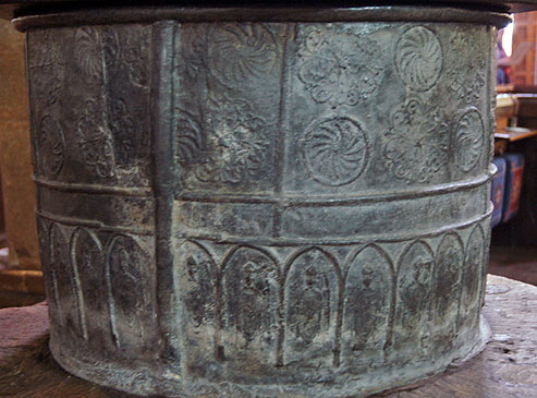
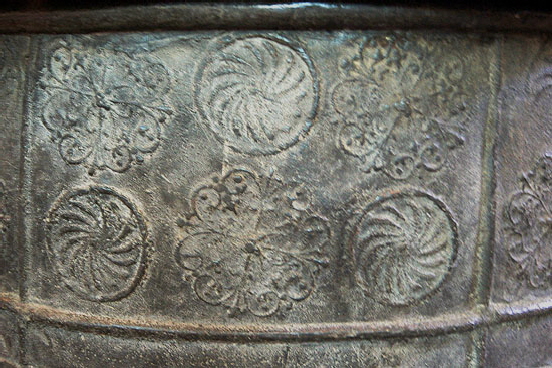
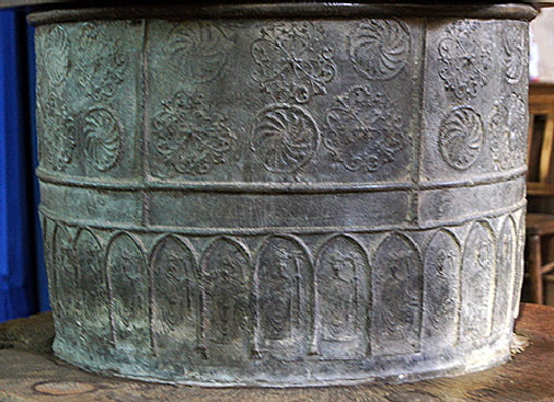
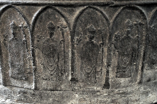
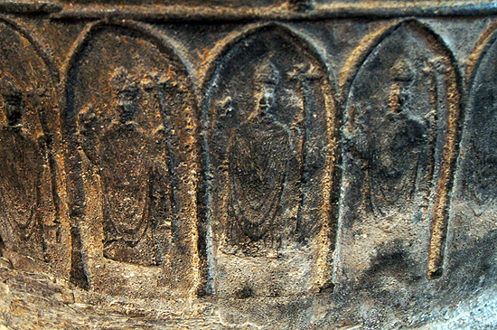
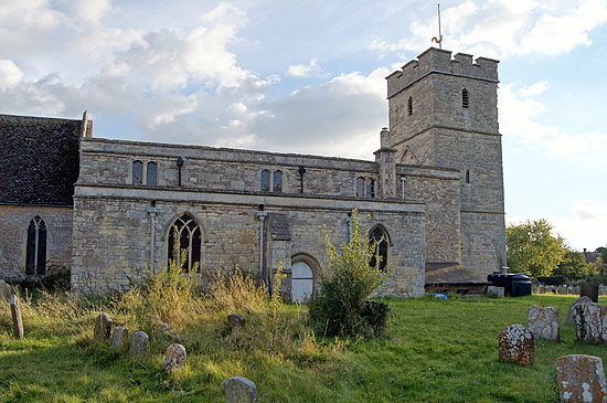
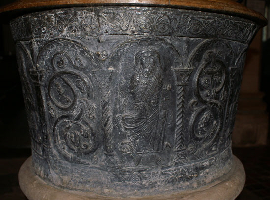
north side of the chancel. A lancet window in the chancel indicates that it was rebuilt in the thirteenth century. It was rebuilt yet again in the nineteenth century but the north windows were re-placed in their original positions. The east window is also Victorian and is a fine piece of faux-Decorated work. The south aisle looks to be of the thirteenth century. Pevsner suggests 1250. The arcade has circular drum piers and stiff leaf capitals. David Nash’s “Royal Berkshire History” site, however, (Long Wittenham was once in Berkshire) claims it is late twelfth century and dedicated to St Thomas of Cantherbury who had recently been canonised. I confess to being sceptical of such an early date but who knows? The thirteenth century would also seen the extension of the chancel, hence the lancet window to the east of the Norman window on the north side. A south chapel came a little later. The fourteenth century saw the addition on the north aisle. The tower is fifteenth century and the clerestory sixteenth. It’s a very typical development path for an English parish church. It’s not often that a south porch is noteworthy but Long Wittenham’s has is fourteenth century and has its original timber frame. Anyway, back to the font. The top section is decorated with two shapes such as you might see as stencils in one of those “decorate your own pot” shops. The makers obviously used patterns of some sort to do it and they were none too careful about how they are spaced. The result is rather strange and looks for all the world like it has been designed by seven year olds at primary school. You’d have to say that the manufacturers were somewhat out of their depth both technically and in terms of iconography. The lower part, however, is rather more refined with a series of images of bishops. Once again, though, it seems to have been a case of repeatedly using a few stock designs. I think you could sum the whole thing up as being a budget production for the cash-strapped parish in somewhat dubious taste, Still, here it is a thousand years on, still functioning perfectly! |
 |
|||
 |
|||
|
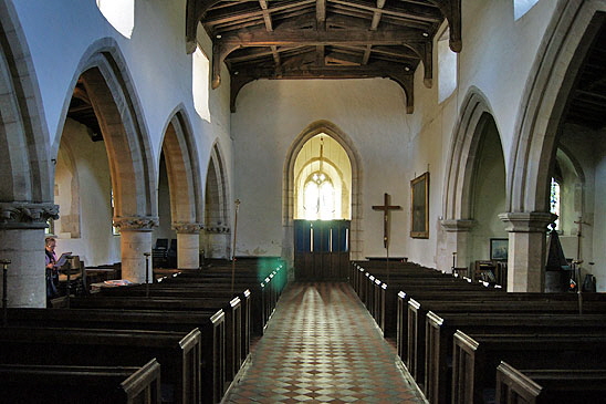
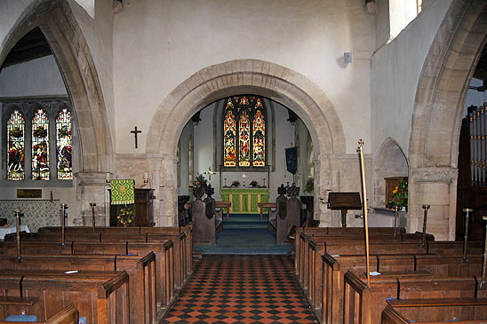
Left: Looking east. The chancel arch is the original Norman one. Right: Looking west. The south aisle (left) has round pillars and stiff leaf capitals from the thirteenth century. The north arcade is a century later and you can see how the pillars are polygonal with rather unambitious capitals and a more refined arch mouldings. |
 |
 |
|
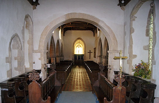
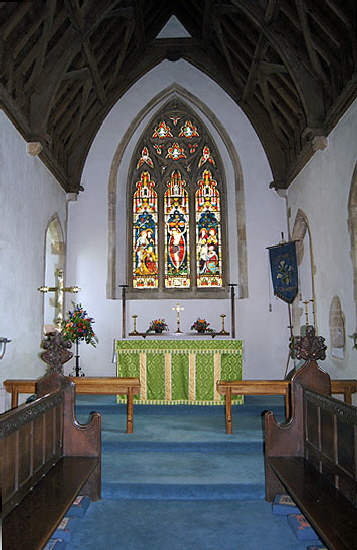
Left: Looking west from the chancel. Right: The north wall of the chancel shows the deeply-splayed Norman window to the right. |
 |
 |
|
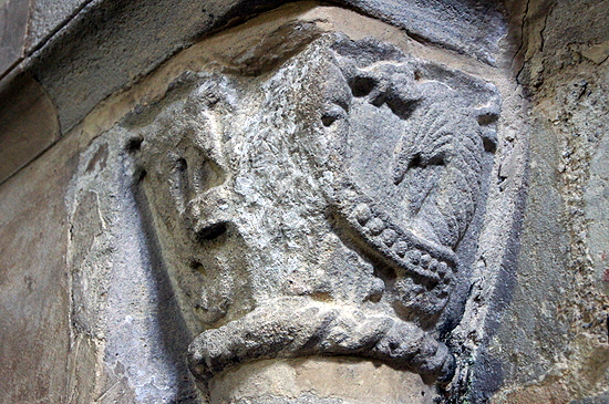
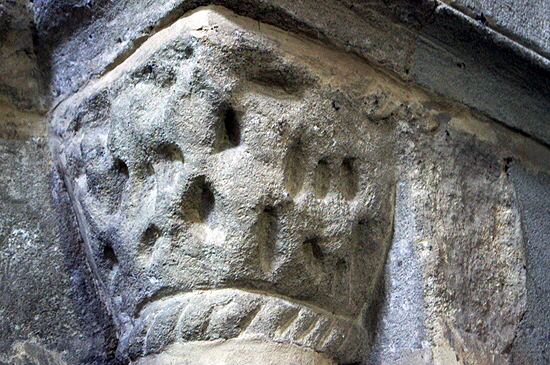
Left and Right: The chancel arch capitals. It is always a bit of a mystery to me how interior decoration can become so weathered even over the course of several hundred years. The dragon device is enough to show us that these capitals would have been very entertaining had they survived. The stone does not look uniform in colour or texture and it appears that the dragon has survived either because it was cut from a more resilient vein of stone or because it has been recut at a later date.. |
 |
 |
||||||||||||||||||||||||||||||||||||
 |
|||||||||||||||||||||||||||||||||||||
|
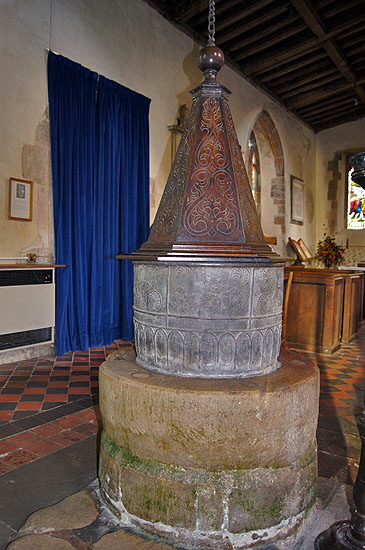
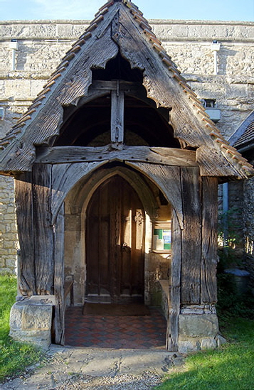
Left: The south porch is a delight with its original timbers. Note that the entire south face is timber apart from the stone foundation blocks. Centre: The chancel. The Victorian east window is very fine in an authentic Decorated style. Right: The font. One of the problems with lead fonts is that they did not come complete with a base so the church has had to improvise one of a size that somewhat diminishes the font itself. The fine cover is Jacobean and the font was itself was once encased in something similar. |
|||||||||||||||||||||||||||||||||||||
 |
 |
||||||||||||||||||||||||||||||||||||
|
Left and Right: Two aspects of the font. The right hand picture is quite instructive. The font would have been cast as a strip, rolled around some kind of former and then the ends would have been soldered together in a way that you can clearly see here. Note the way that the decoration has just been crudely cut off: there has been no attempt to locate the weld in such a way that the decoration is continuous. Long Wittenham’s font is fairly unusual in that its side has made in one piece (and this with one solder) rather than the two or four that can seen elsewhere. In both pictures you can see how very imprecise the decoration is in its placement. It has no discernible religious significance nor does it reflect any of the decorative tropes found on stone fonts. The lower band of “bishops” at least nods towards the font’s function. Why bishops, though? Well I think the answer might be that anonymous figures in mitres were somewhat more within the scope of a lead-working shop than specific religious figures such as apostles that would have required a working knowledge of Christian iconography. Note the thick weld at the bottom of the font, attaching sides to base. The inappropriate use of metal and stone in place of traditional materials like stone and wood has a long history. Within my lifetime local authorities were guilty - that’s the right word, I think - of using “low maintenance” metal window frames on council houses causing appalling draughts and horrible paint finishes that no private home owner would have tolerated. Even today metal is used in the manufacture of low-cost furnishings with mixed results. |
|||||||||||||||||||||||||||||||||||||
 |
 |
||||||||||||||||||||||||||||||||||||
|
Left and Right: More aspects of the font. Note the way that the decorative devices are not equidistant from each other. Nor are the arches enclosing the bishops geometrically accurate or consistent. |
|||||||||||||||||||||||||||||||||||||
 |
|||||||||||||||||||||||||||||||||||||
 |
|||||||||||||||||||||||||||||||||||||
|
Left and Right: Two aspects of the bishops. They could not be described as works of art although there were some efforts devoted to producing detail - look at the folds of the robes, for example. |
|||||||||||||||||||||||||||||||||||||
 |
|||||||||||||||||||||||||||||||||||||
 |
 |
||||||||||||||||||||||||||||||||||||
|
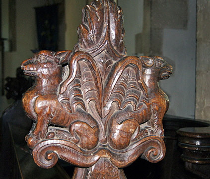
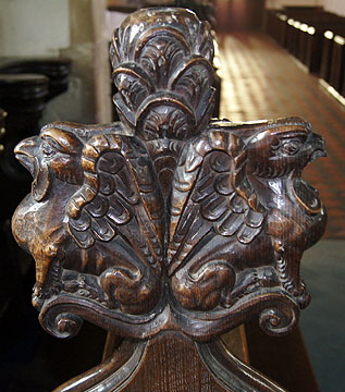
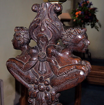
Three nicely carved poppy heads. probably Jacobean |
|||||||||||||||||||||||||||||||||||||
 |
 |
||||||||||||||||||||||||||||||||||||
|
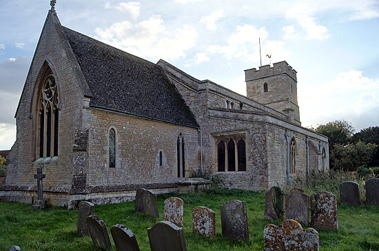
Views of the church from (left) the north east and (right) the north. You can see how an Early English lancet window was placed considerably to the east of the Norman window in the north side of the chancel, marking its later expansion eastward. It isn’t a distinguished church visually. The lowering of the nave roofline and the raising of the chancel’s roofline is a not infrequent of English churches and has the strange and somewhat unfortunate effect of making it look as if part of the church has gone missing |
|||||||||||||||||||||||||||||||||||||
|
Footnote - More on Lead Fonts |
|||||||||||||||||||||||||||||||||||||
|
There are thirty-two surviving lead fonts in England. The northernmost is at Barnetby-le-Wold in Lincolnshire near the Humber Estuary. It also happens to be the largest. This is very much an “outlier” with the majority being located in the southern England and the Midlands. The thirty two are found, however, in no fewer than fourteen counties. This is a considerable geographical spread and suggests that the surviving fonts may be a small fraction of the original corpus. Derbyshire, for example, has just one such font at Ashover. Yet lead was mined in the Peak District from at least the Roman period. We must surmise that many more have been lost. Why should this be so? Well, I have already touched upon the known depredations of Roundhead soldiers in the Civil War. I don’t quite know why Royalists are not in the frame for this as well, but Cromwell’s blokes are an easy target and with their Puritan views they certainly had little respect for fripperies in churches. That, however, is just one aspect of the fundamental threat to the such fonts over the centuries - the recyclability of lead. Brian Harris in his “Harris’s Guide to Churches and Cathedrals” gives a splendid and comprehensive review of the lead font. He had discovered that as late as Victorian times lead fonts were being melted down and re-used for purposes such as repairs to lead roofs. Then there is the issue of iconoclasm. An “idolatrous” stone font might be smashed, disfigured or relegated to use as an animal trough but many were eventually located and restored. A lead font, however, was much easier to destroy totally. Even a fire in the church would inevitably lead to the loss of a lead font. So we simply have no idea of the original numbers. I would suggest that another reason for their loss might be that they really were not very attractive. As stone-carving skills became more sophisticated it would be hardly surprising if a parish decided that a nice octagonal stone font with carvings of - for example - the Seven Sacraments would be preferable to a dull industrial-looking font with rather crude decoration. Again, it would not be difficult to re-use the old one in order to defray the cost of the new. One cannot help wondering how many Gothic style fonts replaced lead ones. Even Norman stone fonts were often treated with disdain by later generations. Many is the Norman font that was found serving in some capacity on a farm or discarded in a churchyard. At Ingleton in Yorkshire the font was found in the river having been apparently rolled down the steep hill from the church. Lead fonts have similar stories. Harris recounts that Barnetby’s was found in the church’s boiler room! Nevertheless, even allowing for uncertainty about the original numbers I believe that lead fonts were no more than an experimental technology that even in the short term was doomed to failure. It is hard to imagine that any parish would prefer the material over stone so it seems likely to me that the market (forgive the neologisms) was producer-led rather than consumer-led. Lead was being used to line stone fonts and it was a short step in the imagination for the manufacturers to start thinking that with a bit of modification and decoration the lining might constitute the actual font. The pages on this website show, I hope, that nothing in our parish churches was as variable in quality or subject matter as the Norman font. Look at Eardisley or Castle Frome in Herefordshire for examples on the Norman font at its sumptuous best. Look at Stone in Buckinghamhire or Sculthorpe in Norfolk for the most sophisticated in symbolism. Then look at North Grimston and Kirkburn in North Yorkshire for the crudest of religious imagery. Some were clearly carved by real master craftsmen with religious guidance from local monks. Others were apparently carved by men more used to just laying one block of stone on top of another. It depended on who was available. There is no shortage of stone in the vicinity of Long Wittenham. There are many wonderful stone fonts in the vicinity that demonstrate the availability of master craftsmen. The adoption of a lead font then seems likely to have resulted from either shortage of money or from having swallowed unrealistic claims about what was achievable. Whether the font is better or worse than the worst of the stone Norman fonts is a matter of opinion and our artistic values are anyway very different from those pertaining nine hundred years ago. I am no expert on the technology of crafting in lead but one shortcoming of using it for this purpose jumps out at me: the difficulty in creating designs with depth. If you look at most of the lead fonts on these pages you will see that the decoration is of uniform shallow depth and therefore rather lifeless. Painters, of course, can give an illusion of depth on a flat medium but metallurgists cannot. Moreover, even the best of the fonts - see Brookland in Kent - are often a patchwork of comparatively small designs. Even the best of the craftsman were unable to create anything on a sweeping scale such as at Eardisely and Castle Frome. If I am right in my surmise that lead fonts were mainly a result of lead miners and smelters seeking more profitable avenues for their industry then we would expect to see a degree of uniformity in design, demonstrating mass rather than bespoke manufacturing techniques. A corpus of thirty-two surviving fonts is an unpromising base for demonstrating this but, rather surprisingly, we see just that in Gloucestershire. The county has nine of the surviving lead fonts. The Forest of Dean was one of the foremost lead producing areas in England so we are not talking here of coincidence. We might speculate that originally there were many more. Of the nine, no fewer than five are undoubtedly cast from the same mould. They are also of a decent quality and their survival surely owes something to that. If you feel I am being too hard on the concept of fonts made of lead, consider this: there are hardly any later than the early part of the thirteenth century or any earlier than the mid-late twelfth century. The envelope is actually probably narrower than that. Whatever the popularity or otherwise of the lead fonts and whatever one thinks of their attractions, it is a fact that their production was short-lived. It is quite possible that the lead producers were simply pursuing a (by historical standards) short-term opportunity when demand for decorated fonts in stone outstripped supply. For today’s “church crawler” a lead font is, of course, an unexpected delight: a curiosity. It’s a bit like those cars from the nineteen fifties. With their chrome and leather and their lovely paint schemes I love to see them. Just don’t ask me to drive one! |
|||||||||||||||||||||||||||||||||||||
 |
 |
||||||||||||||||||||||||||||||||||||
 |
|||||||||||||||||||||||||||||||||||||
 |
|||||||||||||||||||||||||||||||||||||
|
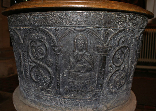
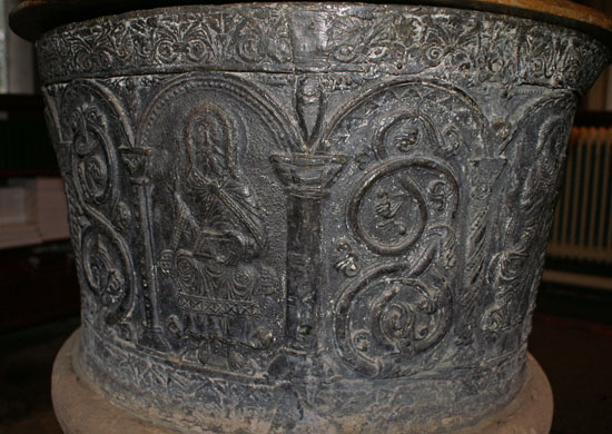
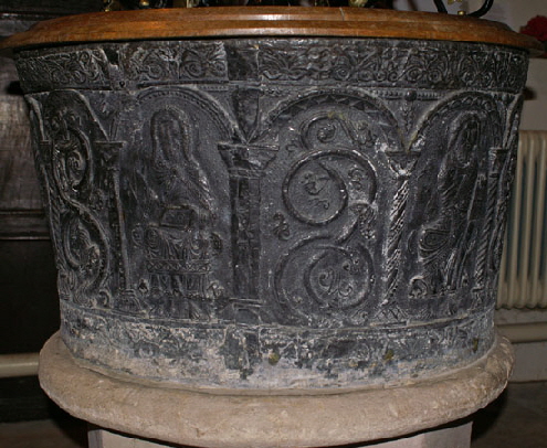
Four views of the “mass produced” lead font at Frampton-on-Severn in Gloucestershire. |
|||||||||||||||||||||||||||||||||||||
 |
|||||||||||||||||||||||||||||||||||||
|
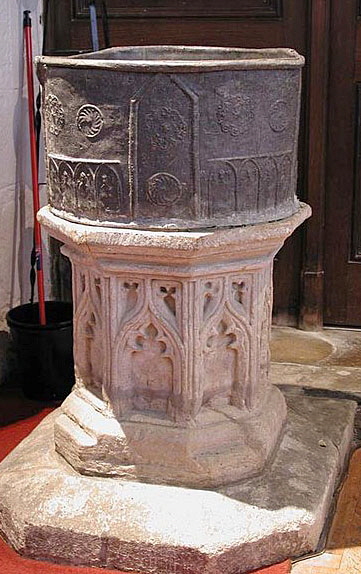
Finally, Warborough Church in Oxfordshire is only three or four miles from Long Wittenham as the crow flies. Above is a picture of its font. Do you see the tell-tale features: the distinctive abstract patterns, the repetitious figures of bishops? Quite clearly this font and Long Wittenham’s emanate from the same foundry! This one would have won no awards for artistic merit either. |
|||||||||||||||||||||||||||||||||||||
|
|
|||||||||||||||||||||||||||||||||||||
