|
Alphabetical List |
|
|
|
|
|
|
|
County List and Topics |
|
|
|
Please sign my Guestbook and leave feedback |
|
|
||||||||||||||||||||||||||||
|
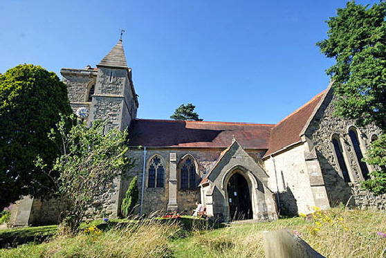
including the attractive Early English style lancet windows of the chancel. The church nevertheless has that comfortable feeling of casual antiquity that so characterises the English parish church. If you come here, however, it is the Norman font that will detain you. Before I begin to describe the font it is worth quoting the "History of Buckinghamshire Vol 2" of 1908: "The smaller details of carving (of the font), heads of beasts &c, worked into knotwork patterns, are so unlike ordinary 12th century work that it must be concluded that much of the carving has been re-worked....". Pevsner had this to say in 1973: "Cylindrical, Norman. Decorated with beaded symmetrical patterns of close interlace, of interlaced stars, rosettes etc and one complicated scene the most prominent part of which is a man fighting another beast, The dove also pecks at this beast. In the mouth of the beast is a human head...". Francis Bond's "Fonts and Font Covers" of 1908 (don't scoff: this is the definitive book on fonts and was reprinted in 1985) has a picture and describes its history but does not even attempt to describe its decoration. Yet Mary Curtis Webb's subsequent research (which you can read or download from this site) show this to be one of the most important fonts in Europe, never mind England. It is the centrepiece of Mary's work and a masterpiece of decoration, four of the five panels synthesising the Christian doctrine of the day with the cosmic philosophy of Plato. To the credit of the church itself, they have embraced Mary Webb's work in their literature. I don’t want to undersell this nice little church but it really needs to be seen in conjunction with Dinton Church only a couple of miles away. The combination of the font at Stone and the south doorway at Dinton will blow your socks off, I promise. |
 |
|||
 |
|||
|
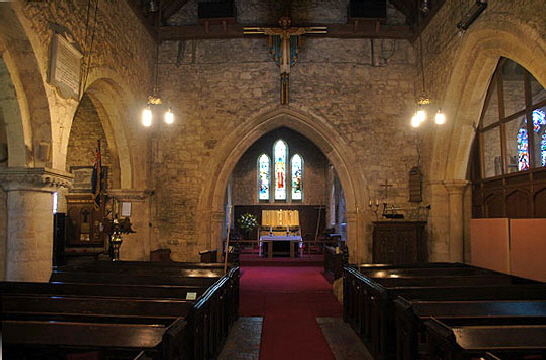
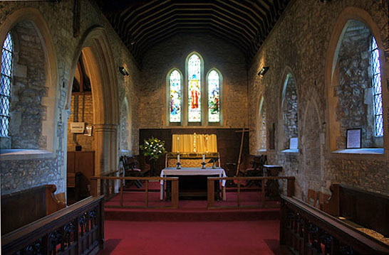
Left: Looking towards the east. On the left you can see the late Norman arcade and the aisle beyond it. The chancel arch is fourteenth century. To the right is the doorway to the south transept. Right: The chancel has been extensively remodelled over the centuries but it still presents a pleasingly mediaeval face to the world. To the left of the altar is the archway through to the modern organ chamber.. Note the filled-in priest’s door to the right. |
 |
 |
|||||||||||||||||||||||||||||||||||||||||||||||||
|
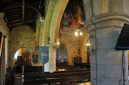
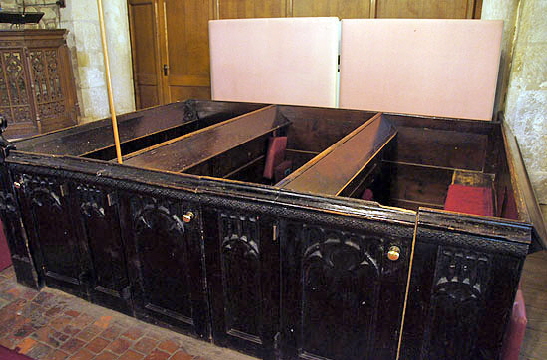
Left: The north aisle was never widened and shows how remarkably little space was sometimes gained for what must have been an extensive piece of construction. beyond the aisle is the north transept. There are three Norman bays. To the west of this picture is a fourth Gothic style bay that enabled the extension of the nave and aisle westwards in the thirteenth century. I have to apologise, by the way, for the pictures which seem to show that we were there late on a winter’s day. In fact it was a bright Summer afternoon but the electric light played merry hell with my camera’s meter. Right: Wooden pews. |
||||||||||||||||||||||||||||||||||||||||||||||||||
 |
 |
|||||||||||||||||||||||||||||||||||||||||||||||||
|
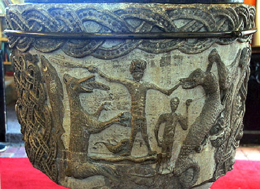
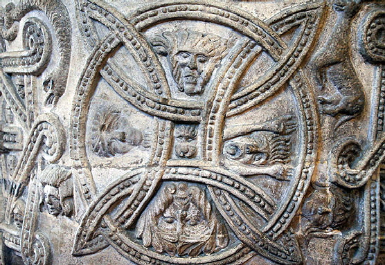
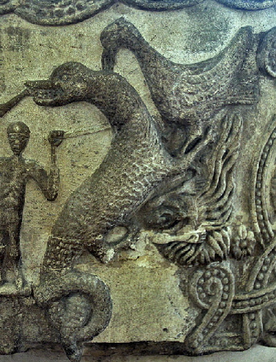
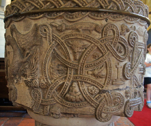
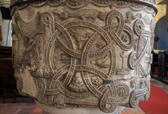
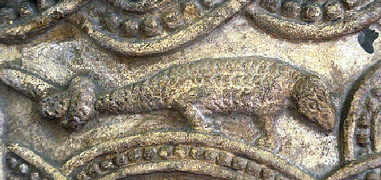
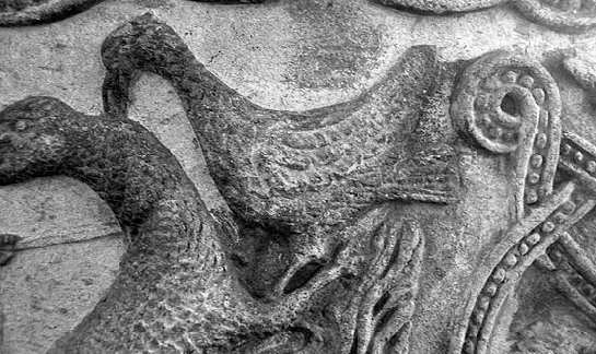
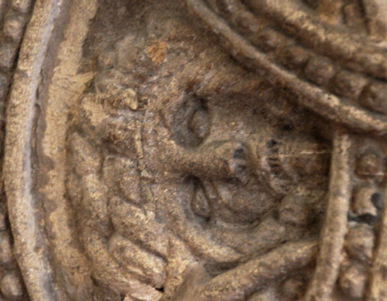
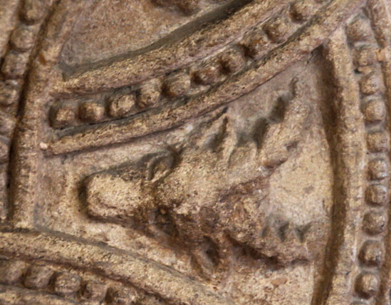
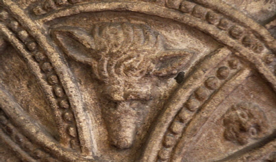
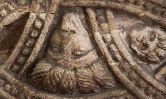
Left: This is the only one of the six panels which is pictorial. Mary Webb described it thus: “The central figure in the scene is that of a man standing naked between two monsters. Satan, the dragon, and Death the wolf-like animal. Here the Redeemer enters Hades at the moment of His death, and comes face to face with the regents of hell...Jesus stands in the centre of the scene, offering his left hand as a bait of mortal flesh to be seized by the dragon. In his right hand he holds a large knife, of the traditional type still used by butchers even today, and he is pointing it at the head of the fish (Leviathan) as a sign of the dismemberment of Leviathan, whose flesh was to be cut up and sold by the merchants in the streets of Jerusalem at the coming of the Messiah”. This is from Pope Gregory Great’s influential commentary (his “Moralia”) on the Book of Job. You can read more about the “Ransom Theory of Salvation” here. At Christ’s right foot is a salamander. The salamander was believed to be resistant to fire and was therefore used in Christian iconography in this case to represent Jesus’s resistance to temptation. You can see another fine representation of a salamander on the font at Youlgreave in Derbyshire. Note the dragon’s twisted tail. This represents the powerlessness of Satan. “By accepting the proffered bait, he is already deceived and mocked by God”. A bird is pecking at the dragon’s head. Bizarrely, this is sometimes interpreted as being a dove! A dove? Mary Webb assures us that it is a vulture - another icon for Christ. With our modern sensibilities this is very strange indeed but, again, this is the legacy Pope Gregory’s “Moralia in Job”. You can see another representation of Christ as a Vulture at the stunning font at Eardisley in Herefordshire. To Christ’s left is another human figure and this is Adam on behalf of whom the “debt” due from Christ to Satan was to be paid. Mary Webb believes that the shallowly-carved stick or knife that he is holding is the work of an ill-informed restorer! Note also the4 serpent at Christ’s feet - the tempter who led to Adam’s fall in the first place - and a large leaf, presumably that with which the unfortunate Adam sought to conceal his naughty bits! So, you see, there is symbolism in every millimetre of this scene - and I haven’t even told you all of it.... Right: Apart from the Ransom Theory panel, this one is perhaps the most significant and the symbol most easily seen elsewhere (which isn’t saying a lot, believe me!). This is Plato’s representation of the Macrocosm within the concept of Cosmic Harmony. See the footnote below. I’ve described it in my pages on Mary Webb so I am not going to do so again here. What makes this example of the “circle with interlaced arcs” design unique is the addition of heads within the segments of the design. On the right is a tormented and screaming head. At the bottom is a “Green Man” head. There are two other “unidentified” heads. Mary Webb was confident that they represented the four ancient “elemens”: are Earth (The Green Man), Fire (the tormented figure), Air and Water. She saw these figures more definitively reproduced in other examples of the Circle with Arcs design in mediaeval literature. Mary Webb has explanation for each element of this design but you will need to read her book (available to read on this site) because I can’t explain it all here! |
||||||||||||||||||||||||||||||||||||||||||||||||||
 |
 |
 |
||||||||||||||||||||||||||||||||||||||||||||||||
|
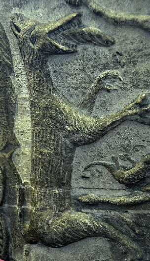
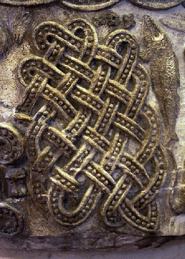
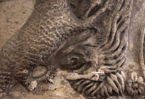
Left: Death in the guise of a wolf. In his mouth is a piece of plaited bread. Why? Death laments that Lazarus has been snatched from him by Christ’s intervention. In a fourth century hymn Death protests “...But my bread from my mouth he snatches it” Centre: Satan in the guise of a dragon. Note the twisted tail and the vulture - Christ - pecking at his head. In his clutches (turn your head to one side!) is screaming soul, hair alight from the fires of hell. Adam to his left is wearing a “helmet of salvation”. Right: Amongst all the symbolism it is surprising to find this half-panel of interlaced decoration. Perhaps the sculptor was just left with a space to fill? Mary Webb entertained that possibility but understandably was sceptical given the symbolism on the rest of the font. She prefers the notion that this represents the labyrinthine entanglements of sin. She believed the same symbolism (although in very different style) is also visible on Eardisley font. To the right of the interlacing is Leviathan in the form of a great fish. He is leaping to the take the triple bait just visible above the interlacing. There are three pieces of bait because some was required from each part of the Trinity. |
||||||||||||||||||||||||||||||||||||||||||||||||||
 |
 |
|||||||||||||||||||||||||||||||||||||||||||||||||
|
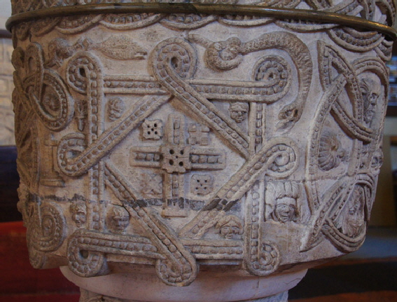
Left: The Platonic symbolism doesn’t get any easier...This interlaced squares design, like the circle with arcs, is found in various places in England and beyond. It represents a cube and was regarded as “the perfection of number”. Right: A circle with double loops. Mary Webb was of the view that this is probably another representation of the microcosm - that is, it mirrors the circle with interlaced arcs design above. Note the four heads within the design, representing again the four elements. Above the main vignette is another creature with a knot in his tail. Is this again a representation of a de-powered dragon? |
||||||||||||||||||||||||||||||||||||||||||||||||||
 |
||||||||||||||||||||||||||||||||||||||||||||||||||
 |
||||||||||||||||||||||||||||||||||||||||||||||||||
|
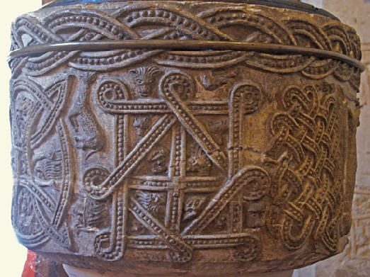
Left: Mary Webb described this panel as a “rhomb on an oblong” and believes it to represent harmonic proportion and the “reconciliation of good and evil”. I confess that I do not see any real geometrical difference between this design and that of the interlaced squares design shown above that could not be explained by the difficulties in keeping perfect proportion when carving with crude tools. Mary Webb was insistent that they are different but sadly it eludes me even now. Whereas that figure had a cross separately inserted in the middle of the design, however, this one has a cross that subdivides the “oblong” into four smaller quadrilateral figures. The four figures contained within the inner diamond shape are the four humours of man. Note the interlaced deisgn at the top of the font. Although this part is fairly regular you can see in some of the other pictures that the sculptor struggles to maintain that regularity. The same design occurs on the doorway at Dinton Church and the same difficulty was evidently encountered. This is support for the belief that the same sculptor carved both this font and that doorway. Right: Whereas the circle with single arcs represents Plato’s Macrocosm, this figure with looped double arcs is the Microcosm. See the footnote below for an explanation. |
||||||||||||||||||||||||||||||||||||||||||||||||||
 |
 |
|||||||||||||||||||||||||||||||||||||||||||||||||
 |
||||||||||||||||||||||||||||||||||||||||||||||||||
 |
||||||||||||||||||||||||||||||||||||||||||||||||||
 |
||||||||||||||||||||||||||||||||||||||||||||||||||
 |
||||||||||||||||||||||||||||||||||||||||||||||||||
|
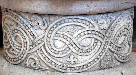
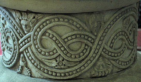
Images of Hampstead Norreys font. Top Left and Right and Second Row Left: The plinth understandably receives little attention when the main bowl has such a wealth of imagery but it is very elaborate in its own right. Many of the images from the bowl re-appear here: tormented souls, fish, deer and so on. I was particularly taken with the fish (in the top left picture) that looks straight out of a Disney cartoon! Second Row Right: Another lizard of some sort with a knotted tail. The recurrence of the knotted tail is a real theme on this font. Above Left: The Vulture (a dove forsooth?) pecks at the head of the distracted dragon. Above Right: The tormented soul within the clutches of the dragon. This is a remarkably fine piece of carving. The agony is there for all to see without descending into the realms of the absurd. In fact, it’s more unsettling than any of the tormented souls seen in later mediaeval wall paintings. |
||||||||||||||||||||||||||||||||||||||||||||||||||
 |
 |
|||||||||||||||||||||||||||||||||||||||||||||||||
 |
 |
|||||||||||||||||||||||||||||||||||||||||||||||||
|
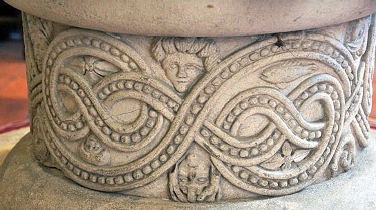
Four Photographs Above: The four elements as represented on the font. |
||||||||||||||||||||||||||||||||||||||||||||||||||
 |
||||||||||||||||||||||||||||||||||||||||||||||||||
 |
||||||||||||||||||||||||||||||||||||||||||||||||||
 |
||||||||||||||||||||||||||||||||||||||||||||||||||
|
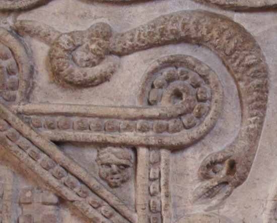
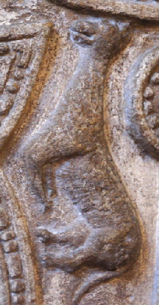
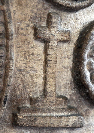
Left: A particularly nasty-looking serpent with the inevitable knotted tail. Centre: Unidentified creature. He doesn’t look very friendly, whoever he is. Right: A three-stepped cross. Mary Webb dismisses the idea that this rather modern-looking cross has been put here during restoration (and, by the way, I am rather curious as to how that would be physically possible) and points to similar crosses on Norman fonts at Burrough-on-the-Hill in Rutland and at Braybrooke in Northamptonshire. The latter is particularly significant as it is on a bowl that also shows the interlaced arcs design. |
||||||||||||||||||||||||||||||||||||||||||||||||||
 |
||||||||||||||||||||||||||||||||||||||||||||||||||
 |
||||||||||||||||||||||||||||||||||||||||||||||||||
|
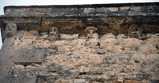
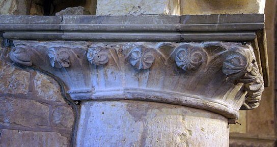
Left: Late Norman capitals on the north arcade. Right: The tower has a row of what are called “corbels” in the Church Guide. I don’t think they have any structural value so strictly speaking this is a decorative frieze rather than a corbel table. |
||||||||||||||||||||||||||||||||||||||||||||||||||
 |
 |
|||||||||||||||||||||||||||||||||||||||||||||||||
|
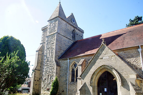
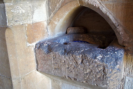
Left: The tower is a rather peculiar thing. It is fourteenth century but the odd “double saddleback” roof is nineteenth century. The plan is a square with a thin rectangle attached - which is very curious indeed, if not unique. We know that all of that was original because the decorative frieze covers the whole cornice. Right: This hefty holy water stoup sits outside the south door. It looks to have been recycled from elsewhere. |
||||||||||||||||||||||||||||||||||||||||||||||||||
|
Footnote 1 - Macrocosm and Microcosm |
||||||||||||||||||||||||||||||||||||||||||||||||||
|
It is important to realise that the Christian church of the first millennium saw Greek philosophical concepts not a being a challenge to their religion but as being complementary to it. Plato did not, of course, know of the Jewish God or the Jewish Messiah but he did recognise the existence of a creator. Confusingly, Plato went further by believing that the world was fashioned by a kind of supernatural artisan craftsman - the “Demiurge” that was not as one with the God figure. Yes, it’s confusing, isn’t it? It’s worth remembering also that the Greek philosophers were thinking this way at the same time as the Greeks in general, as well as the Romans, were polytheistic and, in the case of the Romans, even deifying their emperors. The Greek philosophers had views on how the world was and how it was kept in balance through forces such as Plato’s “Cosmic Harmony”. If you find it hard to understand how the Christian church could reconcile this with their monotheistic culture think of it this way: God was the Creator, the ideas of the Greek philosophers were to do with what he created. I would suggest that modern Christians have to make similar accommodations to reconcile a God-made universre with the Theory of Evolution. “Who created Evolution? God did”. Of course, fundamentalists who believe the literal story of the seven day creation and a world that is 4500 years old manage by dismissing the idea of Evolution altogether which at least has the virtue of being nice and tidy! There is something comforting about the concept of “Cosmic Harmony”, isn’t there? The Greeks were also the first culture (as far as I know) to see the mathematics that they codified as being part of God’s plan. They saw a world in harmony and they observed it in both mathematics and music. You think this is an alien idea too? Well think about the appearances in nature of the Fibonacci Sequence (Google it if you don’t know what I’m talking about) and the geometrical symmetry of snowflakes. Plato’s Microcosm and Macrocosm sounds awfully complex but it isn’t. Having said that, I am going to rely on a third party account of it from http://science.jrank.org/pages/10209/Microcosm-Macrocosm-Plato.html. “Plato argued that human beings and the universe are both composed of an elemental body and a rational soul, and that just as the human body derives from the universe's body, the human soul must derive from the universe's soul. The universe is, therefore, not only an orderly system but an intelligent organism as well. Plato expounded this theme at greater length in the Timaeus,, where he explained how the structure of the human being parallels that of the universe through certain correspondences in body and soul. Just as the body of the universe is spherical, and its soul is composed of orbits along which the planets wander, so too the soul of the human being is composed of orbits along which its emotions rove, and it inhabits the head, which is spherical. The rest of the human body exists merely to serve the head. Unlike the macrocosm, which contains all things and is immortal, and hence has no need of sensory or digestive organs or limbs for locomotion, the microcosm is only a part of the whole, and its existence is threatened by the surrounding elements, so that it needs such additional parts to perceive and avoid danger and to replenish the nutrients it loses. Furthermore, the external disturbances that threaten the microcosm cause the orbits of its soul to be disrupted, throwing its emotions into disarray. Yet when the disordered microcosm observes the heavens, it sees there the orderly motions of the planets following the orbits of the macrocosmic soul. With the aid of philosophical study, it becomes aware of the correspondence between itself and its great counterpart. Having attained this insight, the microcosm realizes that just as the universe employs reason to govern the planets, it too should employ reason to govern its emotions. In this way the microcosm overcomes its inner discord and prepares its soul for a return to the heavens from which it came.” |
||||||||||||||||||||||||||||||||||||||||||||||||||
|
Footnote 2 - Why is this font at Stone Anyway? |
||||||||||||||||||||||||||||||||||||||||||||||||||
|
Stone is thirty-five miles from Hampstead Norreys. The Church Guide explains that the eighteenth century parishioners of Hampstead weren’t too keen on the odd decorations and tried plastering over them! In 1767 they dumped it altogether and it was put to use as a drinking trough - and that is not such an unusual use of a Norman font as you might think. The one at Ingleton Church in Yorkshire, for example, reputedly suffered the indignity of being rolled down the considerable steep hill there into the River Greta below! It, like many others thankfully, was re-discovered and restored to its original position. What would have become of the Hampstead Norreys font had the stitched-up eighteenth century English Christians understood the significance of the decoration I dread to think. Hammers and chisels spring to mind Because that was exactly what happened to Stone’s own font. It was, according to the Church Guide first desecrated and then “cleansed” by the Churchwardens to the point of destruction. Around 1847 the Hampstead Norreys font was recovered by a Fellow of the Royal Society of Antiquaries, presented to the the church at Stone and “lovingly restored”. I suppose it is just as well that the people at Stone didn’t understand it either! |
||||||||||||||||||||||||||||||||||||||||||||||||||
|
Footnote 3 - Who and Why? |
||||||||||||||||||||||||||||||||||||||||||||||||||
|
It must be pretty obvious that whoever commissioned this font was a member of the tiny intellectual elite - and in the eleventh century that meant the inhabitants of the monasteries. There is not the slightest possibility that this font was designed by a common mason. Nor is there the slightest possibility that it was carved by a monk. It must have been a mason directed by a monk. Elsewhere in these pages I pooh-pooh the notion of monks and priests as commissioners of the grotesque carvings that for hundreds of years have adorned the exteriors of English parish churches. Here, though, we are not talking of the grotesque but of the sublime. And we are not talking of masonry or of the outsides of churches, but of one of the focal points of a church: its baptismal font. Mary Webb had the origins of this decoration all worked out and the Church Guide endorses her views. It all emanates from Reading Abbey which is only fourteen miles from Hampstead Norreys. Mary Webb recognised that preserved fragments of the dissolved abbey were stylistically similar to the font and to capitals at Cholsey Church. The Church Guide explains that the first Abbott of Reading Abbey was one Hugh de Boves who entered religious orders at the great monastery of Cluny in modern France. His further education was under Anselm of Laon. Anselm was one of the great religious thinkers of his day and his work influenced many subsequent great thinkers including Thomas Aquinas. Laon became a centre of theological thinking. Amongst the new theological theses were those of Master Hugh of St Victor. No fewer than three copies of his “De Sacramentis Dei” were known to have been in Reading Abbey Library. In that book, Master Hugh says: “There are two works of God under which all thinks are subsumed: these are the Work of Foundation (or Creation) and the Work of Restoration (or Salvation)...As the Church Guide says, echoing Mary Webb’s, the font decorations do reflect these concepts. It seems clear that Hugh de Boves was influenced by Master Hugh’s work and that he in turn taught the precepts and influenced either directly or indirectly the design of Hampstead Norreys font. So much for the “who”. What of the “Why”? Here I disagree with Mary Webb who believed that the decorations were to be used in “educating” the parishioners. For a start, I think Greek philosophical thought would have been way beyond the Job Description of a parish priest. And do we really think that the illiterate commoner would have been capable of understanding such concepts? Do we truly understand them? Even having read Mary’s book twice and written reams about her work I would hate to have to give a five minute summation! I will stretch a point where the Ransom Theory panel is concerned but that’s about it. I believe this was a case of the intellectual elite demonstrating their erudition to their peers. But then who can really know? |
||||||||||||||||||||||||||||||||||||||||||||||||||
|
Please now navigate to this page for more about Mary Curtis Webb’s work. |
||||||||||||||||||||||||||||||||||||||||||||||||||
|
|
||||||||||||||||||||||||||||||||||||||||||||||||||
