|
Alphabetical List |
|
|
|
|
|
|
|
County List and Topics |
|
|
|
Please sign my Guestbook and leave feedback |
|
|
||||||||||||||||||||||
|
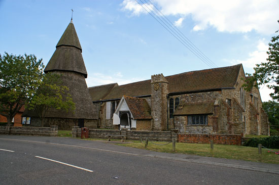
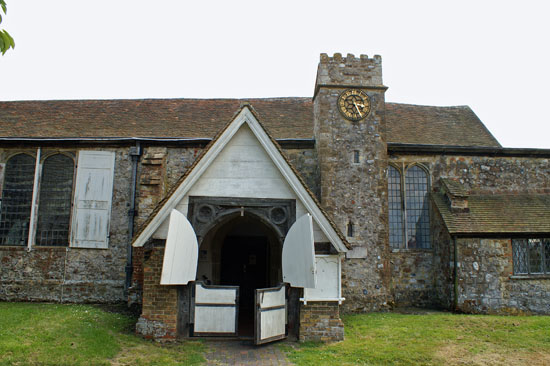
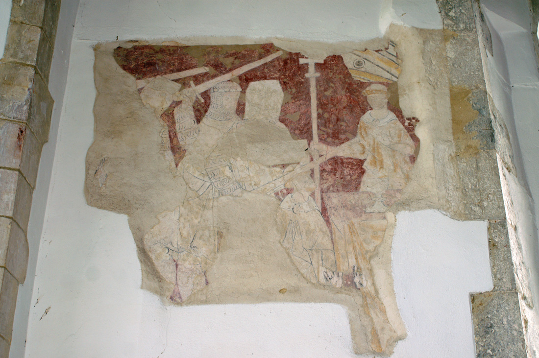
parallel with the entire length of nave and chancel and at much thesame height, a style more reminiscent of Cornwall than of Kent. The north porch is mainly constructed of timber and has curious half doors, a little like a Wild West saloon! There is a peculiar little tower - with a small clock - next to this porch. Put this all together take away the bell tower and you have what looks rather more like a manor house than a church! The nave and chancel here flow seamlessly one to the other without any chancel arch. The chancel is c13 Early English, although the east window is a c16 replacement. It would be fair to say that throughout this church the windows are models of plain and restrained functionality and to my eye are in keeping with the somewhat austere feel of the main body of this church. Elaborate window tracery and stained glass would have changed this church very much for the worse, In my view. The nave is also c13, although the aisle arcades are probably c14. The arcades are oddly - and surely unnecessarily, asymmetrical with seven arches on one side and six on the other. On both sides the aisles lean alarmingly due to long-standing problems with uneven settlement of the subsoil Apparently. the south aisle already leans beyond its point of theoretical collapse - and the church is still subsdiding! In 1964 wall repairs uncovered a superb fargment of wall painting depicting the martyrdom in 1170 of St Thomas a Becket in Canterbury Cathedral. No details is spared: we see a sword entering the unfortunate Thomas’s skull; all four murderers are depicted as is Thomas’s chaplain. The Church Guide (a remarkably authoritative one) puts this painting on the seond half of c13 with repainting occurring in each of the two succeeding centuries. Brookland is charming little church. Bright and airy within and spared constant “improvements” over the centuries, it is like a shabby old lady that extends warmth and hospitality to those that visit. Yet the font and bell tower are amongst the most instantly recognisable icons of the English mediaeval church. Oh, and there’s a pub right next door.....! |
 |
|||||||||||||||||||||||||||||||||
 |
|||||||||||||||||||||||||||||||||
|
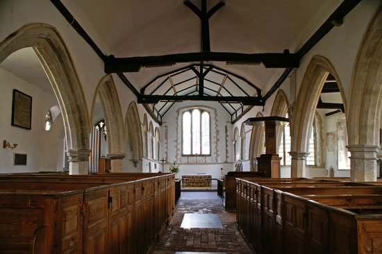
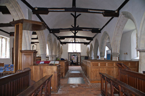
Views to the east end (left) and the west end (right). Note the canted aisles. Note also the rough and ready floor and box pews that date from around 1738. |
|||||||||||||||||||||||||||||||||
 |
 |
||||||||||||||||||||||||||||||||
|
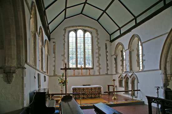
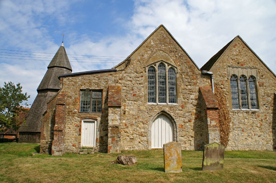
Left: The Early English chancel. Note the masonry courses around the east window that show that there was an EE triple lancet window arrangement here originally. Right: This external view of the somewhat “unchurch-like” west end shows the unusual cross section formed by the nave and the aisles. |
|||||||||||||||||||||||||||||||||
 |
|||||||||||||||||||||||||||||||||
 |
|||||||||||||||||||||||||||||||||
|
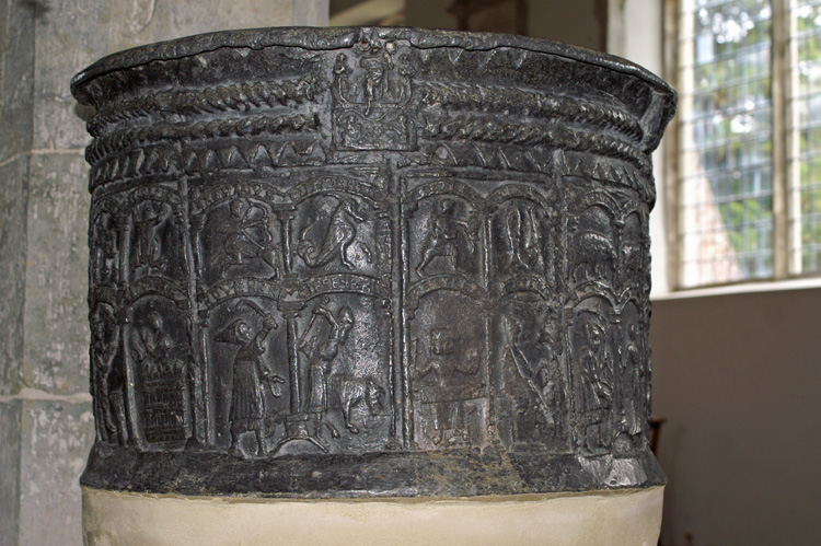
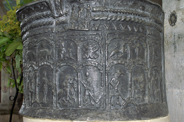
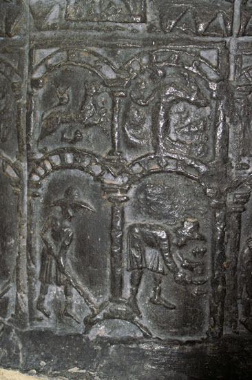
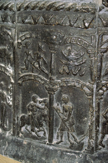
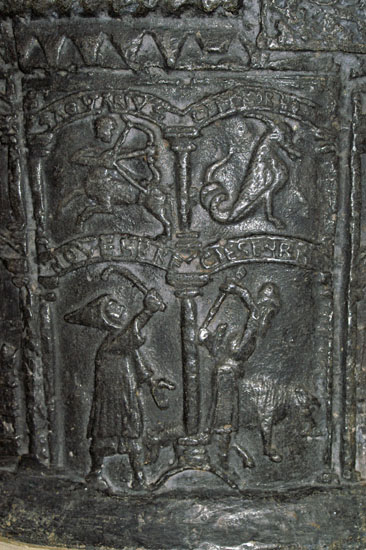
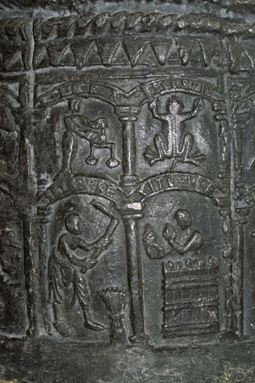
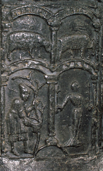
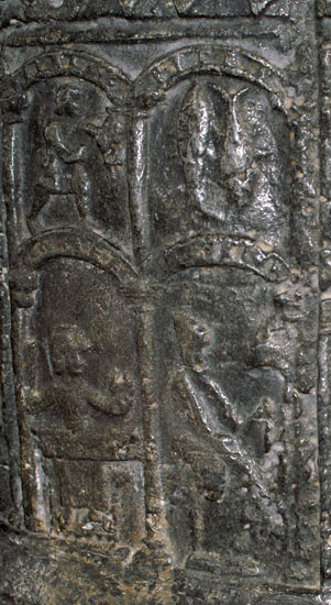
The two sides of the Norman lead font. The upper of the two main courses of decoration shows the signs of the zodiac. Above each is the name of the sign. The lower course has the Labours of the Month - a kind of mediaeval agricultural text book! Within the arch at the top of each labour the month is spelt out - in early French leading to the believe that this font was originally in France. |
|||||||||||||||||||||||||||||||||
 |
 |
 |
|||||||||||||||||||||||||||||||
|
Left: Leo and Virgo. The lion looks more like a South African Springbok! The months are “Juillet” and “Auout”. July has a man working the hay with a rake. August is a somewhat indistinct man working with a sickle. Centre: Gemini and and a distinctly bizarre Cancer that looks more like a frog than a crab! The months are “Mai” and “Juin” For May there is a knight on a palfrey with a hawk on his arm. June has a man mowing with a long scythe, Right: “Sagutarius” and Capricorn. What a wonderful goat with his curly tail!The months are “Novenbre” and “Decenbre”. For November a swineherd using a curved stick to beat down acorns for the pig just visible at his feet. For December we see a man lifting an axe to kill a pig (presumably in order to survive the Winter). |
|||||||||||||||||||||||||||||||||
 |
|||||||||||||||||||||||||||||||||
 |
 |
||||||||||||||||||||||||||||||||
|
Left: Libra and Scorpio. Libra is very nicely drawn but Scorpio looks even more like a frog than Cancer does! Presumably the artist had never seen a scorpion or even a mediaeval manuscript that depicted the zodiac more accurately. The months are “Setenbre” and “Vitovvre”. For September a man is threshing corn with a flail. October sees a man inside a vat examining grapes - a reminder that viniculture was by no means uncommon in mediaeval Northern Europe. Centre: “Capricornus” and Taurus. The artist made a mistake here - the ram should, of course, be Aries! So there are two Capricornus on this font! The months are “Mars” and “Avril”. For March we have a man pruning a vine. April has a figure holding a sprouting branch in each hand. This refers to Rogation-tide * Right: Aquarius and “Pices”. The months are “Janvier” and “Fevrier”. For January a two faced man is seated at a table, drinking from a goblet and seeing the old year out and the new one in. For February a man is sitting at a fire warming himself. |
|||||||||||||||||||||||||||||||||
|
* Most of us are probably aware of “Rogation Day” from its being printed in our diaries but have little idea of what it means. It was believed to have originated in fifth century France and involved blessing fields and livestock. By the eighth century in England it had come to involved people “ganging” around the parish boundaries in order that in this era before maps they were not forgotten. |
|||||||||||||||||||||||||||||||||
 |
|||||||||||||||||||||||||||||||||
 |
|||||||||||||||||||||||||||||||||
|
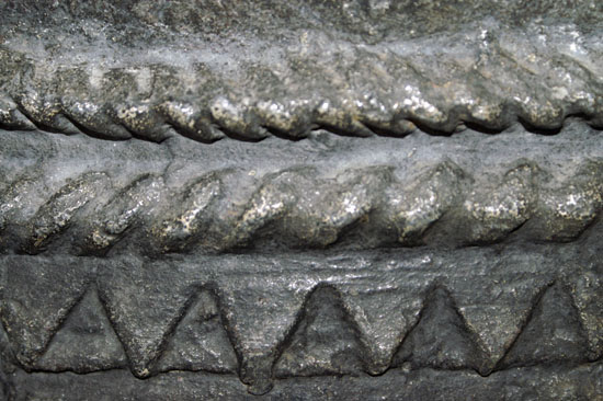
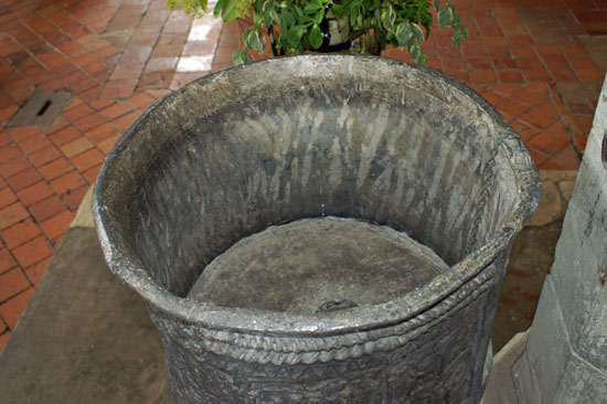
Left: The rim has three courses of typically-Romanesque cable and zigzag mouldings. Right: The font was cast in a single piece, probably by a Norman or Flemish craftsman. The zodiac is seen fairly often in Norman architecture, and the labours of the month are also seen elsewhere, not least on Burnham Deepdale font in Norfolk. The two together, however, are very rare in England. |
|||||||||||||||||||||||||||||||||
 |
 |
||||||||||||||||||||||||||||||||
|
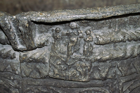
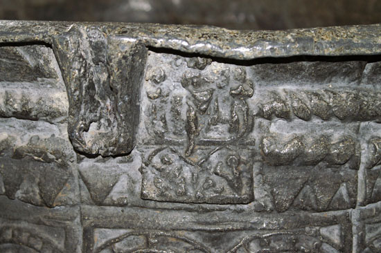
The font also has three casting just below the rim, each showing Christ’s resurrection. Here are two of them. Note the points on the rim to facilitate locking of the font lid. Theft of Holy water, sometimes for witchcraft, was seen as a major problem in the mediaeval period |
|||||||||||||||||||||||||||||||||
 |
|||||||||||||||||||||||||||||||||
 |
|||||||||||||||||||||||||||||||||
 |
|||||||||||||||||||||||||||||||||
|
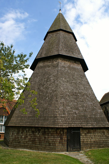
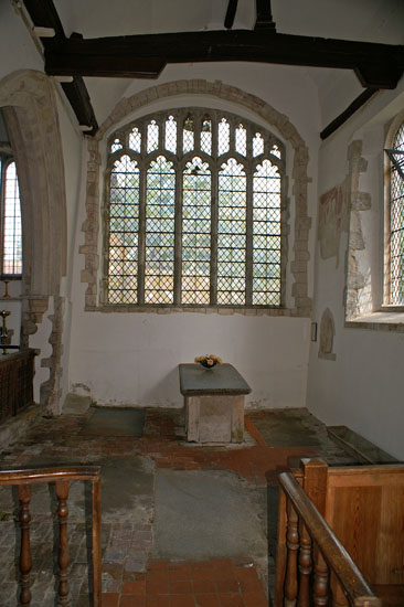
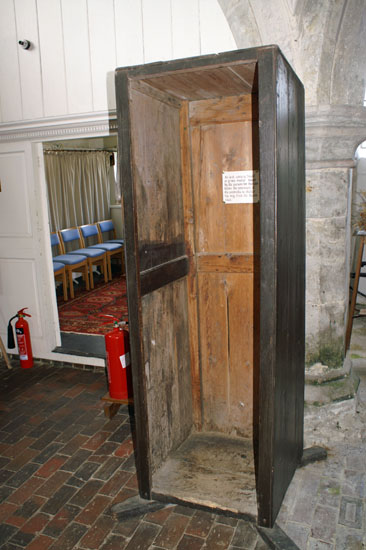
Left: Brookland has a rare surviving portable cabin once used to protect the Rector from the elements when conducting funerals at the graveside. Centre: The south chapel. The “gate” and rails date from the c17 when Archbishop Thomas Laud decreed that all altars must have rails around them - to prevent desecration of the altars by dogs! It is also believed that the altar here may be the original altar table form this period when Laud had decreed that communion must take place around a table with the full participation of the congregation and for a time the practice of placing the altar at the east end was abandoned. The Jacobeanmarble topped tomb is for John Plomer, three time Mayor of Romsey, a Cinque Port. Right: The bell tower. |
 |
|
The Thomas a Becket wall painting. Becket is kneeling in the foreground while a sword held by the knight to his immediate left cuts into his skull. To Becket’s right is Grimm, his chaplain holding the episcopalian cross. This is a painting that was fortunate indeed to survive, as Henry VIII ordered the removal of all Becket imagery. It is not hard to understand why: Becket’s death was precipitated by his assertion of the rights of the Church over those of the Crown. That did not suit Henry’s agenda at all! |
|
|
||||||||||||||||
|
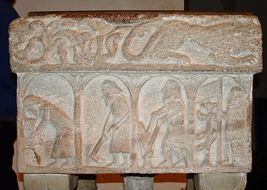
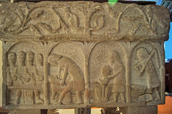
Footnote - The Burnham Deepdale (Norfolk) Labours of the Months font. |
 |
 |
|
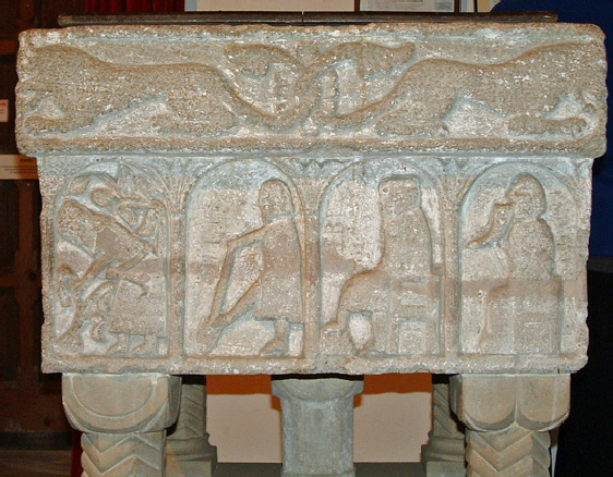
The Labours of the Month font at Burnham Deepdale. There are no zodiac signs and the rim is decorated by finely-carved and wonderfully feline lions. In the left hand picture we have, from right to left: May - a woman carrying a banner at Rogation tide; June - weeding; July - a man mowing; August - a man tying a sheaf. In the right hand picture we have: January - a man carousing with a horn drinking vessel; February - a man warming himself; March - a man digging; April - a man pruning a plant. |
 |
 |
|
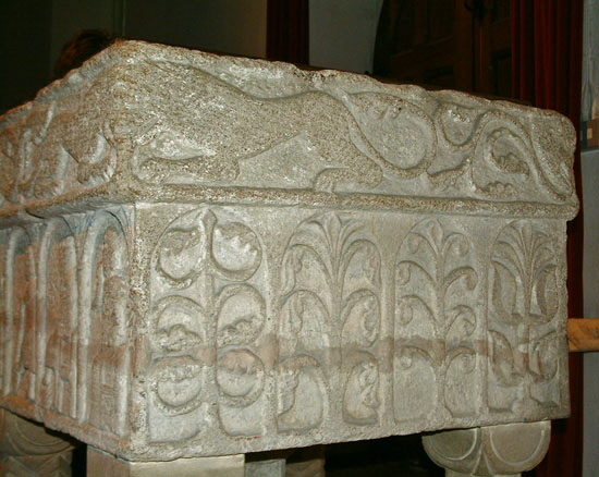
Left: The South side of Burnham font has from right to left (from the corner): September - a man threshing; October - a man barrelling wine; November - pigsticking; December - Four people seated for a meal at Christmas. Right: The west side of Burnham Deepdale font has just these plant carvings. I wondered if they might represent the four seasons but there is no obvious Winter scene so I guess not. |
|
It is interesting to compare these fonts from many points of view. The Brookland font has fine detail in its casting that could not be carved in the stone of Burnham. Yet the Burnham font surely shows the better “art” and is much clearer in its imagery. Note that wine manufacture appears in October of both years - another reminder that wine manufacture was usual in the Northern Europe of the time. Rogation tide is a theme in both fonts. On both fonts the poor old pig is killed in order to survive the winter - although in December at Brookland and in November at Burnham. In both there is an acceptance that for the three months from December to February there is little to do but sit out the Winter - an interesting perspective on the lives of our mediaeval forebears. |
|||||||||||
|
Footnote 2 - Where did Brookland Font come from? |
|||||||||||
|
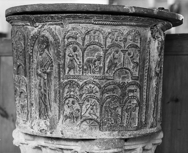
There are thirty lead fonts in England, with a cluster of them in the Gloucester area, so Brookland is far from unique except in its artistry. What it does have, though, is names of months written in “Old French”. This, one suspects, is the main reason that the font is presumed to be of French origin. Pevsner expresses no view on this, but quotes the renowned expert on Romanesque architecture, George Zarnecki, who believed it to be so. |
|||||||||||
 |
|||||||||||
|
The lead font of St Evroult-de-Montfort |
|||||||||||
|
One final thought about these fonts. Most of the survivors are simple for a reason. The fonts were cast. The fonts will have been cast as two or more flat pieces, and curved while still hot. The pieces would then have been soldered together. This would have been a walk in the park for the casters because most stone fonts also had a lead lining. It may sound obvious, but lead fonts were not “sculpted”! Which is why, of course, they could be mass produced. The designs would have been moulded into the sand before the molten lead was poured in. Things like geometric shapes were probably just produced through the use of wooden templates that someone had carved. More elaborate designs such at the one at St Mary, Wareham in Dorset would have required someone more artistically talented to carve the designs on some sort of material and then for it to be impressed into the sand before casting. When we look at the Brookland and St Evroult fonts, then, we are seeing very elaborate designs that someone had to carve on a different material so that the design could be cast. And if the two fonts are indeed by the same artist, then it was he who was the common denominator. He could have had such a font manufactured at any lead smelting outfit in Europe! So we should not rule out the alternative theory: that they were not both cast in England or in France - but each was cast in its own country! It would not then be a question of whether the fonts were English or French but of from which country the artist came. |
|||||||||||
