|
Alphabetical List |
|
|
|
|
|
|
|
County List and Topics |
|
|
|
Please sign my Guestbook and leave feedback |
|
|
||||||||||||||||||||||
|
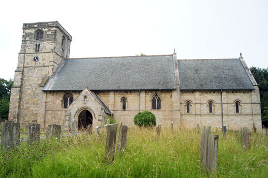
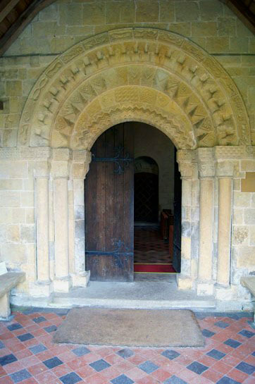
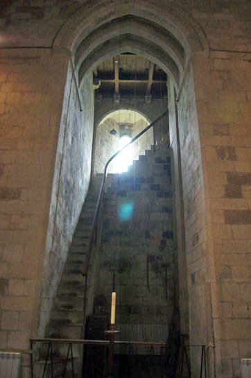
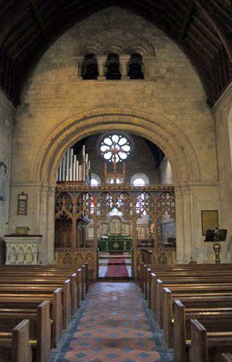
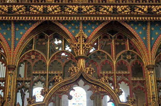
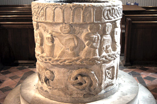
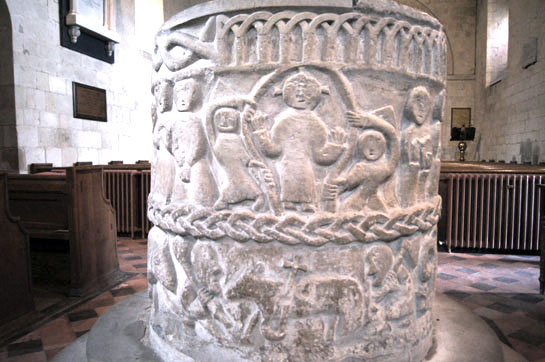
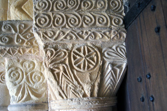
The interest of Sir Tatton Sykes was secured was in 1855 (see the footnote of Cowlam Church for more about him) and he re-engaged Pearson to rescue the situation. The chancel was removed altogether and Pearson restored it in Norman style and took great care and pride to try to recreate the original Norman structure. So successful was he that today it takes some time to make out what is original and what was rebuilt. The fun starts here at the south doorway which is original and quite gorgeous. There are no fewer than five courses of decoration. The innermost one of zigzag moulding and the third of decorated chevrons is divided by an arc of decorated stones. The fourth course is of beakheads. Outside this is the fifth and best course: mainly of animals, a most unusual and delightful surprise for the visitor. All of this, and the carved capitals are more or less intact. Inside, as you turn to the left, there is another surprise: and open staircase to the tower. This leads to two small rooms at the top that, it is believed, were used to accommodate Augustinian’s on their way to the priories at Guisborough and Bridlington. The nave is substantially Norman although there are some Gothic windows. The chancel arch is also Norman, of impressive proportions but decorated simply with three courses of zigzag moulding and an outer one of billet moulding. Above that is a triple opening in authentic Norman style installed by Pearson. The chancel, of course, is Victorian. The east window is a triple light affair arranged in Early English period configuration but with rounded heads to the windows in Norman style - a bit of a mixture but far from incongruous. Above it is a rose window also by Pearson but, again, in keeping with the Norman style. The whole church is surrounded by a corbel table. Pearson recarved those on the chancel but it is not clear if he also restored some of those on the nave as well. He is on record, again, as having tried to keep everything as close to true Norman imagery as possible. Finally there is what Pevsner called the “barbarous jumble of a font”. That word seems to be in vogue for describing elements of this church. It is indeed as unsophisticated work as you are ever likely to see. Effectively, there are three bands of decoration. The middle band features a variety of human figures and the Church Guide says that they represent scenes from the Easter Vigil, a rite that became unfashionable (but not abolished) after the Reformation. The lower band has a set of more symbolic motifs. The topmost bands has a series of stylised designs. Naive it certainly is, but as we shall see it is far from unsophisticated in its imagery. |
 |
 |
 |
|||
|
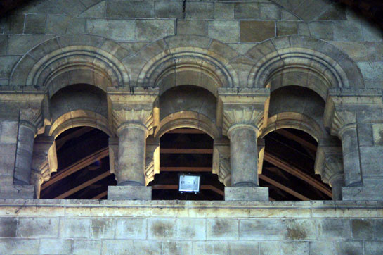
Left: The south doorway with its five orders of decoration. Note the tympanum-like second order. Centre: The open stairs used by the monks to access the guest rooms. Right: The impressive Norman chancel arch. It’s a bit of a whopper and hints that there was a significant chancel beyond it even in Norman times. Above the arch is J.L.Pearson’s neo-Norman trifora. |
 |
 |
||
|
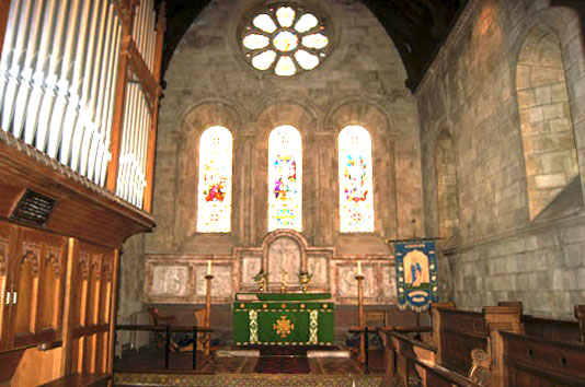
Left: The trifora. As you can see, Pearson repeated the trick on the east side of the chancel wall. Right: Peason’s chancel with its three light east window and a neo-Norman rose window. The glass in all of these windows was paid for by parishoners in 1865 to commemorate Sir Tatton Sykes who died two years earlier and his daughter, Mary Ann, who had drew up the plans for Cowlam Church’s rebuilding. |
 |
|||||||||||||
 |
|||||||||||||
|
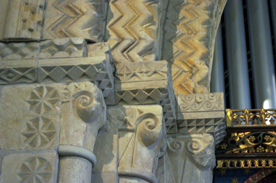
Left and Right: The chancel arch capitals. These are simple scroll motifs, but the carver seems to have got bored on the south side and decided to turn one of them into a face! The geometric patterns are beautifully executed. Was there any restoration carried out on this archway? |
|||||||||||||
 |
 |
||||||||||||
|
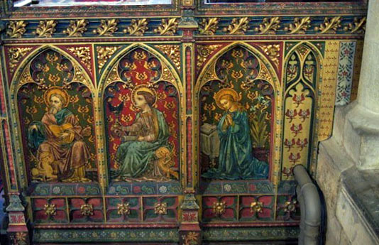
Left and Right: The screen dates from 1872, was designed by the renowned G.E.Street and allegedly took two men two years to paint. The original survived the Reformation but was recorded as being “much mutilated” by 1831. The date of its removal is not known. |
|||||||||||||
 |
 |
||||||||||||
|
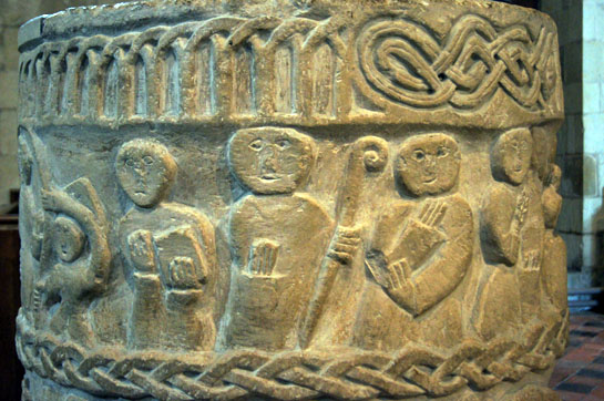
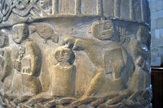
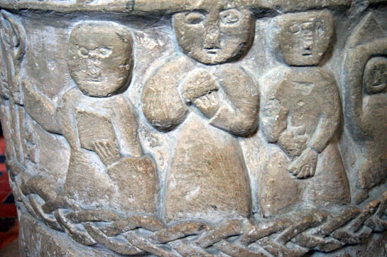
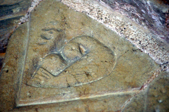
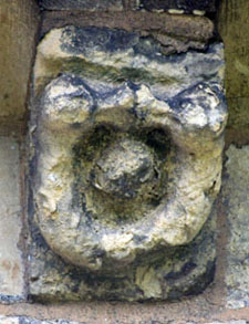
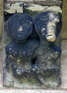
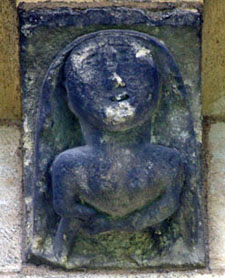
Left: The Norman font. The human figures are of stunning naivety. In saying this, however, it is perhaps right to reflect that it was not carved for the sake of art or for the entertainment of future generations. The Easter Vigil was a time of baptism and the carver here made sure that the congregation would understand the messages. This was the art of the artisan and produced for the common man. So let’s not be so quick to sneer. The scenes in this picture show a baptism with the clergyman making the sign of the cross on a child’s head. To the left of the child’s head is a dove representing the Holy Spirit descending. To the right of the baptism scene are two of the congregation in what the Church Guide describes as “postures of awe”. Right: This is my favourite bit - a girl skipping in the playground. Ok, I made that up. It’s Christ’s ascension. He is contained within a “mandorla” (an almond shaped frame) and showing His hands that had been pierced by nails. Angels support Him on either side. |
|||||||||||||
 |
|||||||||||||
 |
|||||||||||||
|
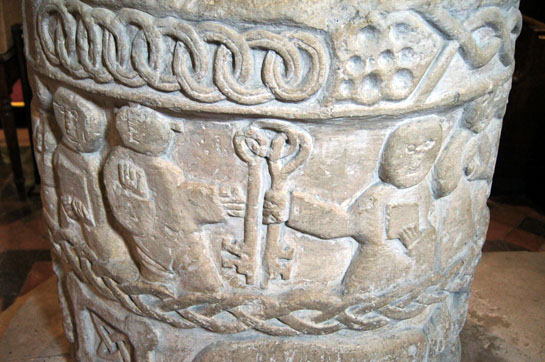
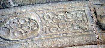
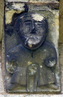
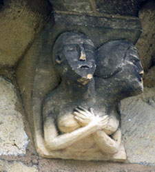
Left: To the left is a clergyman with a book. Then we have a bishop with a crozier. Then we have what the Church Guide claims to be a “layperson with hands in a protective posture representing deference in the presence of a superior power” (!) Right: One of the more easily-recognised scenes: Christ (left) giving the keys to Heaven to St Peter. This juxtaposition of this scene with the baptism is, again according to the Church Guide, is attributable to St Augustine’s use of the story of Peter’s repentance and reward as a parallel to “baptismal affirmations”. Once again here, therefore, we see an educated and well-informed clerical mind guiding the carver. These two pictures also give a good opportunity to study the decorative bands of the font. There is blind arcading and interlaced rings around the rim, both courses irregular. On the other hand, the interlaced ribbon motif, although somewhat crude, is rather charming in its irregularity. The interlaced band running around the base of the Easter Vigil scenes is, again, poorly executed. |
|||||||||||||
 |
 |
||||||||||||
|
Left: The baptism scene. To the left of that is someone holding a lighted candle (not a flower apparently!). the bottom of the candle would have been dipped in the baptismal water to represent the coming of the Holy Spirit. Right: St Peter is on the left receiving his keys. To his right are two more “awestruck” observers. |
|||||||||||||
 |
 |
||||||||||||
|
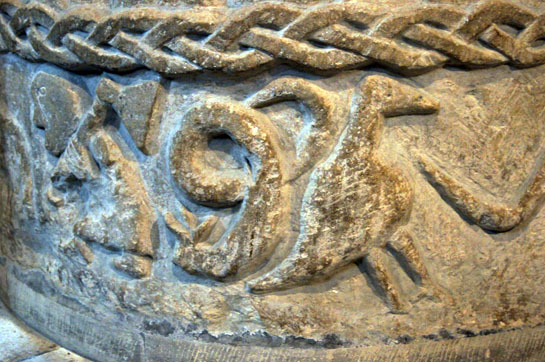
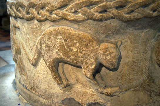
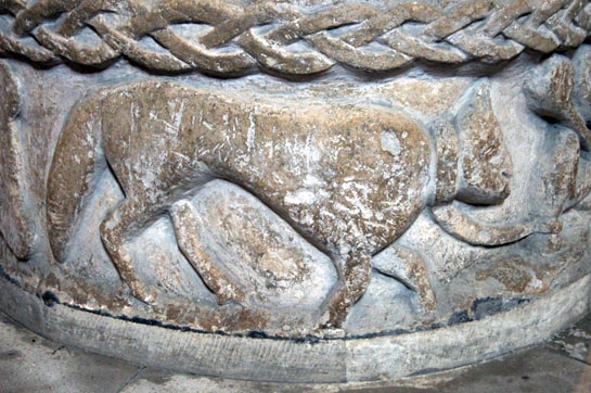
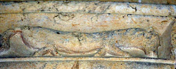
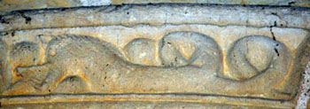
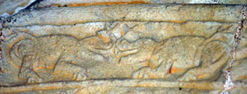
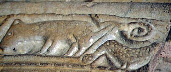
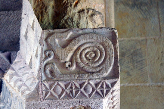
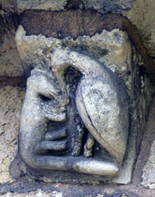
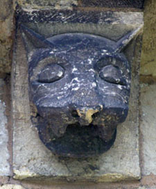
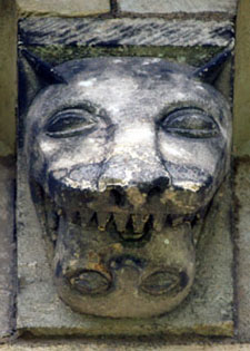
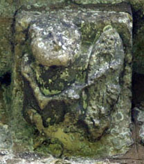
So to the lower course of decoration - and surely the most entertaining. Left: I will explain the man with an axe later. The snake (evil) is coiled and ready to strike. The Church Guide says that the bird to his left symbolises someone whom has been baptised and that the snake is therefore not interested in him. They call the bird a “Perdix” - a type of European partridge - and although I am sure the Church Guide knows what it it is talking about I can find no other reference to this icon. Right: This is thought to be a “Cat of Hell”. He has caught a mouse in his front paws and is dragging it out of its hole to die. The mouse was looking out of his hole and this symbolises the dangers of giving into temptation. Cats are not a common feature in churches (and certainly not on fonts) although many of the animal mask figures are possibly cats, hence the use of the term “cat mask”. |
|||||||||||||
 |
 |
||||||||||||
|
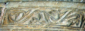
Left and Right: The Church Guide suggests that these two motifs symbolise evil - in the form of another snake - bowing down before a stylised cross and this representing the triumph of good over evil. Is that, however, a “stylised cross”? It seems odd that the carver has introduced such a sophisticated representation of Christianity’s most sacred motif on a font that is otherwise so basic in its representations. It is the only abstract design on the whole font. Why? For an alternative view see the footnote below. |
 |
 |
|||||||||||||||||||||||||||||||||
|
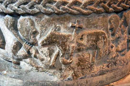
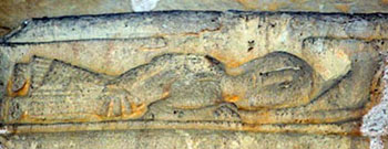
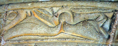
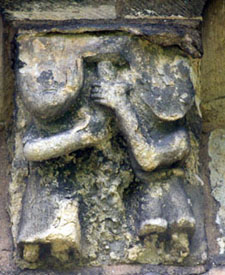
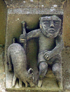
Left and Right: The beast in the left hand picture is tied to the ankle of the club-bearing man in the right hand picture. This suggests the man is tied to his base instincts. The man in turn faces the Agnus Dei - or Lamb of God - bearing his cross. It has to be said that “Calf of God” would be a more accurate description! The Lamn is symbolically situated below the ascension scene. The man with his club is one of two slaughtermen (see below for the other). The lamb thus will be the “Lamb to the Slaughter” perishing for the sins of Man. |
||||||||||||||||||||||||||||||||||
 |
 |
|||||||||||||||||||||||||||||||||
|
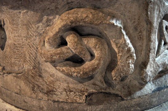
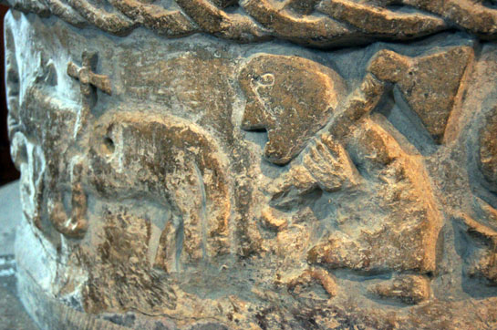
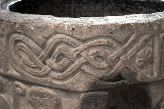
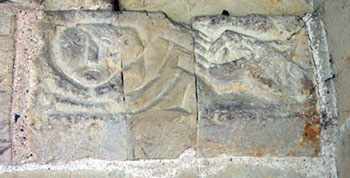
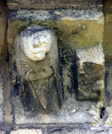
Left: The second slaughterman stands poised with his axe. To his right (see first picture in this sequence) the snake of evil stands ready to strike. Right: The intertwined knot design on the rim. |
||||||||||||||||||||||||||||||||||
 |
 |
|||||||||||||||||||||||||||||||||
|
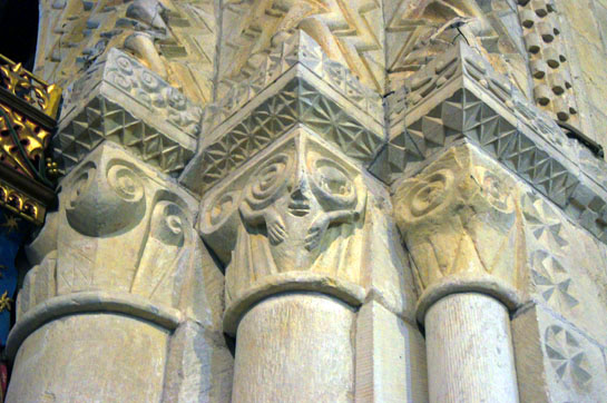
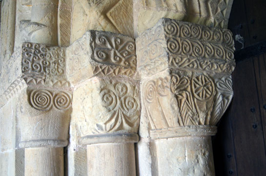
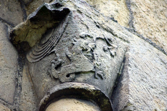
Left and Right: The western and eastern capitals on the south doorway. This is quite an attractive array of designs. |
||||||||||||||||||||||||||||||||||
 |
||||||||||||||||||||||||||||||||||
 |
||||||||||||||||||||||||||||||||||
 |
||||||||||||||||||||||||||||||||||
|
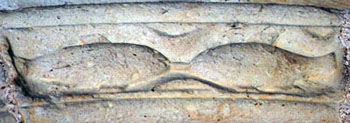
Let’s look at the outer course of decoration on the south door in detail. These pictures are in sequence from the bottom left of the doorway to the bottom right in a clockwise decoration. I am quoting, again, the excellent Church Guide. Left: Thought to be a pig. It doesn’t look much like one! Centre: The loaves and... Right: ...the fishes from the biblical story. The larger loaf is believed to represent the Eucharist. |
||||||||||||||||||||||||||||||||||
 |
 |
|||||||||||||||||||||||||||||||||
 |
||||||||||||||||||||||||||||||||||
|
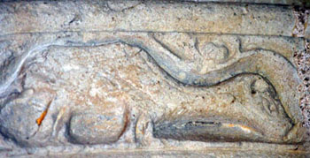
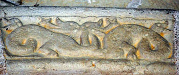
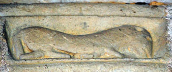
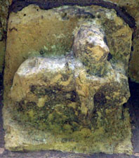
Left: Thought to be a sheep of St Peter’s flock. Centre: Two symmetrical serpents called “Amphisbaena” from the c12 bestiaries. Right: A pair of lions. |
||||||||||||||||||||||||||||||||||
 |
 |
|||||||||||||||||||||||||||||||||
 |
||||||||||||||||||||||||||||||||||
|
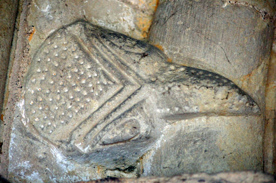
Left: A horse for which the Church Guide can offer no definitive explanation. Centre: This and the eastern impost block are believed to jointly represent the wise and foolish virgins”. This is the wise one, nicely dresses, awaiting bridegrooms. Right: A dragon, again with no biblical reference. |
||||||||||||||||||||||||||||||||||
 |
||||||||||||||||||||||||||||||||||
 |
||||||||||||||||||||||||||||||||||
 |
||||||||||||||||||||||||||||||||||
|
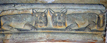
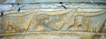
Left: Believed to be partridges complete with spotted eggs. This is a second reference to the partridge (or Perdix) in this church, the other being on the font. The partridge is another bestiary story. They were thought to steal each others’ eggs but the chicks would return to their true mothers when called! Centre: This is my favourite...a pair of jolly looking animals facing each other. Right: It’s partridges again! We have a partridge trying to steal another’s egg. The design is inverted delibarately to show the overturning of the natural order. |
||||||||||||||||||||||||||||||||||
 |
||||||||||||||||||||||||||||||||||
 |
 |
|||||||||||||||||||||||||||||||||
|
Left: A grape vine representing the Blood of Christ of the Eucharist. Centre: A pig followed by...another partridge! Right: The impost block showing the “foolish virgin”. The poor woman is being attacked by a ferocious dog on her right. She wasn’t ready for suitors or for the Second Coming. Her misery is compounded by here being relegated from the door arch! |
||||||||||||||||||||||||||||||||||
 |
 |
|||||||||||||||||||||||||||||||||
 |
 |
|||||||||||||||||||||||||||||||||
|
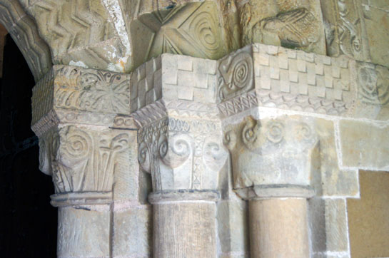
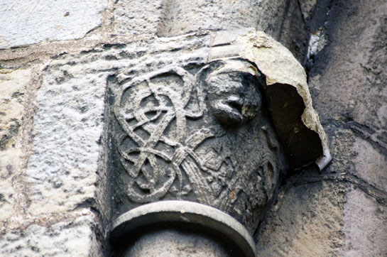
Four views of the south doorway capitals. They appear to be very freelance designs but very neatly executed - in total contrast to the font within! Note what may be a serpent in the lower right hand picture. |
||||||||||||||||||||||||||||||||||
 |
 |
|||||||||||||||||||||||||||||||||
|
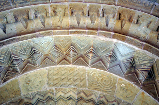
Left: The decorative orders of the south door. This is a beautiful piece of work with embellishments on every surface. Right: This is the leading face of one of the chevrons. |
||||||||||||||||||||||||||||||||||
 |
 |
|||||||||||||||||||||||||||||||||
|
Left: One of the beakheads. Right: Kirkburn is full of little surprises. This is a bird - perhaps a pelican pecking her breast? - on the leading face of one of the chevrons. |
||||||||||||||||||||||||||||||||||
 |
||||||||||||||||||||||||||||||||||
 |
 |
|||||||||||||||||||||||||||||||||
|
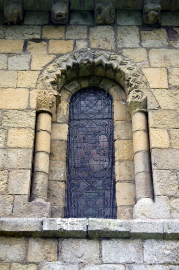
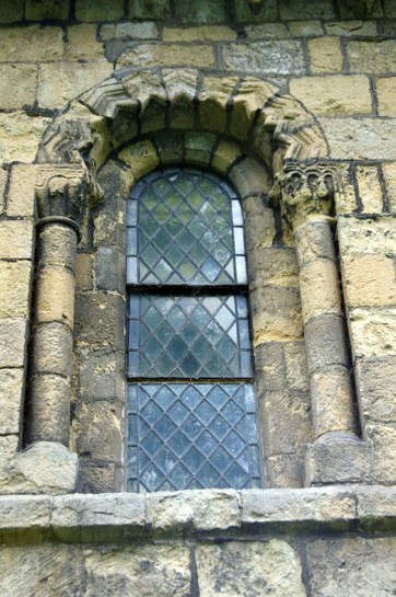
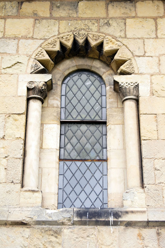
Three views of “Norman” windows. The two on the right with their columns of drum formation and chevron moulding are original. That to the right is Pearson’s neo-Norman - and a fine piece of work it is too. |
||||||||||||||||||||||||||||||||||
 |
||||||||||||||||||||||||||||||||||
 |
||||||||||||||||||||||||||||||||||
|
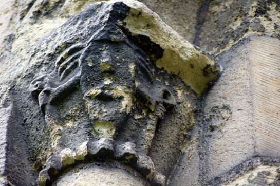
The capitals on the Norman windows are also full of surprises. The prize, though, must go to this exquisite composition of a dragon and lion (left) . This is very fine work. The lion looks like a lion and the dragon is a gloriously rampant specimen. Note the concentric ring design in the rebate. The human face (right) is on the opposite side. It appears to be grasping something - shepherd’s crooks? - in each hand. |
||||||||||||||||||||||||||||||||||
 |
 |
|||||||||||||||||||||||||||||||||
|
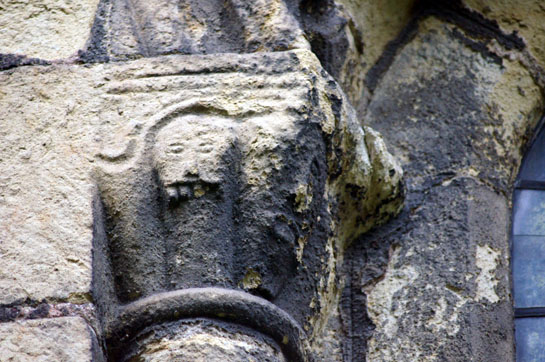
Left: A head entwined with vine stems. Right: This was presumably a trio of human faces although only two are discernible now. These carvings have suffered over the centuries but they are still surprisingly unspoilt. |
 |
 |
|||||||||||||||||||||||||||||||||||||||||||||||||||
 |
||||||||||||||||||||||||||||||||||||||||||||||||||||
|
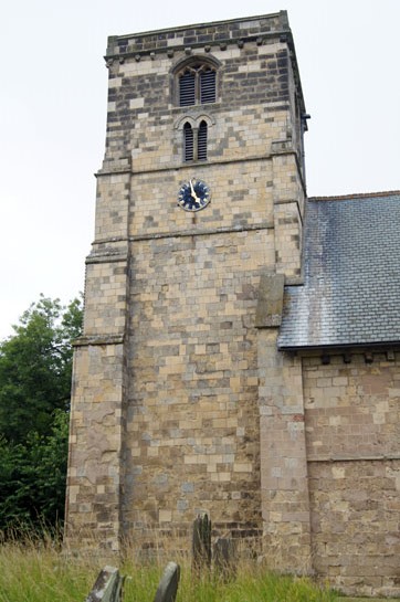
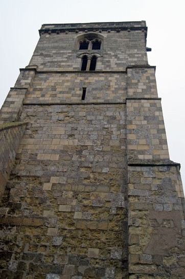
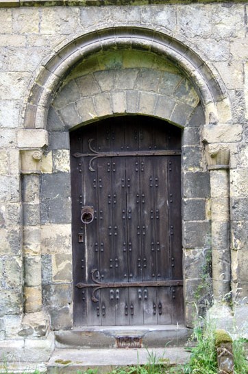
Left: The Norman north door is a plain affair, but what a pleasure to see a north doorway that still has a door within it! Right: The tower from the south. The base is Norman although a little later than the nave. The tower arch within, however, is clearly not Norman (see above). Perhaps it was enlarged when the Early English belfry stage was added in around 1200. Right: The tower from the north. |
||||||||||||||||||||||||||||||||||||||||||||||||||||
 |
||||||||||||||||||||||||||||||||||||||||||||||||||||
 |
 |
 |
||||||||||||||||||||||||||||||||||||||||||||||||||
 |
||||||||||||||||||||||||||||||||||||||||||||||||||||
 |
||||||||||||||||||||||||||||||||||||||||||||||||||||
 |
 |
|||||||||||||||||||||||||||||||||||||||||||||||||||
 |
 |
|||||||||||||||||||||||||||||||||||||||||||||||||||
 |
 |
|||||||||||||||||||||||||||||||||||||||||||||||||||
 |
 |
 |
||||||||||||||||||||||||||||||||||||||||||||||||||
|
Corbels Ancient.... |
||||||||||||||||||||||||||||||||||||||||||||||||||||
|
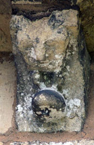
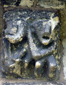
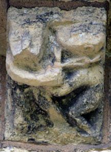
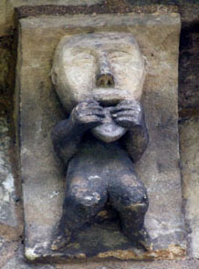
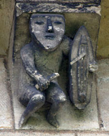
The corbel table at Kirkburn is both large and fascinating. The problem is that Pearson took great pride in replacing some of the badly damaged ones in a style that was true to Norman traditions and even reproducing as far as possible those that were replaced. It is not always blindingly obvious which are old and which are new which is a huge tribute to the man. Anyway, this is a selection of those that I think are indubitably original - and an interesting lot they are too. There are no overt religious symbols. Instead, there is a preponderance of human images with a particular penchant for pairs of people. Because of weathering it is very hard to see what thay are doing but it is a pretty safe bet that there are some cautionary tales. The third row of pictures is particularly interesting. Second left is a very priapic-looking man. In the centre is what looks like might have been a sheelagh-na-gig (a female exhibitionist). On the right is a musician. |
||||||||||||||||||||||||||||||||||||||||||||||||||||
 |
||||||||||||||||||||||||||||||||||||||||||||||||||||
 |
||||||||||||||||||||||||||||||||||||||||||||||||||||
 |
||||||||||||||||||||||||||||||||||||||||||||||||||||
 |
 |
|||||||||||||||||||||||||||||||||||||||||||||||||||
|
...and Corbels Modern |
||||||||||||||||||||||||||||||||||||||||||||||||||||
|
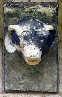
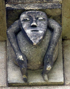
You can tell most of the modern carvings, of course, by their relatively unweathered appearance and the clarity of the carving. Of even greater help to us, however, is the yen for long faces with pointy chins! I have to say I really admire these corbels. They are derivative but show remarkable integrity. Pearson has sought to maintain the tradition and not to ape it. It’s a fine distinction. |
||||||||||||||||||||||||||||||||||||||||||||||||||||
|
This is a big webpage! I have to say I’ve been surprised myself at how much there is to talk about at Kirkburn - and I’m still not sure I’ve done it justice. There are better examples elsewhere of everything Kirkburn has to offer but few churches have so much that is Norman and fine. The south doorway is a beauty and the church is covered in carvings and corbels of real interest. That font is a bit of a scream really, but if you put aside the poverty of the carving is is a font that has an awful lot to tell us about the religious beliefs of the Norman period. There is so much to see at Kirkburn and there are few places where the symbolism is so transparent. That said, I have to pay tribute to the Church Guide that without being sumptuous (or expensive!) is enormously informative and does justice to this fine church. If you are in the are you would be mad not to visit it. And do try to include the homes of those other east Riding Group fonts: Cowlam, North Grimston and Langtoft. They’re all close by and it is a wonderfully rewarding day spent. |
||||||||||||||||||||||||||||||||||||||||||||||||||||
|
Footnote - “Solomon’s Knot |
||||||||||||||||||||||||||||||||||||||||||||||||||||
|
On this font there is what the Church Guide describes as a “cross”. It’s an odd sort of cross because it is formed of two intertwined ellipses which thus form points at the diagonals - that is, if it is a cross at all it is a St Andrews or Saltire cross. This is a quite common device in Norman decoration. But is it really a cross? What I find peculiar about this example on the Kirkburn font is that it is otherwise devoid of abstract symbolism. Why would a cross be represented in this way? Why would it be set in a square frame? Why not a plain cross? The Church Guide is quite definitive about the narrative on the font. It believes that a snake representing evil is bowing before the cross. That sounds perfectly cogent. The design is, however found in many religions and cultures. In the west it is commonly known as “Solomon’s Knot” on account of his reputation for wisdom. I have never seen it, however, described as a cross and, in particular, I have never seen it described as being symbolic of the crucifixion. But there is an alternative explanation for this “cross”. Sometimes it is shown flattened and with the loops closed up so that it looks like some sort of stitch. The work of the late Mary Curtis Webb has proved pretty conclusively that some if not all of the geometric designs had their roots in the Greek view of the Cosmos and that, therefore, the hands of the carvers were guided by educated monks. In her book “Ideas and Images in Twelfth Century Sculpture” she describes this design as “The two intersecting loops of Plato’s World Soul”. So you have to decide whether this image at Kirkburn represents that or the Cross. You might think that the naivety of the font here legislates against the Greek philosophy theory but bear in mind that the font shows no lack of sophistication in its ideas (as opposed to its carving) so the sculptor was probably guided by an educated monk. Mary saw this image at several places in conjunction with others that have philosophical meaning so I am fairly convinced that this interpretation also pertains at Kirkburn but nobody can prove it one way or another. You can download Mary Webb’s work free of charge from here : http://search.ugent.be/meercat/x/view/rug01/001879684. It’s a 200 page document and a weighty read but it might, as it did for myself, give you a brand new insight into early Christian thinking. You can also obtain it in paper or CD format for a nominal charge from Mary’s daughter, Gillian Greenwood at gillyflower123@googlemail.com. Please read also my own notes on Mary Curtis’s work by clicking this link.
|
||||||||||||||||||||||||||||||||||||||||||||||||||||