|
|
||||||||||||||||||||||||||||||||||||||||||||||||||||||||||
|
Please sign my Guestbook and leave feedback |
||||||||||||||||||||||||||||||||||||||||||||||||||||||||||
|
Recent Addition Ratcliffe on Soar(Nottinghamshire) Coventry - Holy Trinity (Warwickshire) Houghton-on-the-Hill (Norfolk) Little Missenden (Buckinghamshire)
|
||||||||||||||||||||||||||||||||||||||||||||||||||||||||||
|
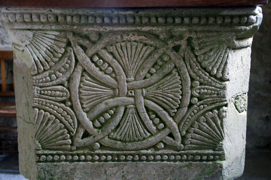
To understand this page properly - that is, to understand why the fonts at these churches are worthy of attention - you need to read my page about the work of the late Mary Curtis Webb. Of course, there is nothing to stop you visiting these churches for other reasons but it would be a shame to ignore the significance of the iconography of the fonts. All of the fonts are Norman and all of them feature the “circle interlaced with arcs” symbol that proven by Mary Webb to represent Plato’s view of the Macrocosm. So what the heck is Plato’s Macrocosm? Well first we need to understand that at this point in history the Greek philosophy that the world was composed of four elements - earth, wind, fire and water - was still unchallenged. Plato in his “Timaeus” said “A suitable shape for a living being that was to contain all living beings would be a figure that contains all possible figures within itself. Therefore He (God) turned it into a rounded spherical shape, with extremes equidistant in all directions from the centre. It was designed to supply its own nourishment from its own decay, and to comprise and cause all processes”. From this and other utterances by Plato a geometric representation of the Cosmos was devised and it is this - the so-called “circle with interlaced arcs” - that we see at this group of Northamptonshire churches. The first known reproduction is in Isidore of Seville’s eighth century “De Natura Rerum” but Mary Webb shows that the design was probably considerably older and, more importantly, that the concepts would have been known to most scholars and theologians in the twelfth century. I have written extensively about Mary Webb’s work on this site and have traced several examples on sculptural art in the rest of Europe. The principal focus of Mary Webb was the extraordinary font at Stone in Buckinghamshire that was originally in the nearby church of Hampstead Norreys. She concluded that the carvings there and at some other locations were influenced by the intellectual wellspring that was Reading Abbey. Mary identified all of the Northamptonshire fonts on this web page with their representations of the Macrocosm and also identified St Peter’s Church in Northamptonshire as having a considerable display of Platonic imagery on the west wall of its tower. Mary Webb, perhaps through lack of time, did not write specifically about this cluster of Northamptonshire churches. St Peter’s also has one of the most complete and spectacular displays of sculpted Norman arcade capitals in England. Interestingly, the Churches Conservation Trust that now cares for St Peter’s proposes that Reading Abbey was responsible for all the sculpture, doubtless drawing upon the similarities between the carved capitals at St Peter’s and those few that survive from the demolished Reading Abbey. The CCT, however, does not acknowledge or does not understand the significance of the carving on the west wall of their church, as opposed to the capitals. The fonts at the four churches described on this page surely were influenced not by distant Reading Abbey but by Northampton Abbey that was built some decades before Reading and which was, like Reading, a Cluniac house. My own view is that Northampton Abbey was the intellectual wellspring for sculpture not only for St Peter’s Northampton and these four village churches but also at Reading Abbey itself. I believe the CCT has got it the wrong way round! Mary Webb was doubtless right in her surmise that Reading Abbey was responsible for the font carvings at Stone, but I believe it was in turn influenced by Northampton Abbey. All of this is supposition and speculation. What cannot be gainsaid, however, is that the churches at these tiny, seemingly inconsequential villages, have Norman fonts that together represent a highly significant corpus of sculpture with a place in the history of theological development in this country. There is a similar cluster in North Norfolk (I am not suggesting that Northampton Abbey was responsible for these) and although the high quality of their sculpture and the likelihood of their being carved by a “school” of stonemasons is generally acknowledged, the significance of their iconography is, again, overlooked. So, this page is about the four representations of the Cosmos on Northamptonshire village church fonts. Manifestly, no two were carved by the same mason. We must see the cluster (as in Norfolk) as emanating from some local intellectual tradition, rather than from an artistic one. Just how many such fonts existed orignially and have since been destrotyed we can never know. Update June 2023. One of the joys of church crawling is the occasional serendipitous discovery. Over the years I have found a fair few examples of neo-Platonic symbolism that Mary Webb did not know about. I recently visited Carlton Church in Bedfordshire. The Norman font there is fairly well-known. It is dominated by cat mask/green man imagery that makes this font charmingly unique. Nobody, however, mentions the side rammed up close to the south wall. Although a good half of the design has disappeared what is left is enough for us to see it was unmistakably a circle interlaced with arcs! It isn’t in Northamptonshire as all of these other examples are, but it is only thirteen miles from Mears Ashby and so I think we must treat it as part of the same intellectual “school” or tradition as the other four examples. So I am including it here. Please see also these other pages on this website: North West Norfolk “School” of Fonts The Research of Mary Curtis Webb |
|
Braybrooke: All Saints |
||||
 |
 |
|||
|
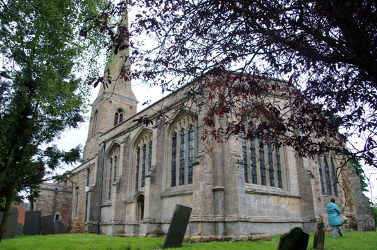
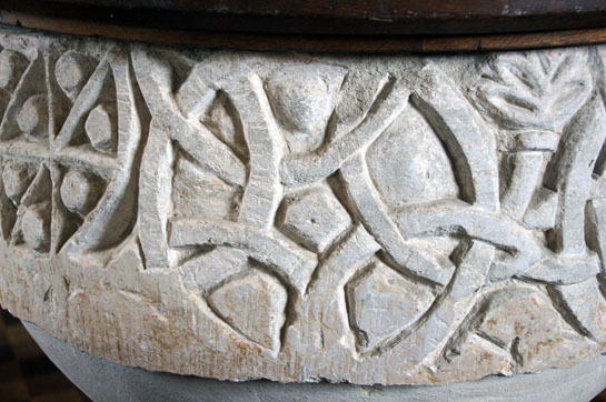
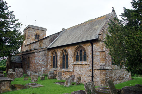
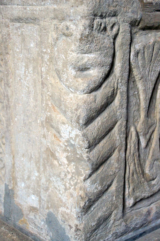
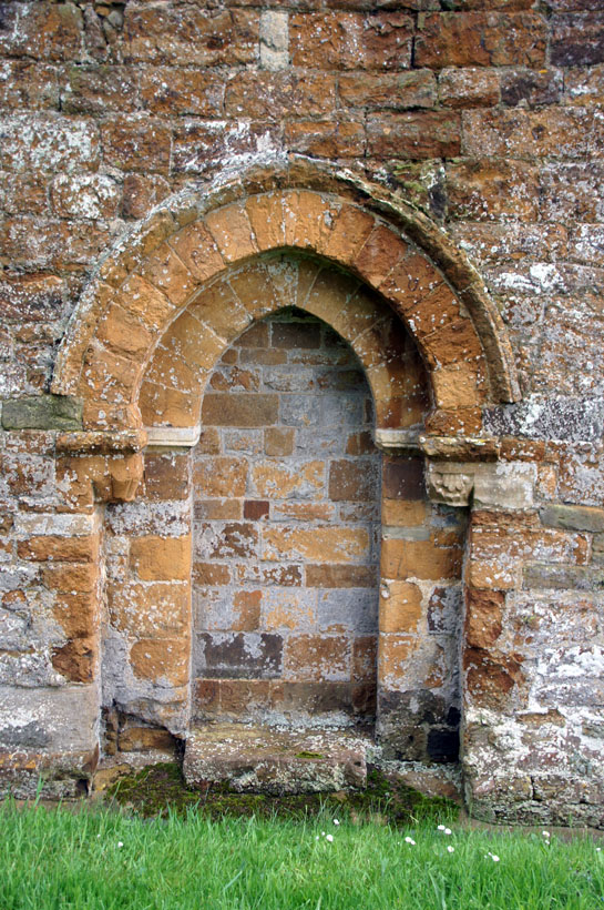
Braybrooke Church, just outside Market Harborough, is a quintessential English country church. It took about three hundred years for today’s structure to evolve but to all intents and purposes it is a Perpendicular church. Its south chapel is described by Pevsner, with characteristic understatement, as “ambitious”. Its grey dressed stone is in harsh contrast to the mellow orange ironstone of the nave and chancel. It is a triumph of mediaeval pride over good taste. This is not a church likely to long detain the casual visitor. Its font, however, is another matter. This webpage is about those Northamptonshire fonts mentioned by Mary Curtis Webb in her book. Of these fonts, however, Braybrooke’s is perhaps the only one of a quality that would make us sit up even if there was no such association. In the picture above right is the circle with interlaced arcs motif. It is perhaps the best example of its kind in England. It is finely executed and it is hardly surprising, therefore, that this is, as Mary Webb has proved, far from being just some fancy of the sculptor. Pevsner describes them as “rosettes”! |
 |
|||
 |
|||
|
|
||||||||||||||||

|
Thornby: St Helen |
||||
 |
||||
 |
||||
|
Both internally and externally, Thornby Church is an unassuming place. Pevsner dismisses of as “of little architectural interest” and it would be hard to disagree. It’s the usual hotchpotch of Gothic and Tudor styles with a c14 tower and some Victorian rebuilding. It’s a pleasant enough little church, though, both inside and out and there is something about that warm Northamptonshire ironstone (above left) that warms the heart. The use of contrasting stones in the north arcade of 1870 (above right) is a pleasant decorative device. The Norman font is pleasant enough but without Mary Webb’s insights it would be one strictly for the Norman font “trainspotters” rather than being worth a detour. Pevsner has nothing interesting to say about it. Yet it has, indisputably and uniquely, not one “circle with interlaced arcs” motifv but two. The rest of the decoration is also geometric. It is rather crude and muddled - a far cry from Braybrooke’s fine work - yet the carver took the trouble to represent Plato’s view of the Cosmos and must surely have been doing so under instruction from a clergyman or monk with a much wider education than his own. |
 |
||||||||||||
 |
||||||||||||
|
The font seems to have incurred some damage with both the top and the bottom of the circular bowl appearing to have sustained some loss. If you focus on the floral device to the top left of the left picture and then look to the picture on the right you will see that the two interlaced arcs designs are actually contiguous and, what is more, one of the arcs from each font is interlinked with the other. This might explain something that has been perplexing me: each of the circles has not four interlaced arcs but five. Since the four arcs are supposed to represent the four elements - earth, wind, fire and water how can this be? We could speculate that the use of the design here was indeed purely decorative - that the carver had no idea of its philosophical significance. That seems unlikely when other decorations on this font are so anodyne. Why stretch his limited talent in this way? Perhaps he misunderstood his brief? More likely in my view is that the fifth arc on each circle is there purely because he wanted to link the two. That link might be simply a freelance decorative frippery or it could be that his instructor had some obscure symbolism of his own in mind that required two linked cosmic designs. Well we can’t know the answer but Thornby does represent something of a mystery. |
||||||||||||
 |
||||||||||||
 |
||||||||||||
|
Left: This side of the font shows the strongest signs of damage. Here too we see the poverty of the carver’s techniques most exposed. Right: The final part of the font shows little improvement! |
||||||||||||
|
Aston-le-Walls: St Leonard |
||||||||||||
 |
||||||||||||
 |
||||||||||||
|
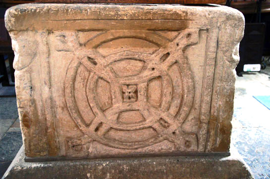
Like the other churches on this page, Aston-le-Walls Church has not attracted much attention from the historians. Leaving aside the Norman fonts, Aston Church has the clearest signs of Norman architecture. The lowest part of its tower with round-headed arches and deeply-splayed windows is clearly of this period. The blocked north door has a pointed arch but its capitals tell us that it is probably Transitional, possibly Early English. So it has an ancient core but c19 restoration has left little of interest. The font, like that at Braybrooke, is square in plan and, like that at Thornby, poorly executed. The circle interlaced with arcs motif (I really must find a shorter name for it!) is shown above right. What distinguishes this font from Braybrooke’s - apart from its poor quality - is that each corner has a carved face. Amongst others, most of the North Norfolk School of Norman fonts have this feature. Bob Trubshaw very plausibly ascribes such designs as representing the four rivers of paradise. |
||||||||||||
 |
 |
|||||||||||
|
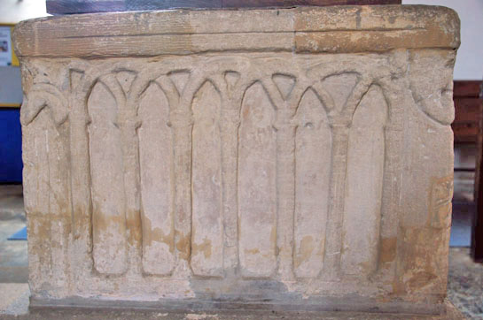
Left: One side of the font shows a Tree of Life motif. Right: The last refuge of the Norman font carver who was fresh out of ideas was, it seems, a length of “blind arcading” that became such a fashionable device throughout the late Norman and Early English periods. The problem was that our carver, like so many of his contemporaries, found that the draughtsmanship required rather outstripped his abilities! Some of the lengths of blind arcading adorning the outsides of churches especially in the Early English period were exquisitely executed. Take a look, for example at the west end of Felmersham Church in Bedfordshire. Some Norman fonts are amongst the finest artistic work of the Mediaeval period but it is clear that font carving was sometimes delegated to the odd job man! |
||||||||||||
 |
 |
|||||||||||
|
Left: Like the man who carved the Thornby font, our carver decided to use a kind of saltire cross design to pad out his design. Oddly, though, he seems to have been determined to keep it as a 6x6 square rather than using all of the rectangular space available to him, thus leaving an awkward blank space. Given the significance of the interlaced arcs did his patron (surely an educated monk?) intend this panel also to have symbolic significance? It’s hard to believe that the carver would choose otherwise to leave empty space that he could so easily have filled. Note also the heads at each corner of the font. Right: The view to the east of the church. |
 |
|||||||||||||||||||||
 |
 |
||||||||||||||||||||
|
Left: One of the corner heads. Note the zig-zag pattern below. Centre: The north door with its pointed arch but Romanesque-type proportions is probably Transitional. Right: The tower is part of the original Norman structure. |
|||||||||||||||||||||
|
Mears Ashby, All Saints |
|||||||||||||||||||||
 |
 |
||||||||||||||||||||
|
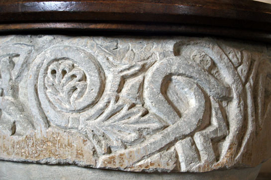
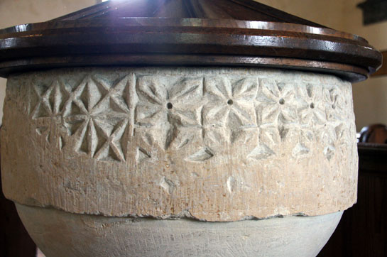
I took me three attempts to gain entry to Mears Ashby which is the reason it appears at the end of this page. That, however, gives me more space to describe this church which another treasure besides its font: a really lurid fragment of a doom painting. It is altogether the most interesting of these four churches. Its font is unique amongst this group - and indeed amongst all the fonts in England bearing Platonic iconography - in being octagonal. This might suggest to us that it is the most recent of the four fonts here. The quality of its carving vies with that at Braybrooke but its extra panels gives provided a larger canvas for the sculptors to exploit. Like Braybrooke it also has strong elements of Scandinavian style interlace work. At this point it is useful to remind ourselves that Northampton and these four churches were within the Danelaw region and some elements of Scandinavian decorative tradition clearly remained after the Conquest. The church has a fragment of an Anglo-Saxon wheel cross dated to AD1000 so Christianity clearly had a toehold at Mears Ashby from very early days. As with the other churches in this group and most of those elsewhere, the circle-interlaced-with- arcs motif (above right) is the only overt element of Platonic symbolism. This is by some distance the most prolific design not only in England but in the rest of Europe. We must add the caveat that the other panels here may also have had significance within the field of Greek philosophy but if so we have no evidence of it. |
|||||||||||||||||||||
 |
 |
||||||||||||||||||||
 |
|||||||||||||||||||||
 |
|||||||||||||||||||||
 |
|||||||||||||||||||||
 |
|||||||||||||||||||||
|
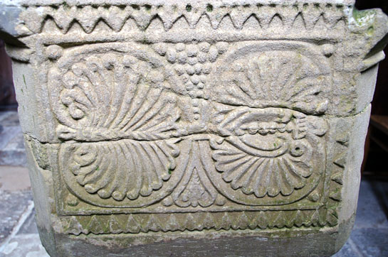
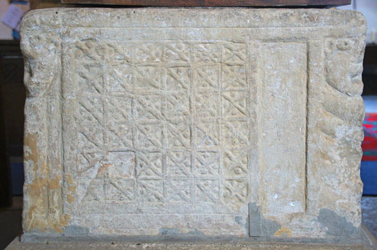
The other panels bar one - which is blank - have a variety of finely-executed geometric designs. All of them are circular motifs with margins of interlaced decoration to left and right. It is well-nigh impossible to know which of these - if any - have iconographic significance and which are freelance decorations. It is important to note that masons might well have -knowingly or not - “re-interpreted”” the instructions they were given. Nevertheless, the most likely explanation here is that the mason produced his Platonic motif as instructed and then created several more freelance designs in similar style. The eight-pointed star, however, in the picture above right does have Christian significance. In fact, let’s be honest, innumerable numbers (!) seem to have Christian significance. Elvis Presley (without a hint of irony) even managed to make his song “Deck of Cards” out of the concept! “One God”, “Holy Trinity”, “Four Apostles”, “Six days creating the world, “Resting on the seventh day” and so on. And I don’t even remember the record! Similarly, if you Google the significance of “eight” you get a bewildering range of explanations. Anyway, eight is often seen as a symbol of regeneration, hence - so it is said - octagonal fonts and, in this case, an eight-pointed star. You might, of course, feel that an octagonal font was a natural geometric and artistic development and I, of course, couldn’t possibly comment. This star, however, is no ordinary one, composed as it is from overlapping squares with slightly curved sides (yes, I know that’s nonsense but look at the picture). So is it an eight pointed star? Or is it a representation of the “square on square” symbol representing the Platonic “perfection of number” such as is seen at Stone and Sculthorpe? It’s tantalising. Regeneration or “perfection of number”? Juxtaposed with the circle interlaced with arcs my money is on the latter - but we can never know. |
 |
 |
|
Left: The church looking east. with the doom painting above the chancel arch. The original church was nave and chancel only. Most of the rest of the church was thirteenth and fourteenth century. There is a nice symmetry to the aisle arcades. Right: Looking towards the west I spy an early English lancet window in the tower supporting the supposed date of the structure of about 1220. I am slightly perplexed that no literature about the church discusses the tower arch which seems to have been remodelled at some point. The outer course of stonework looks like it belonged to an altogether different arch. |
|
|
||||||||||||||||||||||||||||||||||||||||||||||||||||||||||||||||||


|
Left: The Christ figure in his traditional place of centre stage is a curious and rather portly figure here. Both hands raised, you could imagine Him saying “what the hell (!) is all this chaos going on around me?” His legs and feet are visible under a quite voluminous kirtle. He reminds me of nothing as much as Roman emperor! An angel blows lustily into a trumpet to his left. Various figures are visible beneath his feet. Right: Blackadder during his brief incumbency as Archbishop of Canterbury said something along the lines of: “Heaven is for people who like to do good things: sitting on clouds, watering pot plants, talking to God”. Well what little we can see of the virtuous slightly bears that out. The saved seem to be inhabiting the City of God. of course it was much the better place to be - but they aren’t having much fun, are they? Actually one rather suspects that not having much fun was what got them there in the first place! |
 |
|||||
 |
 |
||||
|
Left: The tower is from around 1220 and you can see here on the south side the nice little triple bell opening in characteristic Early English style. Note also the doorway, also in EE style, and compare it with the two other doorways pictured right. Centre: The south door (and the priest’s door) are the only structural evidence of the church’s Norman origins. It is strikingly plain with only two almost-disappeared label stops as decoration. Right: The priest’s door on the south side of the chancel is an obvious stylistic clone of the main south doorway. |
 |
|||
 |
|||
|
Left: The top of a wheel-headed cross - unusual so far south - sits on a ledge in the church. Right: The top stage of the tower on the south side has this little mystery. A rose - the Church |Guide styles it as a “Tudor” rose sits below the parapet. Is it a Tudor rose? Well not if it is contemporary with the rest of the tower. I very much doubt that it is and my suspicion is that it was put here when the battlementing was added to the top of the tower probably late in the fifteenth century when the clerestory was raised. With the Battle of Bosworth ushering in Henry VII as the first Tudor monarch that would fit very nicely: a judicious show of loyalty to the victorious regime. |
|
Carlton (Bedfordshire), St Mary |
|
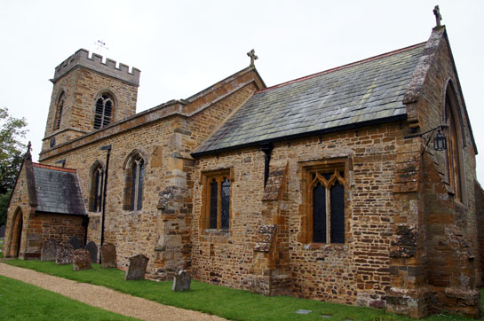
Carlton’s website claims the oldest parts here are as early as AD950. This is based upon the evidence of some herringbone masonry on the north side of the chancel and deeply splayed tower windows at ground floor level. The problem is that herringbone also spanned the early days of the Norman period. And the website then contradicts itself by saying the tower was added in 1100. And that looks wrong too because the windows are surely thirteenth century Early English lancets. The Taylors who wrote about every pre-Conquest church in England didn’t include it and Pevsner did not see Anglo-Saxon here either. The most authoritative description I have seen is in the History of the County of Bedford Vol 3 (1912) and it also saw nothing earlier than the twelfth century. There is what looks like a blocked Norman window on the north side of the chancel and, of course, we have the Norman font that is the whole point of this little piece. Really the distinction between late Anglo-Saxon and early Norman is too fine to bother most of us, although churches do love the idea that their buildings date from before the Conquest. The notion seems to have taken hold her because I have seen that AD950 date mentioned in a few places on the web. Besides the font, the gargoyles on the west tower are rather entertaining, including a particularly unsubtle male exhibitionist! There is also a lovely modern stained glass window. |
 |
 |
||||||
|
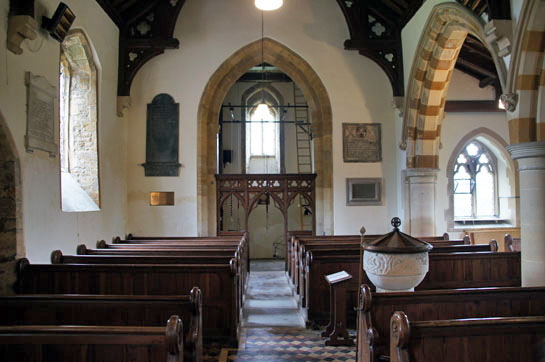
Left: The church from the south. The south aisle and clerestory are fifteenth century. Right: The interior looking east, The screen, which lacks all trace of its coving, is fifteenth century. |
|||||||
 |
 |
 |
|||||
|
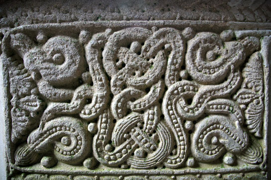
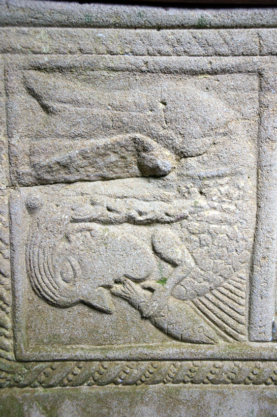
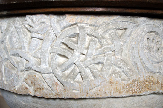
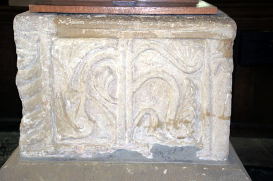
Left: The north chancel wall. The herringbone masonry courses to the left of the doorway and arched window are what give rise to the putative Anglo-Saxon dating. To the right of the rectangular window you can discern the outline of a filled-in round headed window. This looks much too neat to be as early as AD950 . It is surely Norman. Centre: The font. Two green men-like faces are in evidence. They are divided by the tendrils emanating from their mouths and forming rather inventive fleurs de lys-like motifs. Right: Almost hidden against the south wall is the damaged circle interlaced by arcs which led to a great deal of shifting of stacked chairs by this excited writer. Of the examples on this page this is perhaps the most obviously Norman-looking with the pellet pattern on the circle itself. This emulates the font at Stone (and formerly of Hampstead Norries) in Buckinghamshire which piqued Mary Webb’s interest in the first place and where - uniquely - the full range of the neo-Platonic symbolism can be seen. It is a nice study of how the arcs are always entwined around the circle and not just lying underneath or below it. “Interlaced” is definitely the right word. Similarly, you can see that the inner design produces a square, the sides also interlaced. These are not accidental decorative designs: they have ancient philosophical significance and the masons had to get it right even if they hadn’t a clue what that meaning actually was. Just like countless generations of parishioners who gazed uncomprehendingly on it! |
 |
 |
|||||||||||||||||||||
|
Left: To the right of the circle and arcs is this small section of blind arcading. Right: Another section of tendril and another green man. |
||||||||||||||||||||||
 |
 |
 |
||||||||||||||||||||
|
Left: A lovely modern window in the south aisle. Centre: The central panel depicts building at the church. Right: A lancet window at the base of the tower. |
||||||||||||||||||||||
 |
 |
|||||||||||||||||||||
|
Left: The exhibitionist gargoyle. Is it me or is he a bit under-endowed? Right: A quite unusual gargoyle in the form of some sort of winged beast with a moustache! |
||||||||||||||||||||||
a") |
a") |
|||||||||||||||||||||
|
Left: You might well think this is a copy of the picture above right. But you would be wrong. Look closely, you myopic muppets! This one is at Sharnbrook Church (right) only four miles away. I visited both churches on the same day and this was another piece of serendipity. It is incontrovertibly by the same mason. Masons didn’t just turn up for a spot of gargoyle carving. The guy must have been part of a team of masons doing work in the area. They probably built the top stages of the towers at both of these churches. If you want to know more about this sort of thing then visit my pages about an East Midlands group of stonemasons - the Mooning Men Group. You know you want to. For my part, I shall be trying to trace this man and his tools at other churches. Another quest! |
||||||||||||||||||||||
|
This is a .pdf file of this page that you can save to your computer and/or print. |
||||||||||||||||||||||
|
|
||||||||||||||||||||||