|
Alphabetical List |
|
|
|
|
|
|
|
County List and Topics |
|
|
|
Please sign my Guestbook and leave feedback |
|
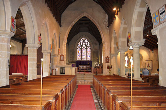
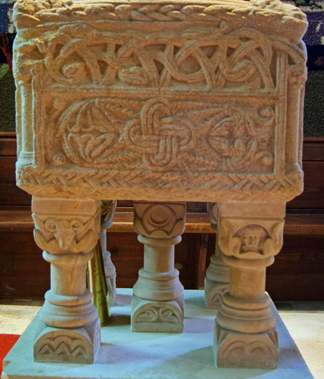
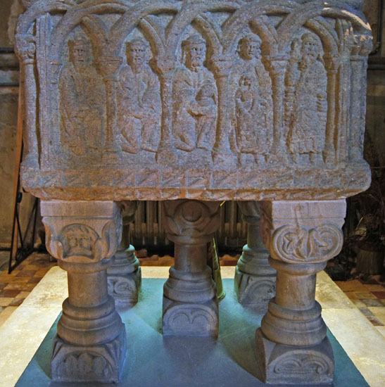
This is an unusual page for me. It covers four exceptionally fine Norman fonts all found within about 10 miles of Hunstanton. They are generally reckoned to have been carved by the same mason, probably between 1160-1180. In many ways they are quite different in character but there are similarities in design and, in particular, in the style of the carving itself that makes the argument for a single master very persuasive. There is a precision in the draughtsmanship that is very unusual for Norman fonts and one has perhaps to look at the “Herefordshire” School (see, for example, Eardisley, Herefordshire) to see font carving as impressive. I quote from “Fonts and Font Covers” (Francis Bond, 1908): “Of all the Norman fonts the finest in design is the group of North West Norfolk...the work of a great, unknown, original genius... a group of fonts unsurpassed in Europe.” They are found at South Wootton, Shernborne, Sculthorpe and Toftrees. As we will see, however, South Wootton was almost certainly carved by a different man. These Norfolk fonts are quite different from those of the Herefordshire School; not least they are all square in plan whereas the Herefordshire ones are circular. Their Norfolk motifs are mainly but not exclusively geometric and are quite different on each of the four panels. We shall see that they are rich in subtle ancient symbolism. Each has a “monster” head at each side or corner. This is far from being a unique feature of these fonts, but it certainly marks them out in this area as being of a group. The Herefordshire fonts, on the other hand, have bold pictorial designs that tell a coherent “story” around the whole font. Each of the Norfolk fonts is mounted on a set of carved legs. This part of Norfolk is particularly rich in Norman fonts, and there are many others even within close proximity to these four that have nothing in common with them. Some observers suggest that the font of Castle Rising also belongs to this group and it is only two miles from South Wootton. For the benefit of readers I have included it below. What is now clear, however, is that whereas Shernborne, Sculthorpe and Toftrees are a quite discrete group carved by the same man, those at Castle Rising and South Wootton are by a different man or, more likely, by two different men. A “school” of architecture is hard to define. Whether you feel that in fact this particular one contains three or five fonts is up to you - but it is convenient to think of them as such. Each is housed within a church that does not have enough else of interest to justify its own webpage on this site when I have so many more with much better claims. However, I think that to show these fonts side by side on a single page is perhaps more illuminating than in splitting them over four different pages. |
|
|
||||||||||||||||
 |
 |
 |
|||
|
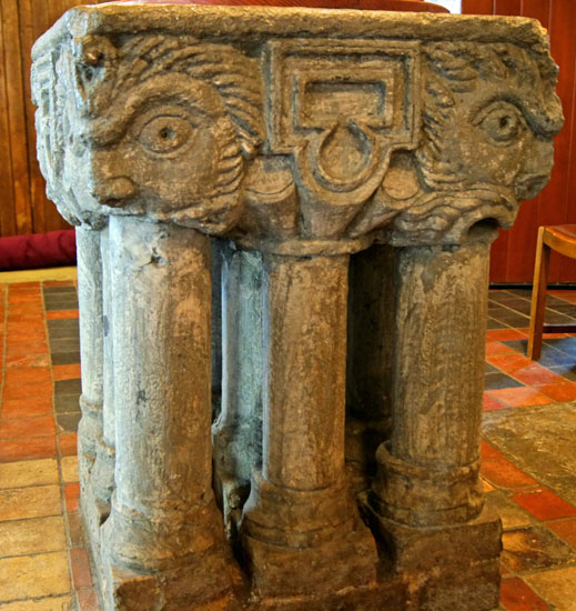
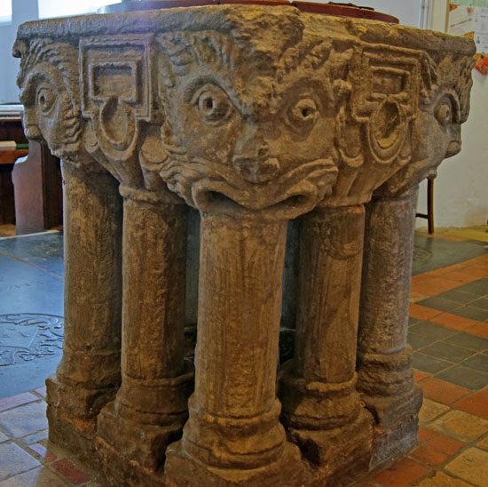
Like the rest of the North Norfolk Fonts, this one has a monster head at each corner. South Wootton differs from the rest, though, in that the heads comprise almost the whole font. On each face the heads are separated by the same geometric motif. It is remarkable also for resting on no fewer than nine columns. |
|
Shernborne: St Peter & St Paul |
|
|
||||||||||||||||||
 |
|||||
 |
 |
||||
 |
 |
||
|
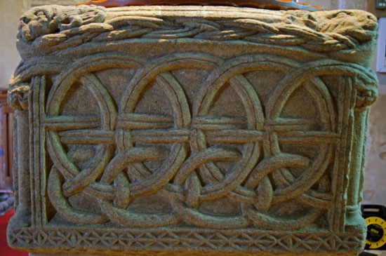
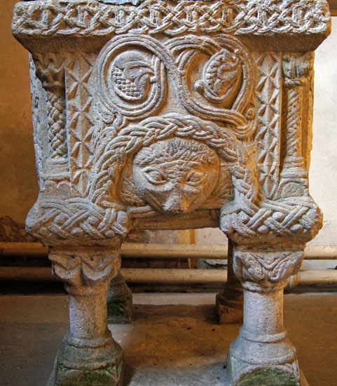
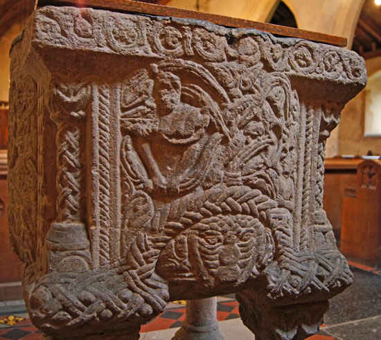
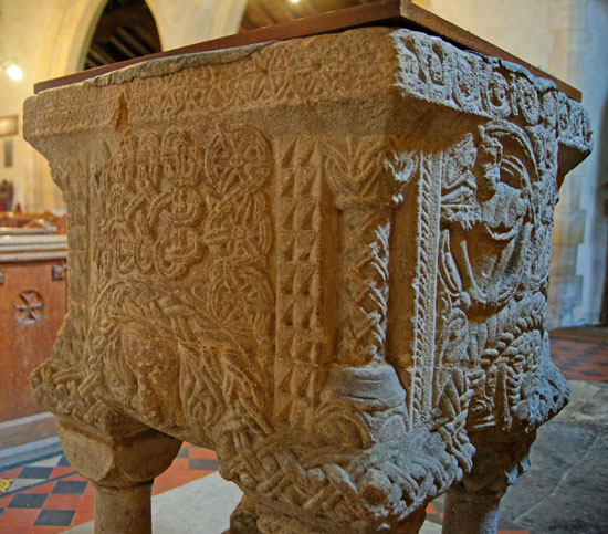
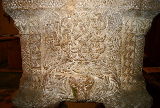
Leaving aside the research of Mary Curtis Webb a simple visual comparison between Shernborne’s font and that at South Wootton would cast doubts on Francis Bond’s assumption that they were carved by the same man. The difference in sophistication is very marked. The large heads and rather lame geometric design at South Wootton are replaced here by a much smaller lion mask at the bottom of each side and a wealth of very sophisticated Norman decorations, all displaying lovely draughtsmanship. The knotted cable design at each of the four corners above the legs is particularly lovely. Each side has a separate geometric design around its lip. At each corner are nice little pillar carvings. On one side (top left) a man seems to be struggling to free himself from the tendrils of evil. The four legs have all been repaired and restored. |
|
Sculthorpe: St Mary and All Saints |
|
|
|||||||||||||||
 |
 |
 |
|||
 |
|||||||||
 |
|||||||||
 |
|||||||||
 |
|||||||||
 |
|||||||||
|
|
|
|
||||||||||||||||||||||||||||
|
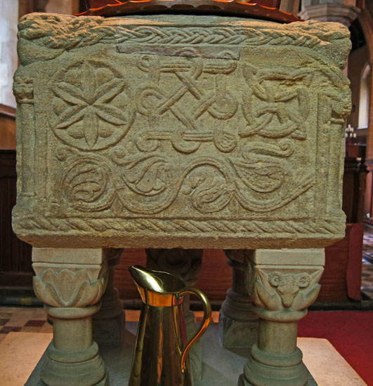
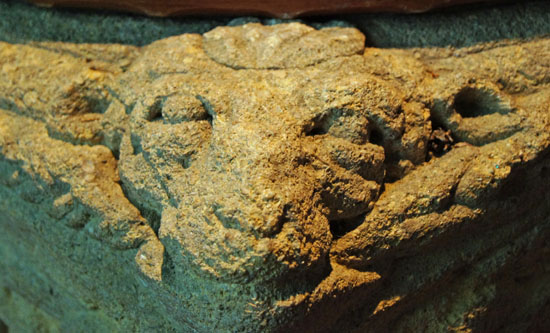
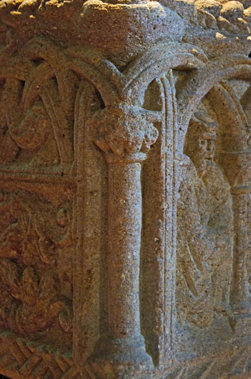
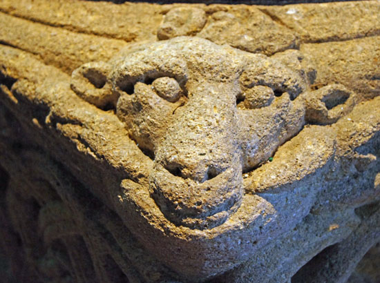
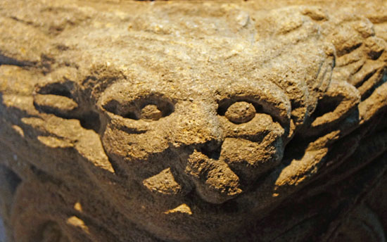
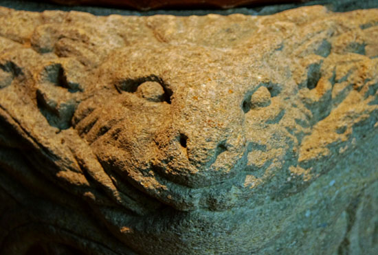
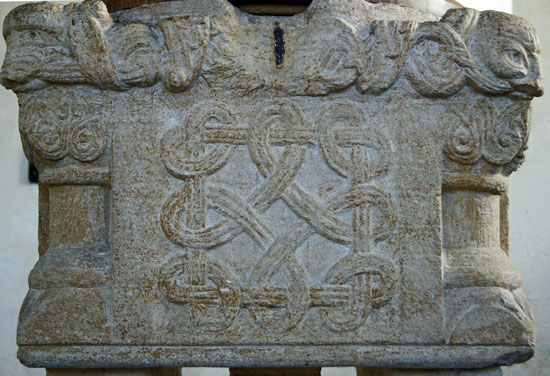
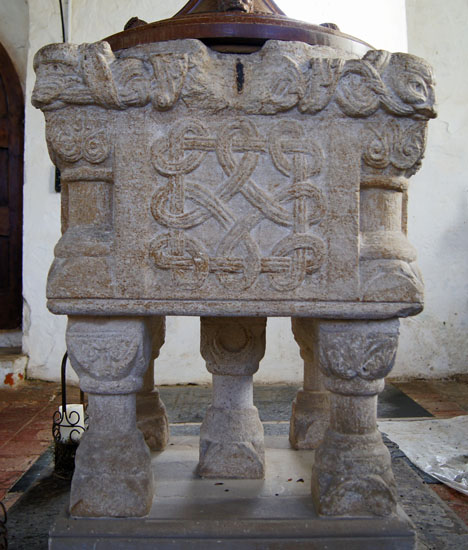
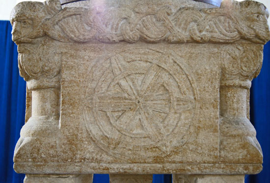
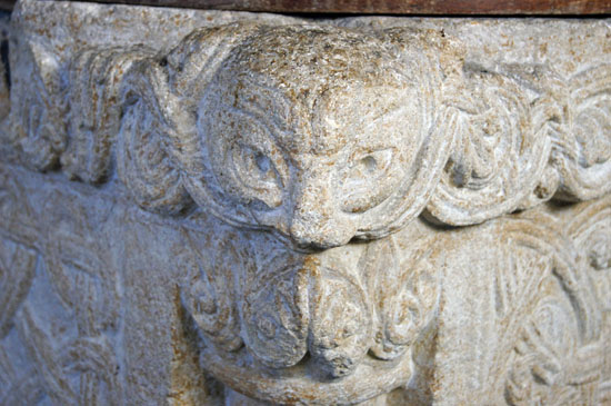
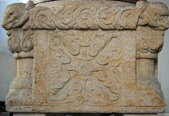
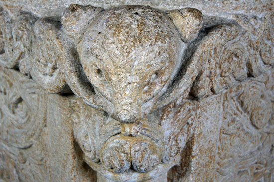
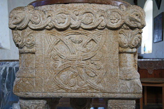
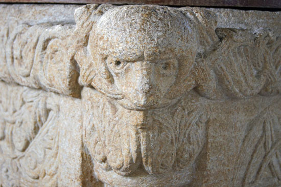
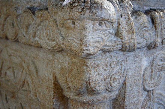
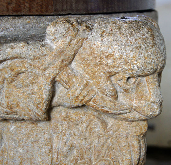
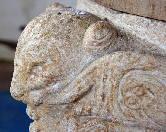
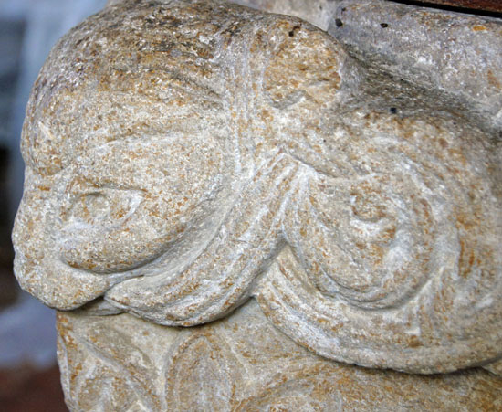
I’ve said that Shernborne, by common consent, is the most impressive perhaps representing the sculptor at the height of his powers. I like Toftrees better, however. True, the side panels are less elaborate. What Toftrees has, however, are the most magnificent beast carvings at the corners. They are in an entirely different league to the rather crude ones at Sculthorpe and the fantastical ones at South Wootton - and Shernborne has none. In these Toftree beasts I think we see the carver - if indeed we are talking here of one man - at his best. If the side panels are less elaborate than those at Sculthorpe and Shernborne, I would argue that the restraint shown at Toftrees is the more artistic leading to a more satisfying piece of work overall. Well it’s all subjective, of course, but Toftrees gets my vote. Humble Toftrees might be, but how many churches can boast such a treasure? Each of the sides of the font has a geometric design of various degrees of complexity. The interlaced design (left) is similar to one at Shernborne. The characteristic complex designs around the rim are there, and as with the other fonts it is different on each side. As with Sculthorpe and Shernborne, there are mini-columns sculpted at each corner. There is the customary beast head at each corner, and in my view these are the finest carvings on any of this North West Norfolk group of fonts. |
 |
||||||||||||||||||||||||||||||||||||||||
 |
||||||||||||||||||||||||||||||||||||||||
 |
||||||||||||||||||||||||||||||||||||||||
 |
||||||||||||||||||||||||||||||||||||||||
 |
||||||||||||||||||||||||||||||||||||||||
 |
||||||||||||||||||||||||||||||||||||||||
 |
||||||||||||||||||||||||||||||||||||||||
 |
||||||||||||||||||||||||||||||||||||||||
 |
||||||||||||||||||||||||||||||||||||||||
 |
||||||||||||||||||||||||||||||||||||||||
 |
||||||||||||||||||||||||||||||||||||||||
 |
||||||||||||||||||||||||||||||||||||||||
 |
||||||||||||||||||||||||||||||||||||||||
|
Each of the corner figures has long tendrils of what looks like foliage emanating from the mouth. These are continued around the rim of the font to create a lovely artistic effect.There is nothing fantastical about these figures. Two of them - lower left and upper right - seem to be sheep. The one upper right actually has fingers which are gripping the tendrils, so perhaps they are not sheep after all! Or, more likely, symbolical needs have been deemed more important that anatomical ones! The other two figures also appear to be of the same type, although one has ears or buds of horns where the other does not. These are glorious pieces of art 850 years old and still in perfect condition. The brown veins within the grey stones serves to add to the striking appearance of this font. |
||||||||||||||||||||||||||||||||||||||||
|
Castle Rising: St Lawrence |
||||||||||||||||||||||||||||||||||||||||
 |
||||||||||||||||||||||||||||||||||||||||
 |
||||||||||||||||||||||||||||||||||||||||
|
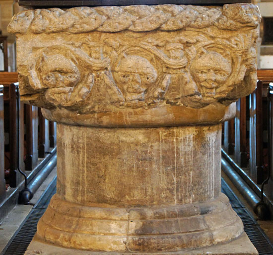
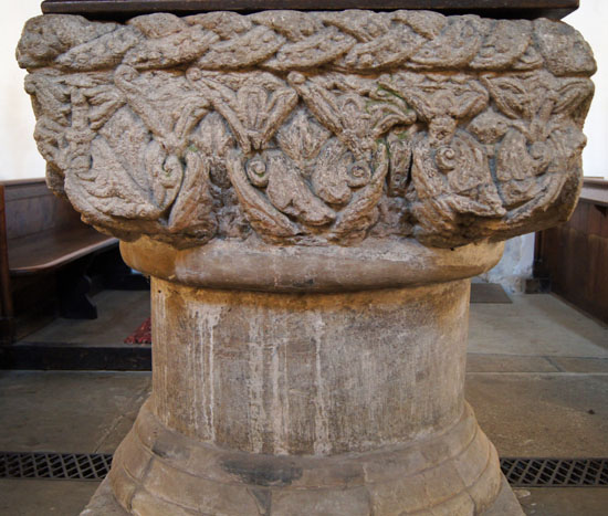
Here are the surviving faces of the damaged font at Castle Rising. The panel on the left has cat faces that are not seen on any of the other North West Norfolk fonts. The panel on the right is a little more so, but we must always bear in mind that there are few motifs that are common to any of these fonts. The interlacing design at the rim is surely significant as are the animal heads at the corners which are reminiscent of those at Sculthorpe. Note, however, that this font is not mounted on legs - but this begs the question as to whether these were lost when the rest of the font was damaged. Certainly, the cable mouldings (below) are identical, whereas on the other fonts no two are the same. |
||||||||||||||||||||||||||||||||||||||||
 |
||||||||||||||||||||||||||||||||||||||||
 |
||||||||||||||||||||||||||||||||||||||||
 |
||||||||||||||||||||||||||||||||||||||||
|
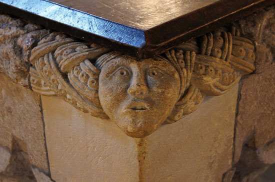
Above we can see a human figure at one corner. This corner piece is obviously re-cut. What we can’t know is when this occurred. Is the human figure are total re-invention or is it what was here originally? |
||||||||||||||||||||||||||||||||||||||||
|
Footnote - Access to these Churches |
||||||||||||||||||||||||||||||||||||||||
|
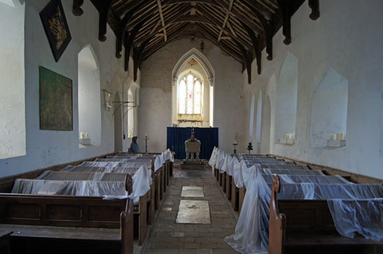
If you would like to visit these churches you need to be aware of limited access to some of them. The status at the time of writing (March 2012) seems to be as follows: South Wootton, Shernborne and Castle Rising : Open at all reasonable times Sculthorpe : Kept locked. Contact one of the two churchwardens who will arrange for you to collect a key on the day. Toftrees: Kept locked. We contacted the very helpful vicar (at nearby Dersingham) by email and he kindly opened the church for the whole day that we intended to visit. Contact details can be obtained (for most churches) from http://www.achurchnearyou.com/ Do yourself a favour and give the vicars and churchwardens enough notice to make arrangements for you and DO NOT rely on contact details being posted outside the church itself. Even if they are there, there is no guarantee that the person will be at home when you happen to turn up! |
||||||||||||||||||||||||||||||||||||||||
|
Footnote 2 - The future of Rural Churches |
||||||||||||||||||||||||||||||||||||||||
|
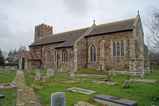
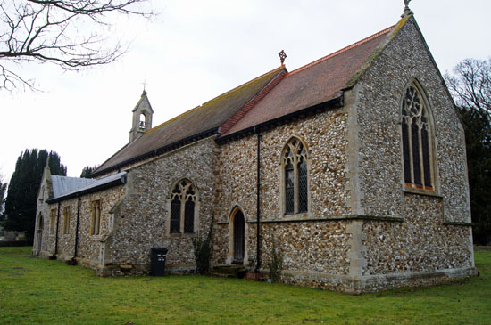
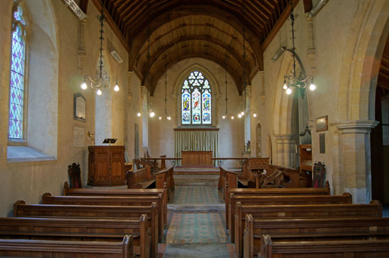
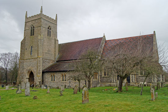
Of these five churches, only two seem to be well situated in terms of their long-term futures. South Wootton appears to be thriving; Castle Rising is conveniently close the the English Heritage managed castle. Both seem prosperous. Sculthorpe is a disproportionately large church in a tiny village. It seems well cared for but I can only imagine that the normal congregation - and, therefore, the income it generates - is ridiculously small to support such an edifice. It is received wisdom that congregations are both dwindling and aging all over the country and many new Christians prefer the more “relevant” style of worship with plenty of movement and music. Many villages are now “dormitory towns” where shops, pubs and Post Offices have already disappeared as residents take their custom elsewhere (and of course raise hell when they lose the facilities they had hitherto ignored). Toftrees (in particular) and Shernborne reek of under-funding. It is idle to compare religious houses with other institutions because they have a unique part in a community and its heritage and they invoke special affection even amongst those that do not support them. I am minded of the analogy of professional football clubs: only when they are threatened with closure do they realise how many passive (and financially non-contributing) “supporters” they have. Toftrees made a particular impact. The church is locked except by arrangement, information on forthcoming events and services is scant. Its pretty exterior hides a rather sad interior made much worse by the plague of bats that make life so difficult for parishioners. The way things are going, the bats will have the place to themselves, though a notice in the church itself mentions some talks that are continuing to try to find a generic solution to the dilemma churches face with these delightful but messy flying rodents. Locked churches are now commonplace. Increasing numbers have to share clergy and celebrate services on some kind of rota. The problem is not going to get any easier. Yet churches such as Shernborne and Toftrees, as we can see here, house architectural treasures that should be regarded as nationally-important works of art. If the churches close what happens to these treasures? The Churches Conservation Trust can’t take all redundant churches over! Nobody surely would suggest that Norman fonts and other treasures would be allowed to decay within abandoned buildings? To remove them from their original homes to other churches might be a pragmatic answer, but what a dreadful notion it is to remove the oldest symbol of a villages heritage to another site. This seems to me to be a time bomb for a part of our national heritage that is not obviously on anyone’s radar except the long-suffering Church of England and its clergy and churchwardens. Some cathedrals, controversially, now charge admission either directly or via hefty “suggested” donations. This obviously is no answer even for the most famous of parish churches - the “footfall” can never be sufficient and charges might well deter what few visitors many churches get. Governments can’t afford to bankroll churches on a national scale even if they want to - and listen out for cries of “me too” if they ever did. Many churches are a bit like football grounds: expensive facilities used once a fortnight. Maybe the answer is in using them more for secular (and chargeable) uses but of course so many are really unsuitable or would require investment for movable seating and so on. But many villages will have village halls already used for those purposes. I can’t think of an answer, but there are already stories appearing in the press about the problems in maintaining non-viable churches. At some time a high-profile or historically important church will be threatened and it may then become a national issue. Maybe the National Lottery might divert some of the money lavished on “saving for the nation” paintings by Italian and Dutch artists to saving buildings by British craftsmen? And pigs might well fly! |
||||||||||||||||||||||||||||||||||||||||
