|
|
||||||||||||||||||||||||||||||||||||||||||||||||||||||||||
|
Please sign my Guestbook and leave feedback |
||||||||||||||||||||||||||||||||||||||||||||||||||||||||||
|
Recent Additions |
||||||||||||||||||||||||||||||||||||||||||||||||||||||||||
|
|
||||||||||||||||||||||||||||
|
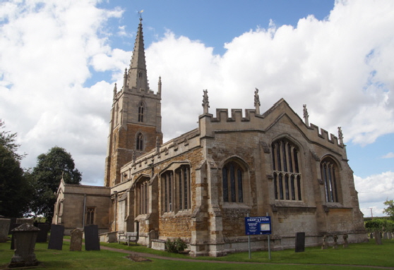
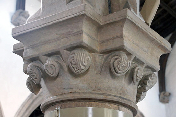
There are few parish churches in England that are high gothic through and through and Harlaxton is no exception. The north aisle here is thirteenth century early English style with one capital that almost wistfully recalls the great age of Norman capital carving. The south aisle is just a little later. The west tower is Decorated in style but its topmost stage is later. The Church Guide puts it and the clerestory at around 1380 which could be right although, because of their associations with the MMG, could be up to twenty years later. Oh that we should be so vain as to affect such precision! The dates of the side chapels that flank the chancel is unclear. The Church Guide puts them at 1325-50. If that is so then I think they were battlemented and leaded some time later when the clerestory was added. More of that anon. |
|
The Church and the Mooning men Group of Masons (MMG) |
|||||||||||||||||||||||||||||||||||||||
|
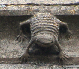
With the nearby churches of Muston and Denton, this church forms what I call the “Harlaxton Triangle”. Harlaxton itself is about nine miles north of Buckminster, the most northerly of the churches that has an actual mooner carving that defines the MMG group of masons. Harlaxton, however, does have a “flea” carving (bottom of page), the trademark of John Oakham who was a prolific mason within the MMG. At all of the churches within the triangle John was one of the masons. The presence of his sculptures suggest he was part of a group of masons that constructed the topmost part of the tower, the spire and the clerestory and who at least built the battlements and applied lead to the roofs of the eastern end of the church. It is a rich body of sculpture. Let’s have a look at it. |
|||||||||||||||||||||||||||||||||||||||
 |
|||||||||||||||||||||||||||||||||||||||
 |
|||||||||||||||||||||||||||||||||||||||
|
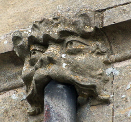
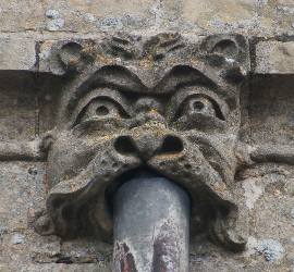
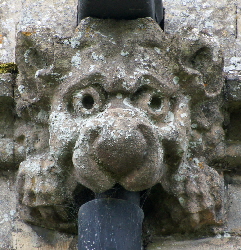
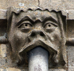
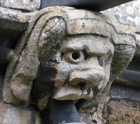
The tower frieze has weathered the centuries well. The sculptures are intriguing in that it shows more than one style, best characterised by different eye forms. There are inset almond-shaped eyes that are similar to those seen at Hungarton, Cottesmore and Buckminster. This is the style of Simon Cottesmore. Others have drilled eyes. This looks like a collaboration between Simon and John Oakham. However, in the upper picture the piece of cornice on the far right supports no fewer than three sculptures. On carving per section is the norm, two the exception. Three is unusual. The carvings, however, do not look as if they are by the same mason. |
|||||||||||||||||||||||||||||||||||||||
 |
 |
 |
 |
||||||||||||||||||||||||||||||||||||
 |
 |
||||||||||||||||||||||||||||||||||||||
 |
|||||||||||||||||||||||||||||||||||||||
|
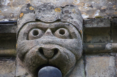
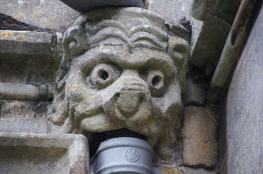
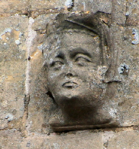
Harlaxton is home to a collection of “flush” gargoyles (my name for those gargoyles that do not project horizontally away from the wall). Again there are two different eye formations which begs the question whether there were two masons producing these? Of them all, the one (top left) is clearly one of the “cow-lion” faces that John Oakham carved in such profusion at Oakham. Most of the top row are out of that stable. Lower Middle is a fairly rare example of a female gargoyle. She has a padded roll headdress apparently surmounted by some kind of drape or veil. |
|||||||||||||||||||||||||||||||||||||||
 |
 |
 |
 |
||||||||||||||||||||||||||||||||||||
|
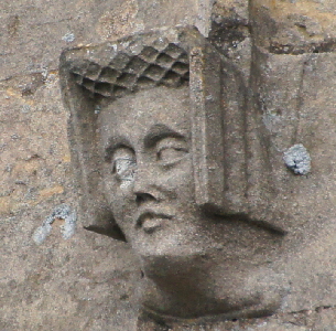
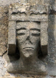
Left: This exhibitionist carving is found on a label stop on the easternmost window on the south aisle in full view. Similar exhibitionists can be see at Denton (only a mile away and also part of the so-called Harlaxton Triangle) and at Claypole Church fifteen miles north. The eye style is similar to that of some of gargoyles. Second Left and Second Right: Ladies with goffered caul headdresses on window stops. These differ from most of the MMG imagery in that they appear to be pursuing a likeness. Rather than being stylised, these faces look like they are meant to represent real people and have an appealing, almost sensuous quality to them. The eye structures are similar to those of some of John Oakham’s gargoyles (above) but without the drilled iris. The figure far right, however, is back to the stiff industrial sculpture that characterises much of the MMG oeuvre. The headdress is of military stiffness, the face with an almost masculine jaw line. The top of the headdress is possibly meant to represent a crown which might explain why feminine sensuousness has been replaced by stern authority. |
|||||||||||||||||||||||||||||||||||||||
 |
 |
||||||||||||||||||||||||||||||||||||||
 |
 |
||||||||||||||||||||||||||||||||||||||
 |
|||||||||||||||||||||||||||||||||||||||
 |
|||||||||||||||||||||||||||||||||||||||
 |
|||||||||||||||||||||||||||||||||||||||
|
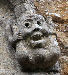
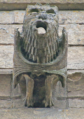
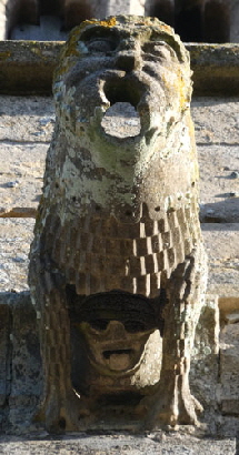
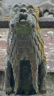
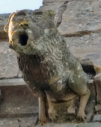
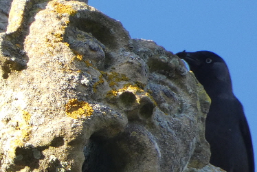
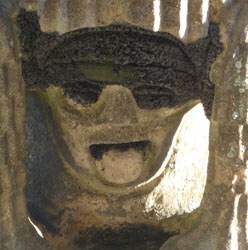
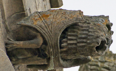
The gargoyles on Harlaxton’s west tower are very interesting. Two of them (top right and second right) have black lead eyes. The other two (top left and second left) have heads inset between the legs. They might once have had black lead eyes but we cannot know. These are surely the work of the Gargoyle Master/ Follow this link to find out about him.. |
|
The question, as always, is what was the MMG doing here? When I wrote the printed edition of “Demon Carvers & Mooning Men” a few years ago I pegged clerestory building, aisle widening and lead roofing as the. I also discovered that the work of building parapets, especially battlemented ones ,was a much bigger deal than I had realised. Their repertoire, in short, encompassed pretty well anything other than building church from scratch. At Harlaxton it seems their work was quite extensive. That they built the clerestory is very clear given the array of John Oakham’s gargoyles and window label stops. To that we must add the topmost quarter of the tower with its frieze and its spire. With that came the pinnacles at each corner of the tower, the leaded tower roof and the gargoyles. Then we need to look at the battlements. The tower is battlemented as we would expect. The south side of the chapel has simialr style battlements.. The east end, however, is battlemented in a fancier style - the one I call “double chamfered”. What is more, this battlementing continues right round the north side including the aisle. I think the key to this church is in the rectangular windows on both sides. This speaks of later rebuilding. Moreover, although the church at first glance is mainly of ironstone, in fact it is mainly of limestone. The MMG clearly used it here for all their work. It seems, however, that all later restoration work used it too, so that the whole north side apart from the tower is of limestone. It seems to me likely that this double chamfered battlementing also dates from this later restoration/rebuilding. We can be sure that the MMG put in the unusual and attractive Perpendicular style windows on the south chapel as they have labels tops almost certainly by John Oakham. The east end looks like MMG work as well and the Church Guide itself hazards a date of 1400-1420 which is within our ballpark. If this was the case then it strengthens the conviction that the double chamfered battlementing is later because it seems inconceivable that the MMG would not reproduce the style they used on the south chapel. |
|
Harlaxton the Church |
|
Harlaxton Church is quite rewarding visit in its own right |
 |
|||
 |
|||
|
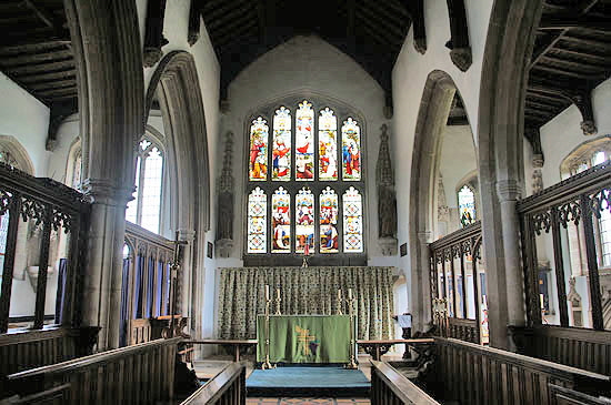
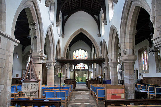
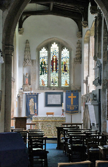
Left: Looking towards the east. Although the arch profiles are similar, the columns of the north arcade are round, while those to the south are octagonal and therefore later. I am always surprised at how willing patrons and masons were to sacrifice symmetry in the interest of quite insignificant changes in architectural fashion. Note the sculpted capitals on the north side, a remnant of the Norman era. Right: The handsome chancel with flanking chapels. To the north (left of this picture) is the Trinity Chapel paid for my the Holy Trinity Guild. Such guilds - not to be confused with craft guilds - were responsible for many chapels and additional altars in the later mediaeval period. Such guilds did “good works” but they also liked to sponsor chapels as a way of protecting their immortal souls from the pains of purgatory in much the same way as the upper reaches of the social ladder were wont to do. They were, I suppose, the forerunners of such modern organisations as the Rotary Club or Probus. They were very much the product of the post-1348 Plague reordering of society that allowed what we would now call social mobility. Just to be clear, though, the high echelons of society zealously guarded their ranks against the “new men”, even down to decreeing through the “Sumptuary Laws” what clothing the social ranks might or might not wear. The south chapel (right of picture) is the Lady Chapel funded by the Guild of St Mary. The guild was founded in 1358 |
 |
 |
 |
||||||||
|
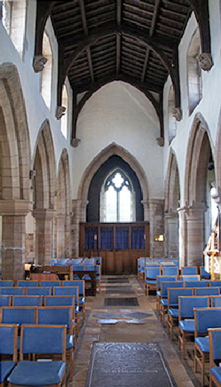
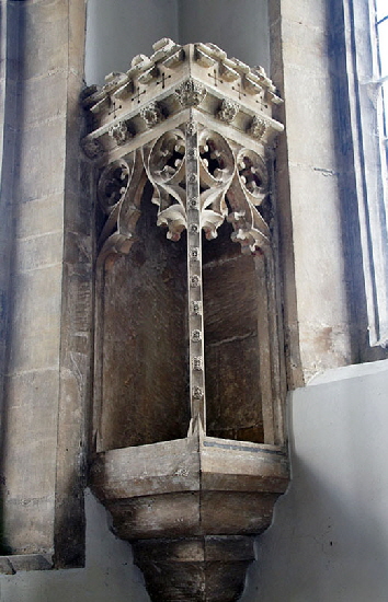
Left: Looking towards the west end. Centre: The south Lady Chapel. It is a fine example with crocketed niches in each corner. I hope nobody will be too offended when I, a mere atheist, say that the ghastly little statue that has been a placed in the left hand one gives you some idea of why the Reformation was not all bad news! Graven images anybody? Right: Continuing the theme of rather fine gothic furnishings this is perhaps the best piece in the church. It sits at the north east corner of the church next to the chapel altar and, remarkably, is carved from a single block of stone. The Church Guide suggests that it was designed to hold the light paid for in perpetuity by the Trinity Guild. A truly remarkable artefact. |
||||||||||
 |
 |
|||||||||
|
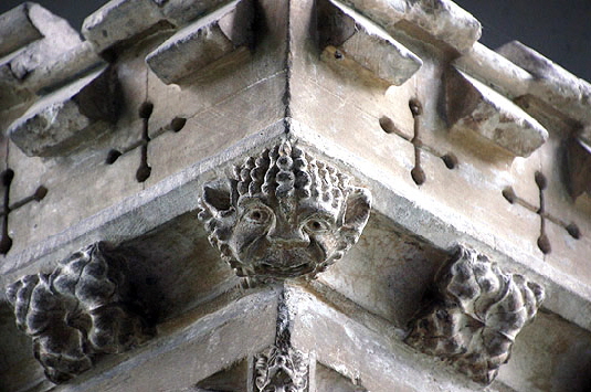
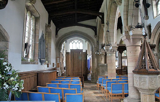
Left: Detail of the Trinity lighthouse. Its fascinating to see the ubiquity of heads like this amongst the more predictable and innocuous fleuron decoration. What could it mean? Right: Looking east along the north aisle. Beyond the (ugh) organ pipes is the Trinity Chapel. Note the font to thee right. More of this anon. |
 |
 |
||||||||||||||
|
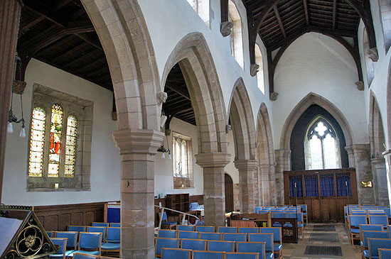
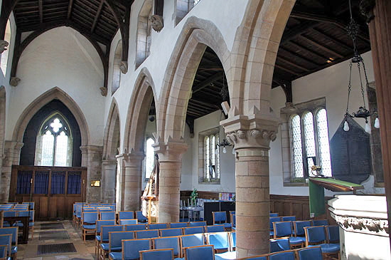
Left: The south aisle looking west. Right: The north aisle looking west. |
|||||||||||||||
 |
 |
 |
|||||||||||||
|
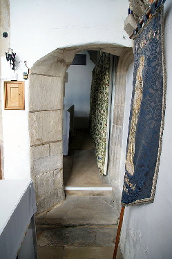
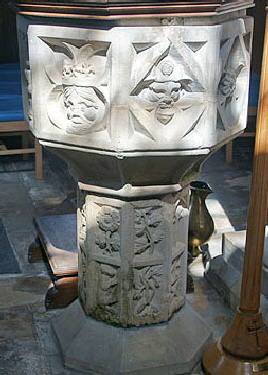
Left: Early thirteenth century carving on one of the north aisle capitals. Centre: An oddly agricultural doorway through from the south chapel to the chancel. It has literally been hacked straight through the wall. It was designed to give access to their altar for the Holy Trinity Guild. Right: The distinctly odd fifteenth century baptismal font, about which much more below. |
|||||||||||||||
 |
|||||||||||||||
 |
|||||||||||||||
|
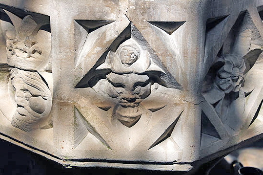
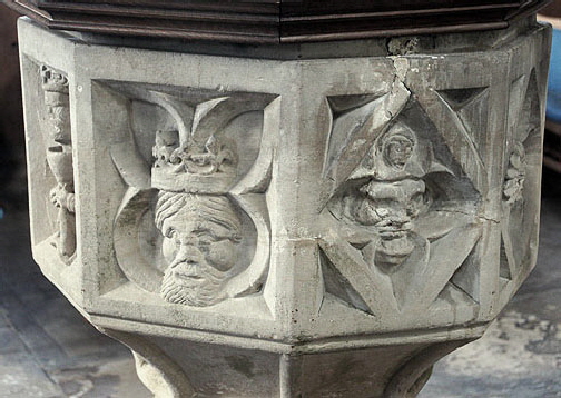
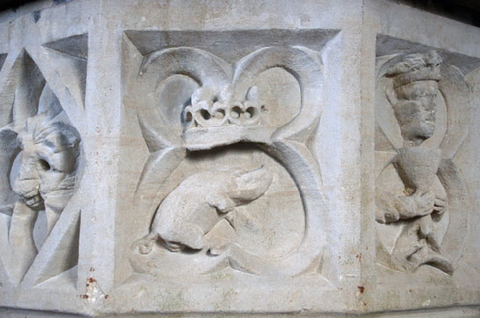
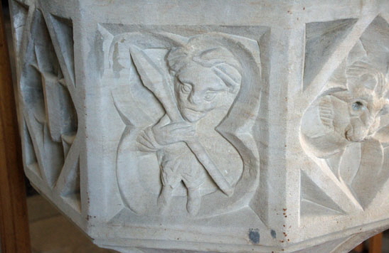
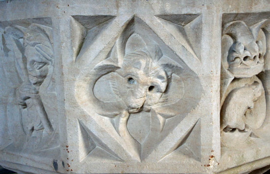
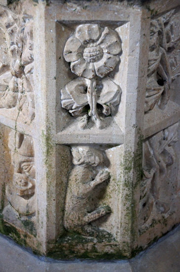
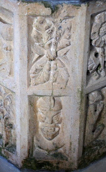
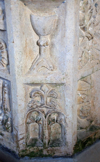
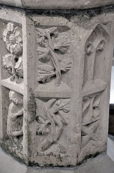
Pictures Above: What a very peculiar font this is; one of the most peculiar I have seen. As peculiar, in fact, as the one at Muston only a miles away although they are very different. The font here is octagonal and highly decorated. It is generally agreed that it is fifteenth century - the Church Guide puts it at around 1400. Pevsner states in his usual imperious manner that it has “all entirely recut”. He doesn’t say why he thinks this, he doesn’t say when it would have happened. That’s the trouble with Pevsner (hallowed be his name) he sometimes just said these things and because he said them everybody thinks he’s right! Not for the first time I wish I was able to question him on his inferences. I think he has got this totally wrong. The reason the font is odd is because it is much more recent than the “anything goes” anarchy of Norman font carving. This octagonal bowl and stem is very much of the high Gothic era when the prevailing themes were religious and heraldic. I looked through all the plates in Michael Bond’s epic “Fonts and Font Covers” and just about every one of that era fitted that design template. Yet this font, apart from a king and a priest is covered in obscure symbolism that looks totally freelance. If it was an anachronism in the fifteenth century why the thump would it be recut to look like this later still? More likely, in my view and by some margin, is that this was the work of one of the Mooning Man Group masons and probably by John Oakham who definitely carved the similarly anachronistic one at Muston and, as we will see, another like this one at Allington only seven miles distant. You are left with many questions about this font, as well as its odd iconography. Has the sculptor stepped outside his usual competence or has he carved in this somewhat idiosyncratic style as an experiment? The stem seems to me to be slightly more conventional than the bowl. When I look at this I don’t see the work of a bodger, it is actually quite a sophisticated design. And when you understand the potential iconography (see below) you will be convinced too. |
 |
 |
||||||
|
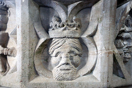
Left: Very obviously a king and very obviously Henry IV. Why, you might reasonably ask? Well, it’s all about those three fleurs-de-lys on the crown and you can see the same symbolism on the Right where a pig - see his curly tail - is also sitting under a crown with three fleurs-de-lys. England’s kings, of course, claimed to be the rightful rulers of France and persisted with this conceit right up until the death of Henry VIII. These images clearly pander to those claims. Henry IV changed the English royal arms to show a group of three fleurs instead of the usual more numerous ones and this was also the insignia of the House of Lancaster. In fact this pattern of three fleurs on the royal arms persisted right up the reign of Elizabeth I. Why is it not the likeness of one of the later kings? Because Henry IV was the last one of this era to sport a beard! QED. You may call me Holmes! Henry ruled from 1399 (when he usurped the throne from Richard II) until 1413. This is bang within period for the Mooning Men Group who, I am convinced, carved this font. |
|||||||
 |
|||||||
 |
|||||||
|
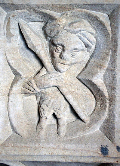
There is other curious imagery on the font. Left: Apparently a representation of a spear-wielding “Wild Man” (a club was more usual). This is an icon as old as time and found all over Europe and further abroad. In England it was often called a “woodwose”. Believe it or not, the common surname “Woodhouse” derives from this (eat you heart out Jane Austen who, I am sure had no idea of this when she thus named her conniving “Emma”)! It is derived from folklore, not religion, and might reasonably be equated with the enigmatic green man. What is it doing on a font? The most likely explanation is in their alleged predilection for abducting and eating women and unbaptised children. I am sure this is a libellous misrepresentation against centuries of decent misunderstood Wild Men. Right: The face of a hedgehog. Possibly another folkloric symbol. |
 |
 |
||||||||||||||||||||||||
 |
|||||||||||||||||||||||||
|
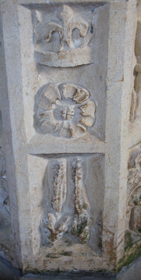
The font’s stem is a mass of undecipherable iconography. Left: This is an interesting panel, I can’t make out the oddly vertical creature below that has a face that is clearly meant to be significant, Above that what could well be the Red Rose of Lancaster that was often represented with this criss-cross centre, . The bottom has a representation of the architecture of the time. The posh word for this (and I know of no other) is skeumorphia that my spell checker had never heard of either! Skeumorphia was very common in high gothic architecture. Above the “windows” could be another fleur-de-lys. The top panel appears to show a goblet. The holy grail perhaps? But more likely a eucharist cup. Right: A distinctly demonic face with diabolic eyes and bared teeth occupies the bottom panel while above it is foliage. |
|||||||||||||||||||||||||
 |
 |
 |
|||||||||||||||||||||||
|
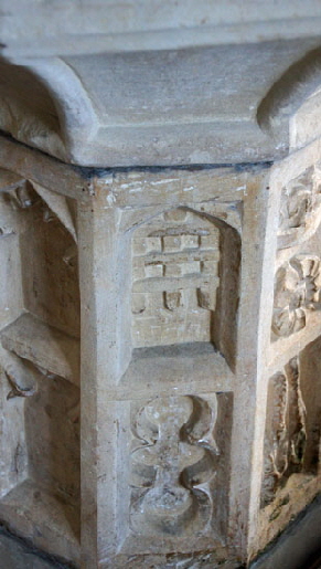
Left: Foliage and geometry dominates the panel in the centre and right but their is another skeumorphic representation of a gothic window to be seen. If we keep reading and writing that word I am sure it will sink in eventually! Centre: A closer look at the Wild Man. Right: The upper panel shows yet another fleur-de-lys juxtaposed with a putative Red Rose of Lancaster. This font clearly is intended to do homage to the usurper King Henry IV. Henry’s deposition of Richard II was by no means universally supported and the church here doubtless wanted to nail it colours to the mast. Why did they do this? Because, I think, nearby Harlaxton Manor of which have been versions since the Domesday Book was in the fourteenth century used as a hunting lodge by John of Gaunt, founder of the second House of Lancaster. John - himself the son of Edward III - was the father of Henry IV. QED again, I think. |
|||||||||||||||||||||||||
 |
 |
 |
|||||||||||||||||||||||
|
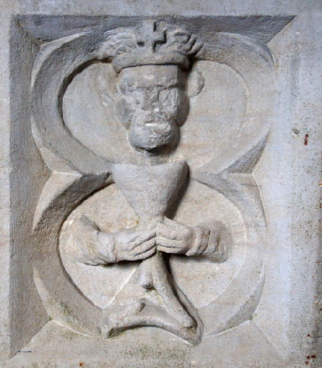
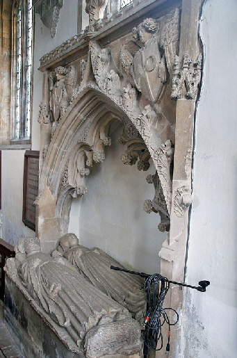
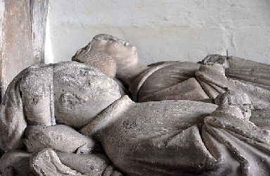
Left: Here we see a portcullis emblem. This was a symbol of John of Gaunt, the father of Henry IV. Centre: It’s our old friend Henry Bolingbroke again and this time he clutches a eucharist vessel and wears a circlet or crown adorned with a cross. Right: A splendid alabaster memorial on the north wall to an anonymous and undated couple. The Church Guide suggests a variety of possible identities. |
|||||||||||||||||||||||||
 |
|||||||||||||||||||||||||
 |
|||||||||||||||||||||||||
 |
|||||||||||||||||||||||||
 |
 |
||||||||||||||||||||||||
|
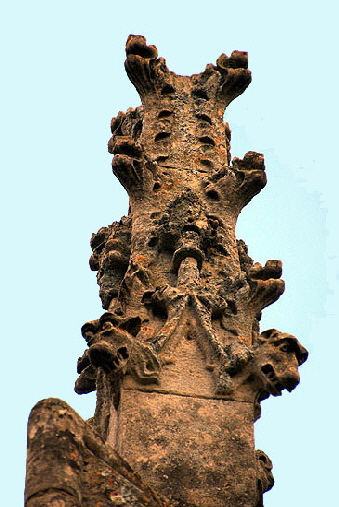
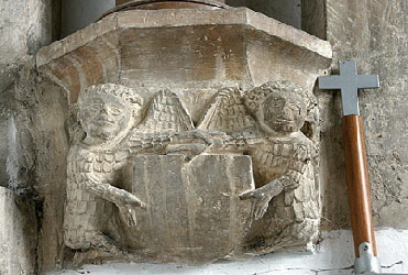
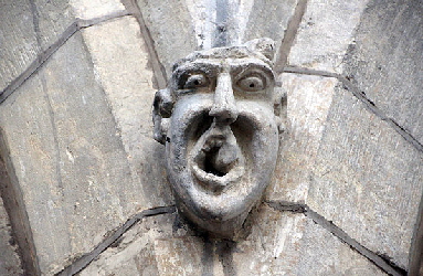
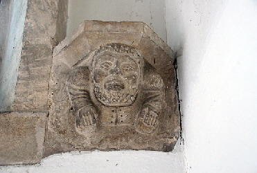
Left Above: Detail of the alabaster monument. Rather curiously the male figure seems to be wearing a distinctly non-aristocratic and definitely most unmartial night cap. Left Below: I have commented frequently that it is to me quite obvious that where a clerestory is added to a church some reprofiling of the arcade arches is almost inevitable. This accounts, I think, for the emergence of grotesque carvings on the spandrels of arcades that were constructed before such things became fashionable. Harlaxton, I think, was no exception and resulted in this handsome brute! Centre Above and Below: Corbels with somewhat contrasting themes! Note on the lower figure what appear to be lace holes in the man’s tunic. Right: There is a variety of pinnacles around the church. This one on the east end has a variety of cartoon-like dog faces snarling away at passers-by, |
 |
 |
|||
|
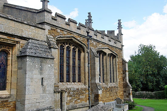
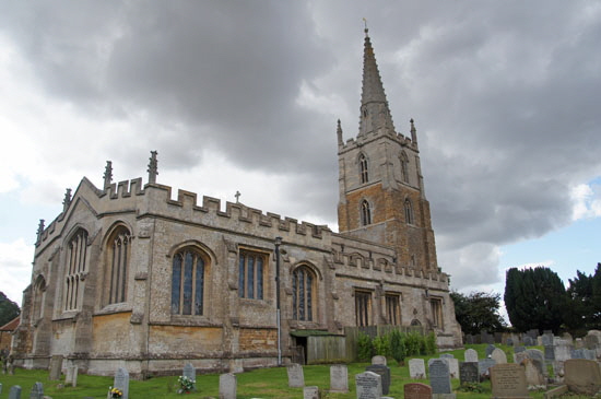
Left: The east end of the south chapel. Note the windows that have the same outer profiles but dissimilar inserts. Those outer profiles are original - the label stops are by the MMG - but I believe the easternmost window has been altered. Right: The church from the north side presents a very different picture from the south. There is little sign of ironstone here and the plethora of limestone bespeaks of several phases of remodelling, Note particularly the rectangular Tudor-looking aisle windows and a similar aesthetically very unfortunate insertion in the north chapel. Note also that the battlementing spreads to the north aisle although the MMG-built clerestory is plain on this side as on the south. |
||||
 |
||||
|
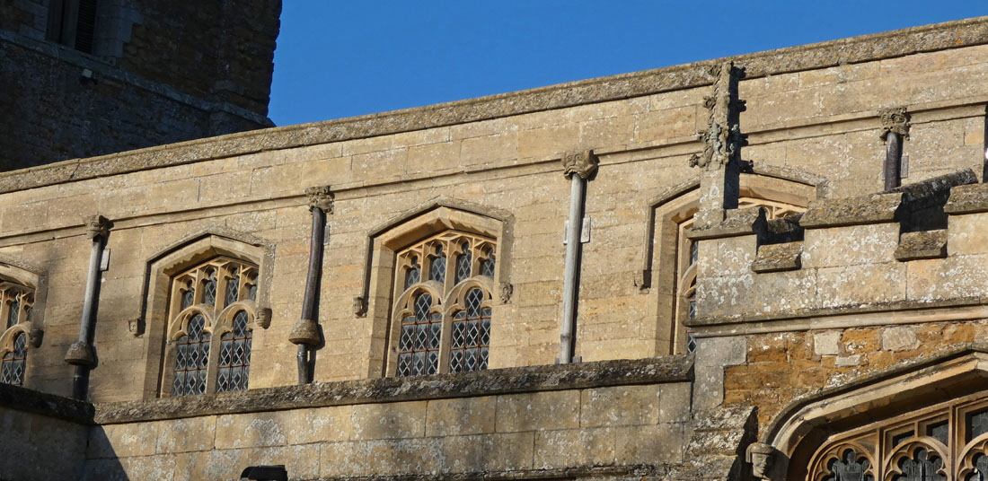
The south clerestory with its pointed-profile windows. The label stops are by John Oakham - two goffer caul headdresses are visible in this picture alone - and so then are the windows. The flush gargoyles are also by John Oakham . |
 |
|
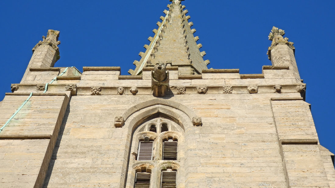
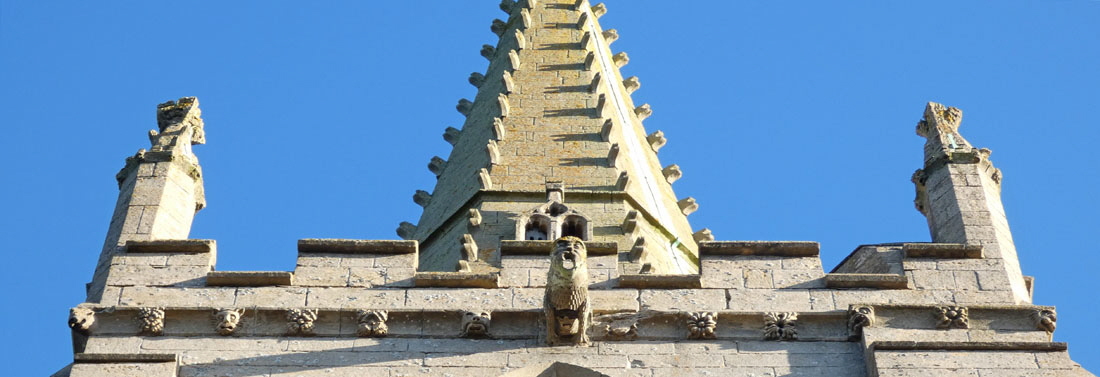
The west tower. This top section was built by a group of masons that included John Oakham - note his iconic “flea” carving second right on the frieze - and Simon Cottesmore, erstwhile member of the Mooning Men Group. This frieze is, I think, a joint effort by the two of them. As you can see, the frieze has not quite “worked out”. The carving just to the left of the gargoyle is misplaced: the carving should surely be to the right of that piece of cornice and not the left. It is an interesting study in the practical challenges masons faced. This cornicing would have been sculpted on the ground not, of course, in-situ. They would have planned the lengths of cornice needed and, presumably, how they would take account of the gargoyle. When they set in place there would have been a big “ooer” when they realised that they had got it slightly wrong! Fascinating! The spire was by this team as well and the peculiar extrusions at the edges of the sections - presumably there to aid the perilous act of climbing the spire - are similar to those at Hungarton. |
 |
 |
 |
|
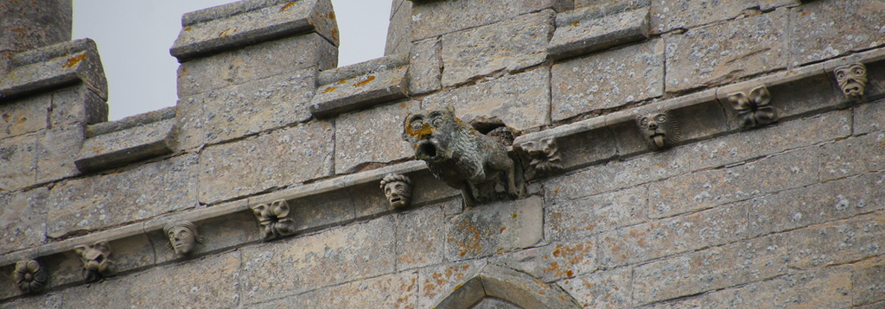
The three pictures above show the other sides of of the tower with the friezes and gargoyles. |
 |
|
|
Harlaxton’s “flea” carving - the trademark carving of John Oakham. |
|
|
Allington Dedication: SS Mary & Peter Simon Jenkins: Excluded |
|
|
|
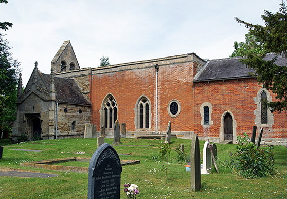
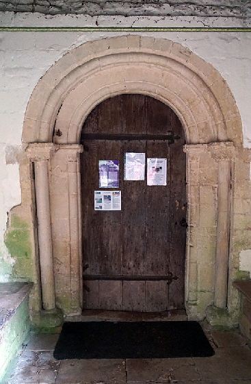
seem here. And the south porch gives us some indication that it was not originally as odd-looking as it is now. As you enter through the south door you should be struck by the simple round headed Norman doorway. This would prepare you for your surprise, then, when you enter to see a three-bay Norman north arcade as well! The chancel arch is also round-headed but its breadth confirms that it has been remodelled. As a church here was mentioned in the Domesday Survey we can also safely assume that there was an Anglo-Saxon church on the site. This is confirmed by a fragment of an Anglo-Saxon cross near the font. No less interesting that this church is unusual for the area in having a surviving Jacobean west gallery as well as a Jacobean pulpit, both dating from the Rev Clarke’s incumbency. So this church is an exemplar of how unremarkable church exteriors can conceal unexpectedly interesting interiors. Our focus here, however, is very much on the font. Let me say from the start that this font is posited as “late fifteenth century” by English Heritage’s “listing”. Unsurprisingly, the simple Church Guide has repeated this. Quite how this dating arose is a mystery. Possibly individual based this on a view of its perceived “style”. If so, this is quite unsubstantiated; because the style of the font - as well as those at Harlaxton and Muston - is quite bizarre. They have a style all of their own that is totally at odds with high Gothic decorative norms. The font at Muston is quite anachronistic - Pevsner himself calls it “strange” - and I can point that with its “cow-like” faces incontrovertibly to John Oakham who was working with the rest of the “Mooning Men” lodge in the very early fifteenth century. Now at this point I hope you have read what I have had to say about the iconography of the font at Harlaxton. I think I have made a convincing case that the iconography is from the reign of Henry IV, tying in perfectly with John Oakham, and the Mooning Men Lodge. Let’s now have a look at Allington’s font. |
 |
 |
|||||||||||||||
|
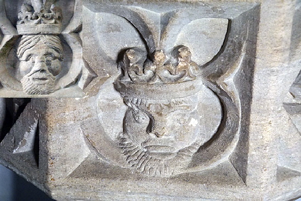
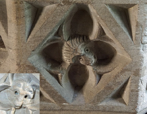
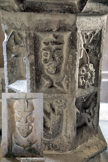
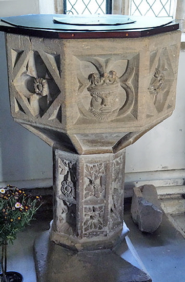
Let’s note initially that the designs are set within inconsistent quatrefoil frames as at Harlaxton. And then, lo and behold we have (left) another bearded Henry IV wearing a crown with three French fleurs-de-lys, claiming sovereignty over France, exactly as we saw at Harlaxton (inset). I do not mean that the designs are identical, of course. The mason was not painting portraits but you can see the same bold strokes that form the beard, in each case with the beard overlapping the bottom of its frame. We also see the central fleuron merging into the descending part of the quatrefoil design in both cases. Then we see a hedgehog design (right), again similar but not identical to that at Harlaxton (inset). Look at the way both both piggies have deep-set round eyes. That these two designs appear on two different fonts only five miles apart is surely beyond coincidence. |
||||||||||||||||
 |
 |
 |
||||||||||||||
|
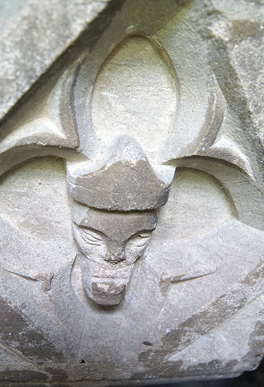
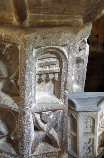
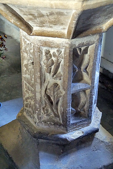
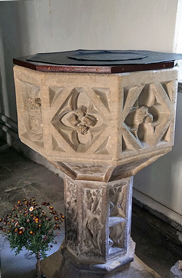
Left: This figure is on the “blind” side next to the north wall. Possibly a bishop but I am inclined to think it more likely to be a mason. Centre: Here we have another point of congruence with Harlaxton. Both fonts sit on octagonal stems, each with two layers of decoration. Here we see a portcullis with three horizontal bars. This is almost exactly the same as that at Harlaxton (inset) and was a symbol of John of Gaunt, father of Henry. Right: More decorated panels from the stem. There is a rose carving - I am presuming of Henry’s house of Lancaster - as there is at Harlaxton. A spooky-looking face is mirrored at Harlaxton (inset). |
||||||||||||||||
 |
 |
 |
||||||||||||||
|
More font imagery. Left: You can see the rose again here with other stylised floral designs. Centre: More stem designs. Right: The king can be seen in the left hand panel with the hedgehog on the right, flanking a fleuron. |
||||||||||||||||
|
I don’t think there can be any doubt that these two fonts are by the same stonemason nor that they are concurrent with the early fifteenth century rebuilding at Harlaxton in the early fifteenth century. We know for sure that John Oakham carved the font at nearby Muston. And we know for certain that John Oakham was also at Harlaxton - see above. This leaves the question as to whether John Oakham carved the Harlaxton and Allington fonts as well? There is little evidence for that. True, Muston’s is also an octagonal font on an octagonal stem but those things are hardly unusual for the time. Again, all three are anachronistic designs. Muston is especially so, since its designs are mainly grotesque heads from the John Oakham stable of “cow-like” heads. There are grotesque heads at Harlaxton and Allington but both also have that extraordinary image of Henry IV with their claims to the throne of France. I am not aware of any other font that has political commentary like that. What, one wonders, prompted this? We can only assume that is an example of fifteenth century virtue-signalling. There is no sign of any building work at Allington at that time. Where were the Harlaxton and Allington fonts sculpted then? It seems likely that the Harlaxton font was made on site. Did a mason sculpt both of these fonts at Harlaxton and have the Allington one carted to the church? Or did he make a separate visit to Allington and carve its font in-situ? I have to believe that the patrons of the two churches endorsed the political messaging. It does not seem likely that thinking emanated from the quarry. Again, though, we know that masons would move to and from the quarry during building projects so maybe they were made at the quarry but by one of the Harlaxton masons? Either way, I hope you will agree that I have the iconography of these fonts nailed and that it proves the early fifteenth century date of the fonts at both Harlaxton and Allington. |
||||||||||||||||
 |
 |
|||||||||||||||
|
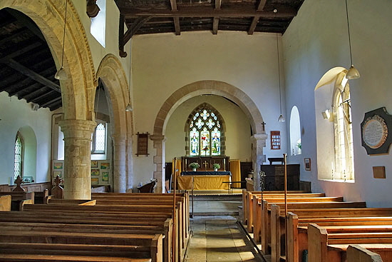
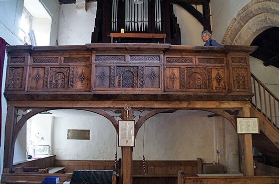
It would be unfair to Allington Church to ignore its other features. Left: The view to the east. The Norman north arcade is to the left. The chancel arch was originally Norman but was remodelled early one the twentieth century.. To the right, in front of the chancel arch is a surviving Norman window. The east window is a later replacement for an early English triple lancet that would have matched the lancet in the chancel south wall (see picture above).Right: The Jacobean west gallery. Many churches would have had these but few survive, the West Country being the best area for them. The galleries coincided with the post-Commonwealth focus on scripture-based piety. The commandments, the psalms, long sermons were all the rage. The west gallery was a focus for quires (rather than “choirs” in those days) and the singing of psalms accompanied by village orchestras. To this day, “West Gallery Music” is a recognised genre but the galleries themselves were mostly removed from our churches. |
 |
 |
|||||||||
|
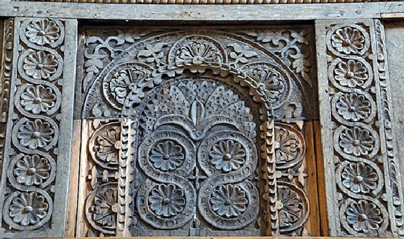
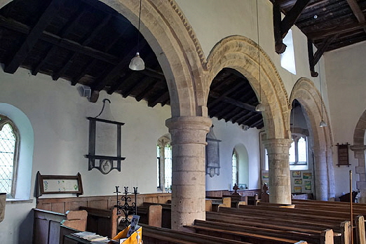
Left: Panelling of the west gallery. Right: The Norman north arcade. |
||||||||||
 |
 |
 |
||||||||
|
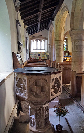
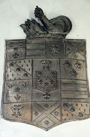
Left: Looking past the font east along the north aisle. Its narrowness indicate that this aisle retains its Norman proportions, albeit the windows have been replaced by gothic ones. Centre: The Norman south door. Right: An elaborate memorial plaque on the north wall of the chancel. |
 |
||||
|
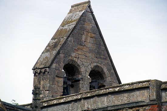
The church has no west tower, emphasising the humble nature of this church. The bell cote, however, appears to be Norman with twin round arches and a small decorative string courses. |
||||
|
The A1 Trail |
||||
|
|
|
|
