|
Alphabetical List |
|
|
|
|
|
|
|
County List and Topics |
|
|
|
Please sign my Guestbook and leave feedback |
|
|
||||||||||||||||||||||||||||
|
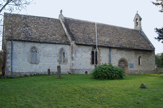
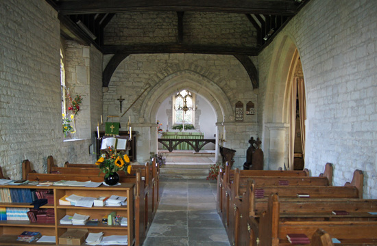
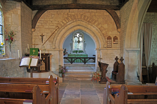
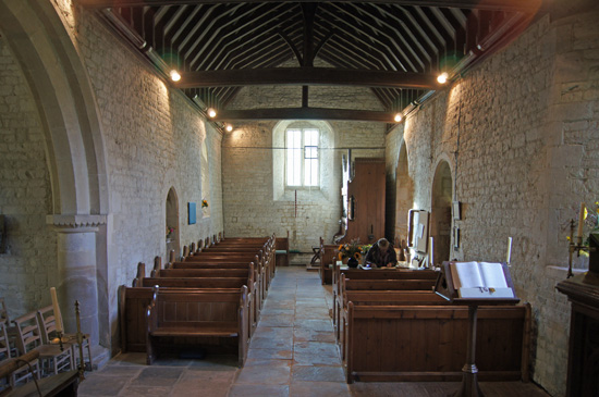
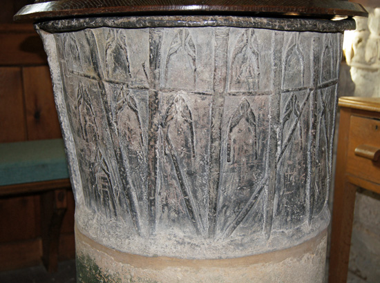
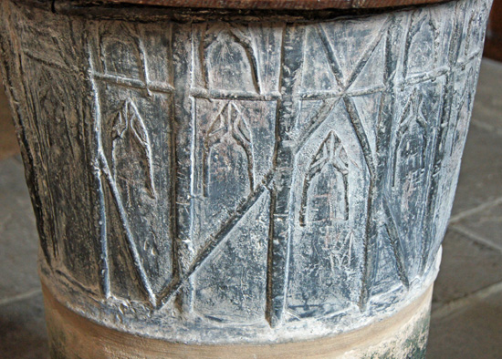
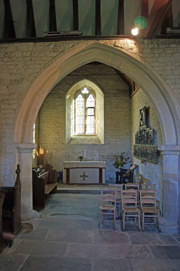
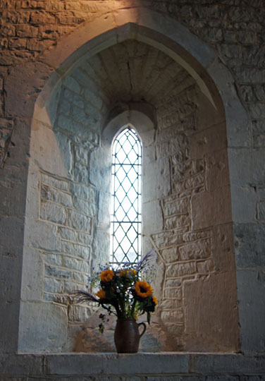
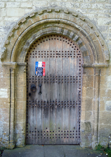
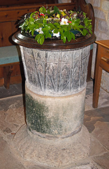
They look too large for the arch and almost as if they have been brought here from somewhere else. One might have expected them to adorn much more ornate late Norman doorways such as at Kilpeck and Iffley On the exterior of a church so well-mannered and lacking in drama they are something of a surprise. There is a blocked doorway on the south side of the church. This also have a Transitional look about it but the reconfigured masonry and, above all, the massive stone blocks on either side of it make me wonder if this church is all that it seems. So too the rubble masonry courses around the base of this church. The two western lancet windows also look Transitional with their lancet shapes but deep splays. Other windows seem to be simple Decorated period work from perhaps the late c13. The chancel arch also looks Transitional with a Romanesque billet moulding surround. The label stops of the arch, however, are clearly much later and the billet moulding and the masonry voussoirs that surround the arch are discontinuous and have clearly been repaired or rebuilt. Was this a rounded arch originally? To the west of the chancel arch is a lofty gothic arch leading to a south chapel. It is disproportionate within this bijou church but its capitals have a distinctly Norman look to them - but they may not be, of course! The font is the main interest here. Its decoration is curiously muddled in conception. It is crudely divided into several segments by raised vertical lead mouldings; and there is also a horizontal moulding near the rim that splits the font laterally into two very unequal parts. Most of the resulting spaces are filled with crude and irregular motifs of what might be gothic window shapes. This might be why Wikipaedia dates it rather surprisingly to the c14. To my eyes the designs are so crude that it is impossible to be sure. And why would anyone create a pattern in the shape of a window? It is true that we see blind arcading designs on many Norman fonts but this is a motif repeated as a decoration all through Norman churches, inside and out. So perhaps it is merely abstract. The church at Childrey, only six miles distant, dates its very different lead font to the c12. We will never know. So little is written of this church. So much about it makes me wonder if its foundation was not rather earlier than its Transitional features indicate. Anyway, if you are in the area visiting the truly awe-inspiring White Horse and Wayland’s Smithy do drop off at this lovely little church. You won’t be sorry you did. It’s a lovely little slice of England. |
|
|
||||||||||||||||||||||||||||||||||||||||||||||||||||||||||||||||||||||||||||||||
 |
 |
||
|
Two views of the peculiar font. The vertical pilasters look to have been “drawn” freehand and the odd “gothic window” motif looks like it has been done using patterning stamp of some sort, with little attention to precise placement. There is no real sense of art here at all. What on earth are those diagonal lines for? If you didn’t know any better you might think it was something a primary school class had fashioned from clay! There are clusters of lead fonts in both Oxfordshire (although Woolstone was in Berkshire until 1974) and in Gloucestershire. Presumably both “schools” owe their existence to the lead smelter of the Forest of Dean. Let’s not mince our words, this is a rare example of a really ugly font - but there is something engaging about the work of the well-meaning bodger, isn’t there? |
 |
|||||
 |
 |
||||
|
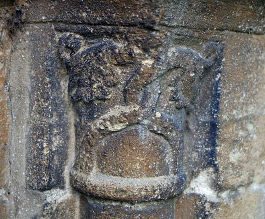
Left: The blocked up south door seen from the inside. Note the crude jamb stones and, clear evidence that the not-quite-rounded outer arch, was probably not its original form. Centre: The southern transept chapel with its rather disproportionate arch. Right: One of the deeply-splayed Transitional lancet wndows. |
 |
|||||||||||||||||||||||
 |
|||||||||||||||||||||||
 |
|||||||||||||||||||||||
|
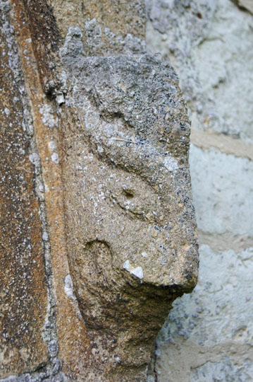
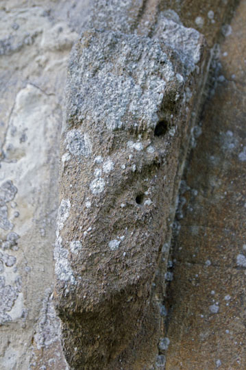
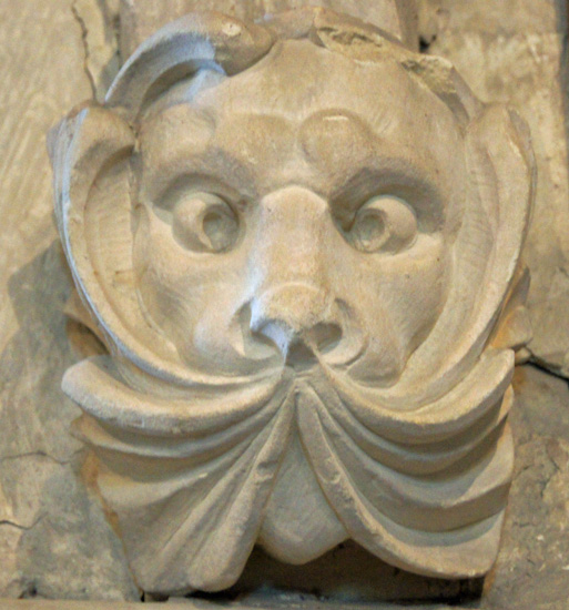
Left: The Transitional North door - the current entrance to the church. Unlike the south door, this one looks what we see now is its original form. Centre and Right: The badly-weathered but still fascinating north door label stops. These pagan images really don’t look in keeping with the this otherwise restrained doorway. |
|||||||||||||||||||||||
 |
 |
||||||||||||||||||||||
|
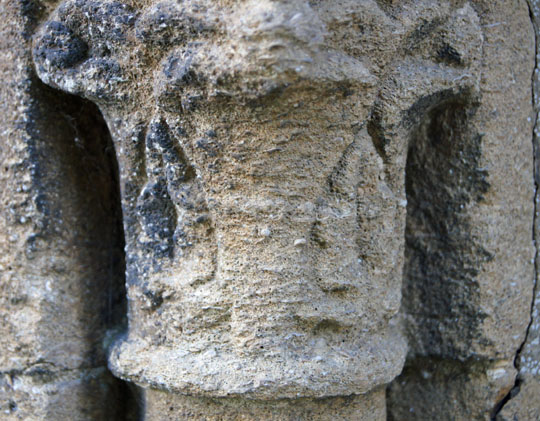
The two north door capitals. The eastern one (left) has suffered grievously from weathering but the western one (right) has fared rather better. |
|||||||||||||||||||||||
 |
|||||||||||||||||||||||
 |
|||||||||||||||||||||||
|
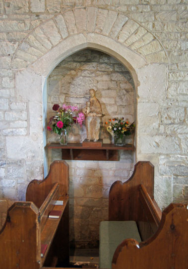
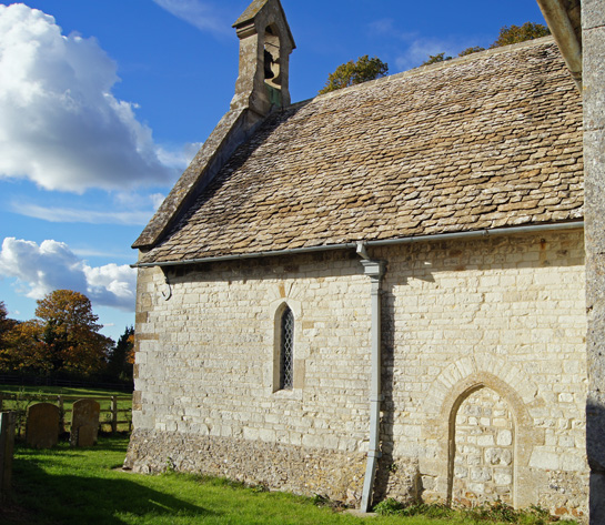
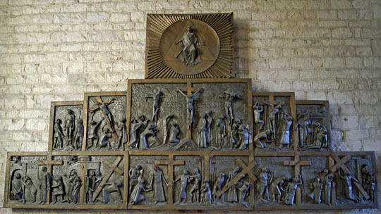
Left: The south west end of the church. Note the blocked doorway. Note also the rubble base to the church. is thsi contemporary with the stonework above or it a survivor of an earlier building? Right: The south chapel houses this rather splendid crucifixion cycle, cast in fibre glass and presented by long-time worshipper Hydie Lloyd in 1968. This is probably the best “art” to be seen in this church and it is uplifting to know that our own generations also have positive contributions to make to our churches. Just don’t talk to me about the Victorians though....:-) |
|||||||||||||||||||||||
 |
 |
 |
|||||||||||||||||||||
 |
|||||||||||||||||||||||
|
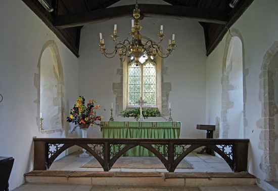
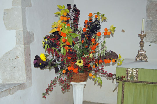
Top Left and Centre: The rather modern-looking chancel arch label stops. They are nicely done, unlike many modern copies of mediaeval sculptures that look like they were designed to be sold in garden centres! They reinforce, however, the fact that the chancel arch has been tampered with, possible during the c18 re-modelling of the east wall. Above and Right: We visited on 15 October 2012 on a lovely day, and the early afternoon sun was pouring into this timeless lively little church. Someone had done these beautiful floral arrangements to add to an idyllic scene. Perhaps that font was always destined to be a plant pot...only joking! |
|||||||||||||||||||||||