|
Alphabetical List |
|
|
|
|
|
|
|
County List and Topics |
|
|
|
Please sign my Guestbook and leave feedback |
|
|
||||||||||||||||
|
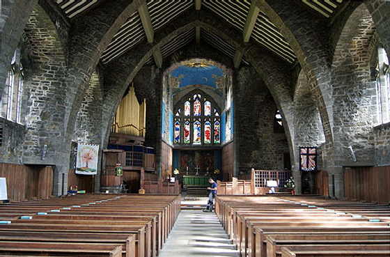
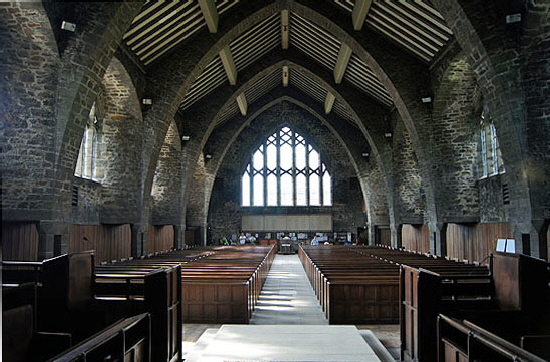
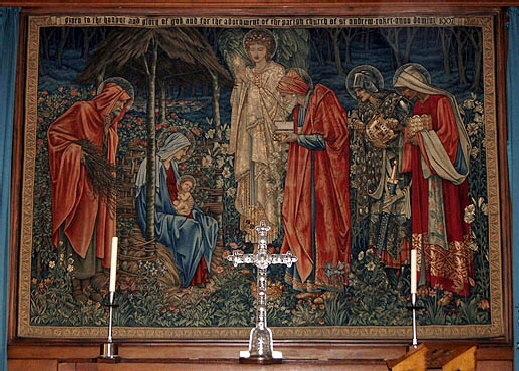
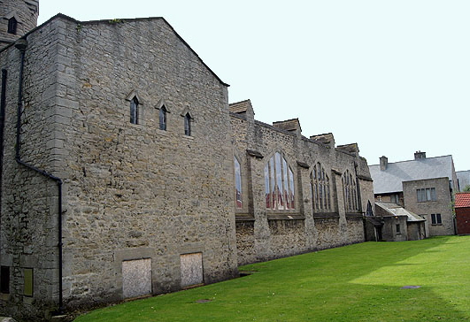
The movement loved traditional design and revered traditional craftsmanship which they blended with the pre-Raphaelite and Art Nouveau artistic styles of the day. John Priestman wanted the church to have a whopping capacity of seven hundred worshippers. His Christianity was very much of the Reformation. He insisted that all of the congregation should have uninterrupted views of both altar and pulpit so there were to be no screens. Prior’s response was an enormous nave fifty two feet wide and of five bays. The roof span is similarly huge and the walls are similarly massive in order to support it. Those walls are not built from dressed stone but from of concrete with stone facings. The project just couldn’t support the cost of such a massive quantity of dressed stone. To help with the weight there are arches set into both the north and south walls. In cross section it is, like Brockhampton Church in Herefordshire elsewhere on this site, shaped like the inverted hull of a ship, the effect being reinforced by the timbers in the roof. This is doubly appropriate: the nave comes from the Laton word “navus” which means ship and, of course, Sunderland was a shipbuilding town. The chancel is the same height as the nave but is much narrower so it is extraordinarily lofty. Whilst accommodating Priestman’s demands, Prior’s design is very idiosyncratic. It is an extraordinarily well-lit church utilising enormous windows along most the length of both north and south walls. They are divided vertically into five sections. The glass is in small square leaded panes and each section’s glass bows outwards. There is a repeated use of triangles, sometimes doubled up vertically to produce diamond shapes. The bell turret is punctuated by triangle-headed windows of distinctly Anglo-Saxon proportions so it is a reasonable assumption that this explains his use of triangles throughout the church. Just as Brockhampton Church was clearly designed to be in keeping with Herefordshire’s Norman heritage, so it is reasonable to assume that Prior was anxious to reflect the Anglo-Saxon heritage of the old Kingdom of Northumbria. It is surely no coincidence that the historically important Monkwearmouth Church is within the town of Sunderland (we visited both on the same day) and the even more legendary Jarrow is in nearby Newcastle-upon-Tyne. Arts & Crafts churches are defined as much by their beautiful art as by their avant-garde architecture and St Andrews is no exception. Burne-Jones, that most prolific of contributors to A&C churches, produced the “Adoration of the Magi” tapestry behind the altar. The beautiful painted chancel ceiling is by MacDonald Gill to a design sketched by Prior himself. The main windows – the east window and the south transept windows – are by Henry Payne. There are several other contributors. This is what sets apart churches of the twentieth century: we know the names of those who designed and furnished the churches. It would perhaps be uncharitable to suggest that in these days of falling congregations these A&C churches are primarily galleries of early twentieth century art and bastions of architectural innovation, but we can safely say that these functions will ensure the interest of future generations |
 |
 |
|
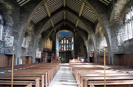
Left: The nave looking towards the east end. Note the enormous dimensions and the obvious strength of the concrete-based masonry. Note also the light falling on the benches from the large nave windows. Right: Looking towards west end you get an idea of the huge capacity of this church. This owes as much to Priestman’s demand for unfettered views of the altar and pulpit as to the enormity of the church itself. There are no arcades to interrupt the view. Unlike in many mediaveal churches, a parishioner “relegated” to one of the wall seats would have no complaint about feeling detached from the proceedings. Tilt your head (or your monitor!) through 180 degrees and see how much like the cross-section of the hull of a ship this nave is. Don’t blame me if you crick your neck! |
 |
 |
||||
 |
|||||
|
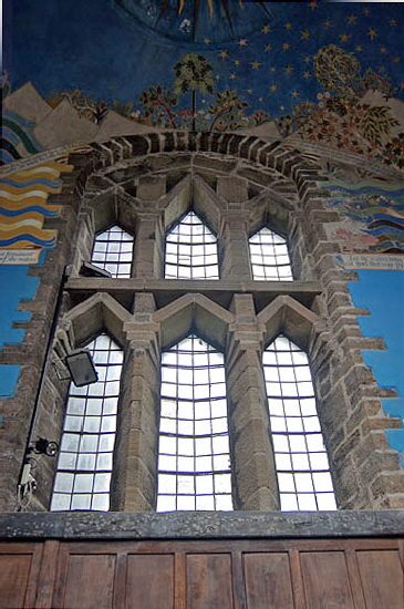
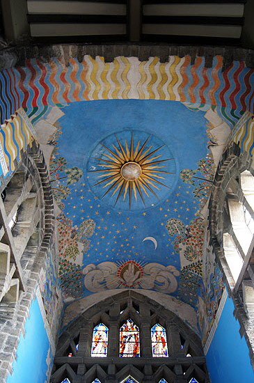
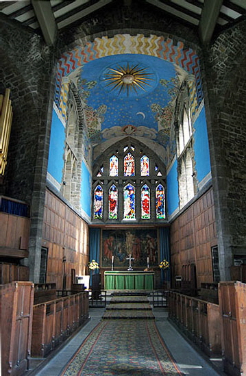
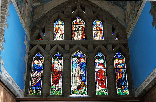
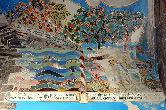
Left: The chancel’s narrowness makes for a lofty space. The east window fills the entire top half of the east wall. All of the windows are in the upper half and they are large making for a very light space. The east window seems to be pointing to the painted ceiling. Centre: The north chancel window. The pointed masonry is very Anglo-Saxon in derivation. Note, however, the small glass panes and the outward bow to each cluster. Right: Creation is the theme of MacDonald Gill’s painted ceiling. |
 |
|||
 |
|||
|
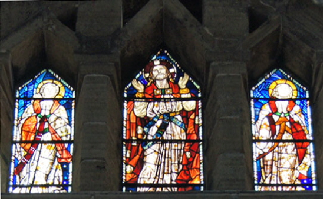
Left: This is detail of the chancel ceiling painting between the east wall (right) and the north chancel window to the left. It is elaborate and delightfully colourful: a real contrast with the (literally) doom-laden decoration of the mediaeval period. Sadly, however, the painting is deteriorating already. Doubtless is will be restored in due course. Right: The east window. Delicacy has been self-consciously eschewed. This is the sort of east window the Anglo-Saxons might have made had they the glazing technology and the desire! There is no mistaking those triangular-headed window lights. The glass itself is by AH Payne of Birmingham and depicts the Ascension. The apostles in each of the five lower lights lok up in awe to Christ in the upper middle light. |
|
|
||||||||||||
 |
|
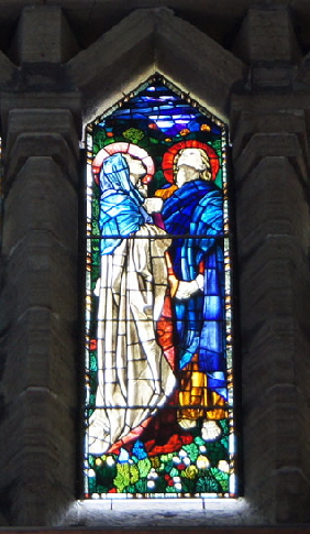
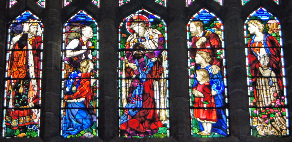
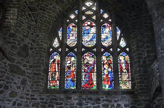
The lower panel of Payne’s Lady Chapel window. Here you can really see the contrast between this glass, produced consciously as a work of art, with the anonymous factory-produced mediocrity mass-produced in the Victorian era. Christ is depicted with humanity in his face and his posture. When did you ever see a picture of Christ embracing another? The scene is based upon the test “Come unto me all who are heavy laden and I will give you rest”. The figures, apart from Christ, are representative of all classes of Edwardian society. Note the mustachioed man with his backpack (second left) and the bearded man (second right). These are every bit Edwardian men with the facial hair of the period. The ladies are perhaps a little more idealised but nevertheless consciously of this |
 |
 |
|
Left: The Lady Chapel window. I have refrained from cropping this picture so you can see the the elaborateness of this church. It is not readily apparent as the senses tend to be overwhelmed by the scale of it all! Right: Burne-Jones’s Adoration of the Magi reredos. It is in archetypal post-Raphaelite style, particularly the central figure of the Archangel. The cross and candlesticks are of wrought iron by Ernest Gimson. |
 |
 |
||||||
|
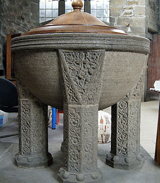
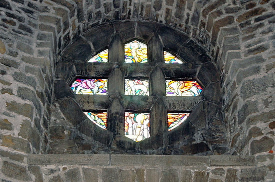
Left: The font is large enough for an immersion baptism. The decoration is Celtic in style but as a piece it is, of course, decidedly Arts & Crafts! The wooden cover is later and was a gift from the renowned Thompson of Kilburn whose famous mouse trademark is carved on the rim (and sadly not visible in this picture). Right: A circular window by Payne with an agnus dei in its central light. |
|||||||
 |
 |
||||||
|
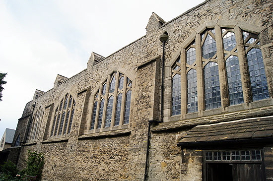
Left: The south side of the church. Note the windows bowed outwards. Right: The north side. The windows here are slightly larger. Note the buttresses integrated into both walls and very necessary to support the huge nave. It has to be said that nobody would call the church beautiful from the outside. |
 |
 |
 |
||||||||
|
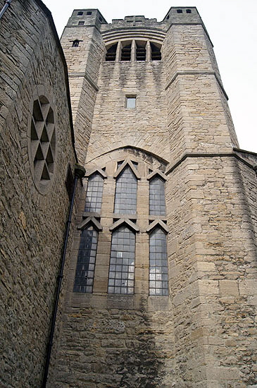
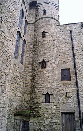
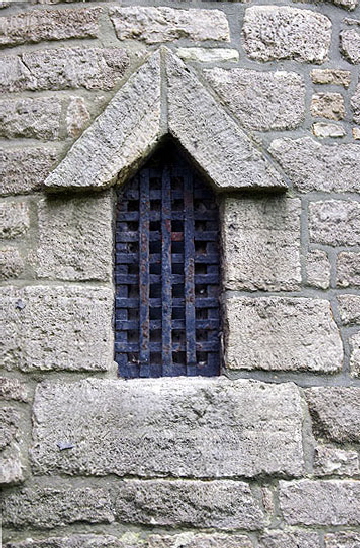
The tower is possibly unique in being situated at the east end of the church. I find the composition in the picture (left) rather odd. The lower window looks disconcertingly as if the pointed stone mullions have just been stuck on as a afterthought. This pointed arch is surmounted by a curved topped bell opening on the top an has a circular window to its left (see it from the inside in a picture above). Centre: The bell stair is lit by Anglo-Saxon looking pointed windows infilled by iron grilles. Right: A close up of one of the “Saxon” windows. The huge stone blocks that frame the window are also consciously Saxon in appearance. The angled slabs, however, are Saxon is shape only. Saxons tended to have much slimmer masonry here and the stones would not have protruded. There is no criticism implied here. The intention was never to copy Saxon architecture, only to suggest it. Art, not imitation. |
||||||||||
 |
||||||||||
|
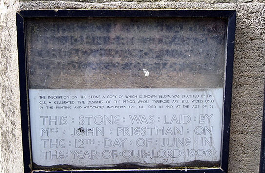
It is very clear when going round the outside of the building that it is already showing signs of wear and tear. This block perhaps proves the point. The original was by the legendary and now notorious Eric Gill who amongst other things was the giant of typeface design until his work was overtaken by the tidal wave of typographical monstrosities facilitated by the computer revolution. For more about Eric see Adel, Yorkshire. |
||||||||||
|
|
||||||||||
