|
|
||||||||||||||||||||||||||||||||||||||||||||||||||||||||||
|
Please sign my Guestbook and leave feedback |
||||||||||||||||||||||||||||||||||||||||||||||||||||||||||
|
Recent Additions |
||||||||||||||||||||||||||||||||||||||||||||||||||||||||||
|
|
||||||||||||||||||||||
|
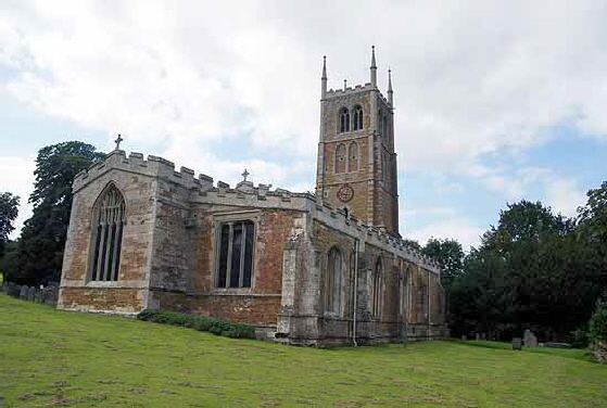
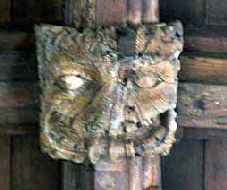
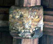
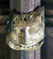
windows “look Dec”. That is debatable but he admits that they are bound to be as one with the arcade arches that the octagonal piers and their castellated capitals that are decidedly Perpendicular in style. Once again we find ourselves struggling with the bear trap of assuming that Decorated style somehow coincided neatly with a notional Decorated “period” when it is clear that no such hard chronological boundary existed. John Oakham’s presence and the connection of this church with those at Harlaxton and Denton is announced in a number of ways. Firstly, there is an exhibitionist label stop that is the same as one at Harlaxton. Indeed there is a second here in the same style. Secondly, there are flush gargoyles (those flat against the parapets) that are clearly in the same style as those at Harlaxton and in turn in similar style to his cornice frieze carvings elsewhere, Finally, something that eluded me until I was writing this page, the font here has the same design of stem as that which John Oakham very clearly carved at Muston. To all of these we can add the same plethora of goffered caul headdresses that we see at Harlaxton. .As always when discussing John Oakham and/or the MMG we have to ask the question of what they were doing here. In the case of Muston it was probably not a much other than the font. Here the answer is a great deal. John Oakham created sculptured label stops on both the clerestory and the south aisle. Almost certainly then, the group of which John was a member built that clerestory and re-fenestrated the south aisle. To allow the addition of the clerestory it was almost certainly this group of masons who changed the pitch of the north aisle roof. This notion of this comprehensive program of work is supported by the continuous run of battlemented parapets around aisles and clerestory. This leads us neatly on to the question of the tower. The Church Guide puts it at 1350-1400. Ignore that first date. Parish church building in England almost ground to a halt after the Great Plague of 1348. The 50% of masons left breathing were habitually conscripted onto royal projects. Patrons had died. The country was exhausted and frightened. 1380 maybe. 1350 is extremely unlikely. The Church Guide also notes what it calls the “peculiar ladies headdresses” that I call goffered caul headdresses. Bravo for noticing them at all. No other Church Guide I have read has done so. As explained elsewhere in the “Mooning Men” narrative I believe the fashion was a little earlier than this and this is supported by dated funerary monuments as well as by women’s costumiers I have consulted. I think 1420 might be two decades too late but really we cannot be definitive. Bring it back to 1400, however, and we are looking at very much the same era as that west tower. That would explain why its battlemented parapets are of exactly the same design as others on the church. I think I might be the first writer on churches that has noticed that not all battlements are the same! Furthermore there is a sub-parapet frieze here. This is not a tower with a broach spire such as at Muston which can rely on gravity for rain clearance: It has no spire and has a battlemented parapet. The sub-parapet cornice frieze is surely contemporary with the battlementing and very possibly the whole tower, Moreover, as we shall see, the frieze is almost identical with another at Claypole. Putting aside the John Oakham connection. What else is there to interest us here? Well, it may seem a little lame but this is a fine church in its own right and perhaps an exemplar of an English parish church that was largely remodelled in the Perpendicular style.. Its triple sedilia quite special but for myself the highlights are the grotesque wooden roof bosses.. |
|
The Church and John Oakham |
|||||||||||||||||||||||||||||||||||||||||||||||||||||||||||||||||||||||||||||
|
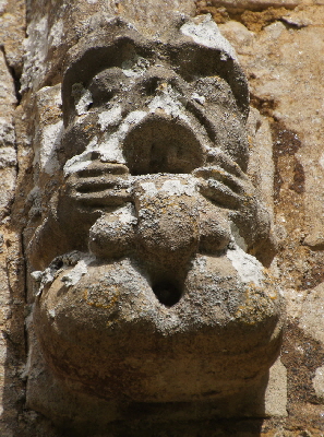
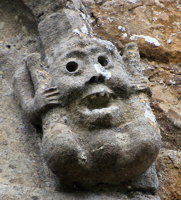
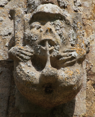
Only Harlaxton of the Triangle churches announces John Oakham’s presence with a “flea” carving. None of them, to reiterate, has a mooning man carving so we have to assume that John Oakham was at these churches either as an individual contractor or, far more likely, as a member of a team carrying out a variety of tasks. Despite the lack of a flea carving we can easily link Denton to Harlaxton through very explicit shared exhibitionist carvings and similar flush gargoyles that in turn recall the cornice frieze carvings he executed at such places as Oakham and Brant Broughton. |
|||||||||||||||||||||||||||||||||||||||||||||||||||||||||||||||||||||||||||||
 |
 |
||||||||||||||||||||||||||||||||||||||||||||||||||||||||||||||||||||||||||||
 |
|||||||||||||||||||||||||||||||||||||||||||||||||||||||||||||||||||||||||||||
|
Left and Centre: Legs behind the ears exhibitionist carvings at Denton. Right: A similar image at nearby Harlaxton. All of these obscene images are on label tops at ground level. There is no notion of concealment, as indeed there is not in the placement of mooning men imagery within the MMG area. Our forebears had considerably more robust attitude towards such things than we have today, which is odd when you think about the amount of sexualised imagery there is within the arts and the media. |
|||||||||||||||||||||||||||||||||||||||||||||||||||||||||||||||||||||||||||||
 |
 |
||||||||||||||||||||||||||||||||||||||||||||||||||||||||||||||||||||||||||||
 |
|||||||||||||||||||||||||||||||||||||||||||||||||||||||||||||||||||||||||||||
 |
|||||||||||||||||||||||||||||||||||||||||||||||||||||||||||||||||||||||||||||
 |
 |
||||||||||||||||||||||||||||||||||||||||||||||||||||||||||||||||||||||||||||
 |
|||||||||||||||||||||||||||||||||||||||||||||||||||||||||||||||||||||||||||||
 |
 |
||||||||||||||||||||||||||||||||||||||||||||||||||||||||||||||||||||||||||||
|
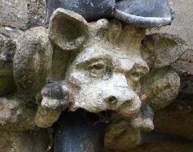
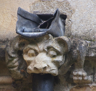
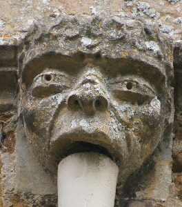
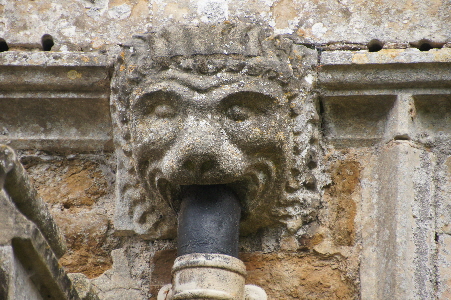
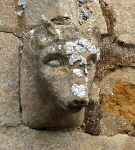
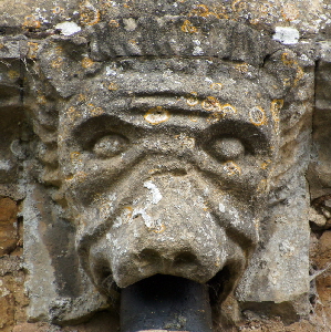
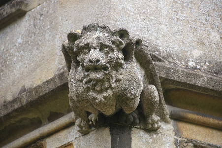
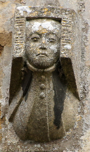
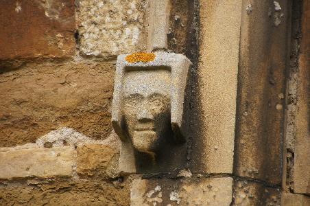
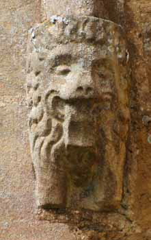
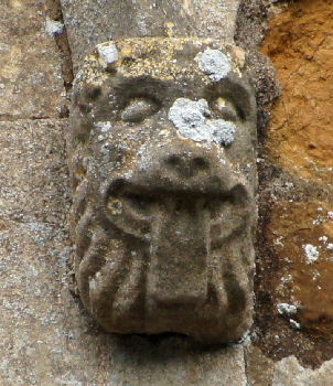
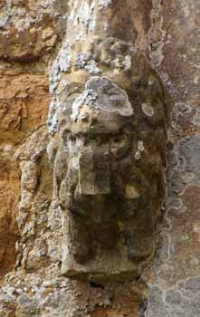
Various images of gargoyles and label stops around the church. In a whole bunch of ways they are reminiscent of Harlaxton (which, never forget is only about a mile away). In particular, note the two figures at the right of the top row with their humanoid eyes, cow-like ears and the little tuft of hair on the top of the head, These are very much John Oakham signatures. The fierce lion-like countenances of Oakham have now metamorphosed into mournful dog-like faces. John left these images from Oakham to Boston yet we have no idea what he thought he was carving. Sobering. Note also the goffered caul headdresses bottom row right. |
|||||||||||||||||||||||||||||||||||||||||||||||||||||||||||||||||||||||||||||
 |
|||||||||||||||||||||||||||||||||||||||||||||||||||||||||||||||||||||||||||||
 |
 |
||||||||||||||||||||||||||||||||||||||||||||||||||||||||||||||||||||||||||||
 |
|||||||||||||||||||||||||||||||||||||||||||||||||||||||||||||||||||||||||||||
 |
 |
||||||||||||||||||||||||||||||||||||||||||||||||||||||||||||||||||||||||||||
|
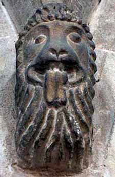
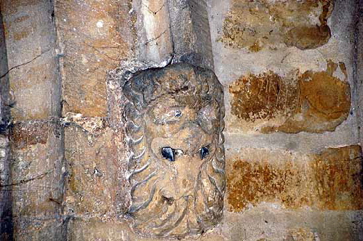
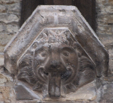
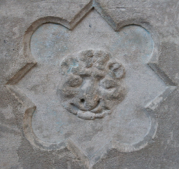
Let us now address the “what were the masons doing here?” question which is always so intriguing. What could a fifteenth century program of works at an East Midlands parish church look like? I have already suggested that at Denton the program was likely to have been a hefty one. Unwittingly the masons left us a great big clue. This church has many carvings but here at Denton we see a recurrence of a lion’s head with protruding tongue. The three left hand images are of external label stops. Top right is a lion carving on an arch spandrel inside the church. Bottom left is one of a pair of lion carvings on the south door. Bottom left we can see something very similar modified to create a corbel to support the nave roof. I have reproduced a handful here: there are several more. Oh my goodness! Let us think about this in detail. Arguably the most significant carving here is the one on the inside of the church. This indicates that alterations were taking place to the aisle arcades. Why would someone be messing around with arches? Well. it is a surprisingly unremarked fact that if you want to install a row of windows above the arcade to form a clerestory the chances are you are going to want to raise the nave walls. And if you raise the nave walls and leave the arcade arches at the same height you can end up with a rather peculiar look inside the church. This, I believe, accounts for the appearance of rather a lot of spandrel carvings above the arches. This had the the bonus of providing more space from the light from the aisles to penetrate through to the nave. And we can see from the lion label stops that the masons were installing Perpendicular style windows to the south aisle. I suspect that at the very least they were also changing the pitch of the south aisle to make it shallower. This would allow taller windows to admit more light, a development that would have complemented the raising of the arcades. This whole program was about light. Then we have the lion carvings on the south door. It looks like the masons replaced the original doorway too. Then there is the south porch. It has carvings that are clearly from the same sculptural stable as on the rest of the church. That would also, of course, explain why the masons were messing with the south doorway. If you need further confirmation it is worth looking at the battlemented parapets that are so often dismissed as being bog-standard and of little interest. All battlements are not the same. Here at Denton the same battlement design surround the church at both aisle and clerestory levels. Why have parapets at all? Because the new shallower pitches of the aisle roofs that match those of the new clerestory would have been leaded to compensate for poorer rain and (particularly) snow clearing properties. But leaded roofs without parapets are ugly (see Cottesmore and Hungarton) so parapets and gargoyles were the practical and decorative answer. What then of the tower? I have already suggested that it was likely to have been contemporary with these other works. Let us, though, take a look at the architecture. The tower arch at the west end of the nave is immensely tall. It could not possible have been that height before the nave walls were raised to accommodate the clerestory. That great height was also clearly designed to facilitate the transmission of flight through the huge Perpendicular style window of the west end of the tower. Clerestory, tower arch, tower, arcades: they all tell a tale of a single program - at hideous cost - to create a church of distinguished appearance and with every possible architectural contrivance to allow more light into the church. We haven’t quite finished with the tower yet. Firstly, on a general note, Denton shows the same evidence as at other churches in this study that Leicestershire ironstone was not the most durable - although it was the prettiest - choice for a part of a church that is necessarily exposed most to the elements. The limestone adornments have fared much better. The battlements are uniform with the rest of the church. Below this is a cornice frieze! This is exactly what we might expect of masons in this area - and in particular with any associated with John Oakham. At Harlaxton - where a flea carving definitively announced his presence - there is also a tower cornice frieze and one, moreover, in which John played a part himself, At Muston there is also a cornice frieze. That tower, however, has a broach spire that is self draining requiring no parapets, The frieze there is almost certainly contemporary with the original building of the tower a few decades before those at Denton and Harlaxton. The Denton frieze is distinctive and interestingly mirrors the one on Claypole Church tower where the is also an exhibitionist carving similar the one here. Whether John Oakham personally carved these friezes is a matter for debate, There is no doubt that the ear formations are reminiscent of John’s sculptures. Note also also a saltire-shaped fleuron (illustration below) and these are certainly found with remarkable regularity where John was a sculptor. Yet the frieze is very different one form that at Harlaxton upon which John obligingly left a flea carving. There are many mysteries and contradictions within the John Oakham and Mooning Men Group locations. This is one of them. |
|||||||||||||||||||||||||||||||||||||||||||||||||||||||||||||||||||||||||||||
 |
|||||||||||||||||||||||||||||||||||||||||||||||||||||||||||||||||||||||||||||
 |
|||||||||||||||||||||||||||||||||||||||||||||||||||||||||||||||||||||||||||||
 |
|||||||||||||||||||||||||||||||||||||||||||||||||||||||||||||||||||||||||||||
 |
|||||||||||||||||||||||||||||||||||||||||||||||||||||||||||||||||||||||||||||
|
Top Two Rows: Frieze on Denton Church Tower. Bottom Two Rows: Frieze on Claypole Church Tower |
|||||||||||||||||||||||||||||||||||||||||||||||||||||||||||||||||||||||||||||
|
Muston Font |
|||||||||||||||||||||||||||||||||||||||||||||||||||||||||||||||||||||||||||||
 |
|||||||||||||||||||||||||||||||||||||||||||||||||||||||||||||||||||||||||||||
 |
 |
||||||||||||||||||||||||||||||||||||||||||||||||||||||||||||||||||||||||||||
|
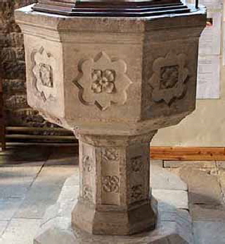
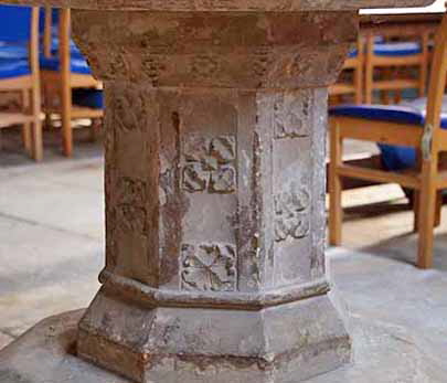
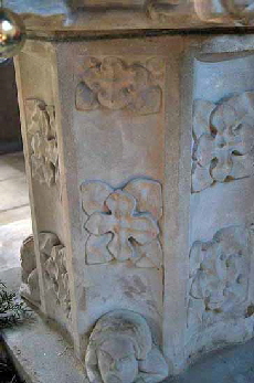
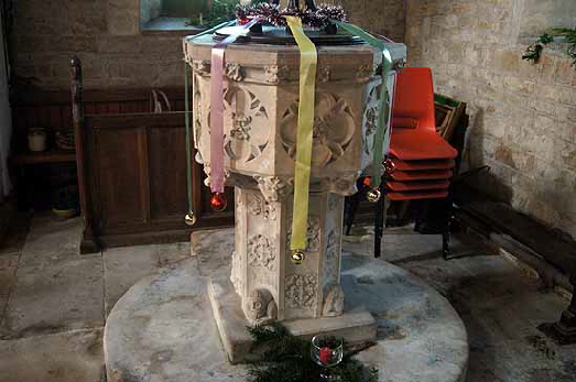
Denton’s font is a strong contender for “England’s Most Boring Mediaeval Font” (Victorian fonts have their own fiercely-contested category). The octagonal bowl (left) and stem (centre) are adorned - if that is the word - by shallowly-carved and repetitious fleurons. The monotony is slightly relieved by one very odd grotesque face (right). I have long asked myself if it is a whimsical version of one of John Oakham’s “cow-lion” heads. Confirmation Bias is a real danger in comparing sculpture so I resisted the notion as wishful thinking, Now, when I was in the early days of my long career in management, one of the mantras I was made to work under was “if you haven’t written it down, you haven’t thought it out” and I have found that to be true through much of professional life. It was only when I was “writing down” about nearby Muston Church and Denton that I realised that the stems of their fonts are remarkably similar in their fleuron-bedecked fonts. THat Muston’s font is by John Oakham I have no doubt whatsoever. Now I am 90% certain that je carved this one at Denton as well. |
|||||||||||||||||||||||||||||||||||||||||||||||||||||||||||||||||||||||||||||
 |
 |
||||||||||||||||||||||||||||||||||||||||||||||||||||||||||||||||||||||||||||
|
Muston Font |
|||||||||||||||||||||||||||||||||||||||||||||||||||||||||||||||||||||||||||||
|
Muston - The Church. |
|||||||||||||||||||||||||||||||||||||||||||||||||||||||||||||||||||||||||||||
 |
 |
||||||||||||||||||||||||||||||||||||||||||||||||||||||||||||||||||||||||||||
|
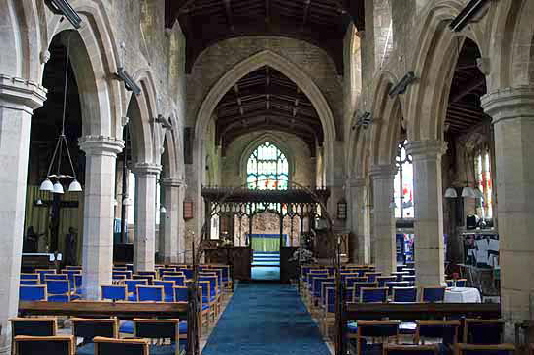
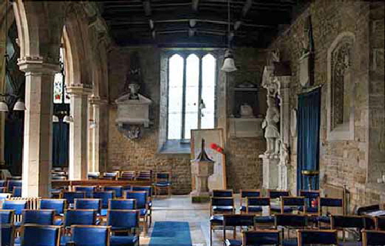
Left: Looking towards the east. The luminosity of the church demonstrates the success of the building program carried out by John Oakham and his colleagues. Light enters at every angle. Note the tall arcade columns with High Gothic octagonal profile and battlemented capitals. The arches are comparatively narrow. Note also the way that the points of the arches almost reach the level of the base of the clerestory. Right: :Looking to the west end of the south aisle. This is a spacious aisle sporting windows to east and west that seem to both have been fitted during the shallowing of the roof. Note the font. |
|||||||||||||||||||||||||||||||||||||||||||||||||||||||||||||||||||||||||||||
 |
 |
||||||||||||||||||||||||||||||||||||||||||||||||||||||||||||||||||||||||||||
 |
|||||||||||||||||||||||||||||||||||||||||||||||||||||||||||||||||||||||||||||
|
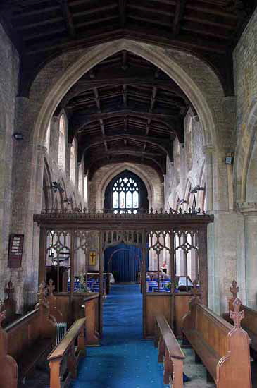
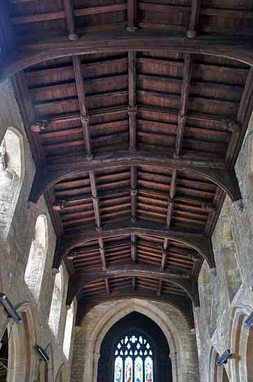
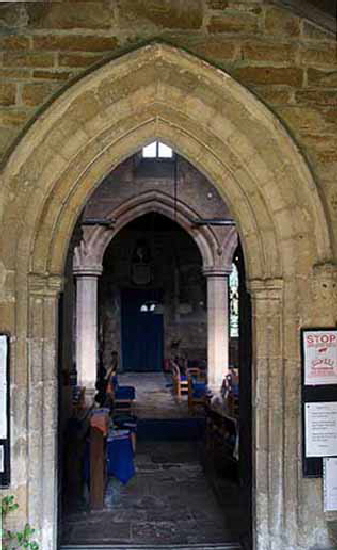
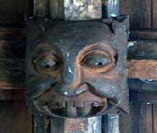
Left: Looking through the south door to the arcade beyond. Both capitals have tongue-poking lion sculptures. Centre: Looking from the chancel towards the west end. Note the loftiness of both chancel and tower arches. The screen is original and tradition has it that it was damaged by fire shortly after it was built. Right: The nave ceiling. The bosses are spectacularly grotesque in keeping with the church’s sculptural carving. |
|||||||||||||||||||||||||||||||||||||||||||||||||||||||||||||||||||||||||||||
 |
 |
||||||||||||||||||||||||||||||||||||||||||||||||||||||||||||||||||||||||||||
 |
|||||||||||||||||||||||||||||||||||||||||||||||||||||||||||||||||||||||||||||
 |
|||||||||||||||||||||||||||||||||||||||||||||||||||||||||||||||||||||||||||||
 |
|||||||||||||||||||||||||||||||||||||||||||||||||||||||||||||||||||||||||||||
|
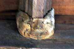
A selection of grotesque roof bosses from the nave. |
|||||||||||||||||||||||||||||||||||||||||||||||||||||||||||||||||||||||||||||
 |
 |
 |
|||||||||||||||||||||||||||||||||||||||||||||||||||||||||||||||||||||||||||
|
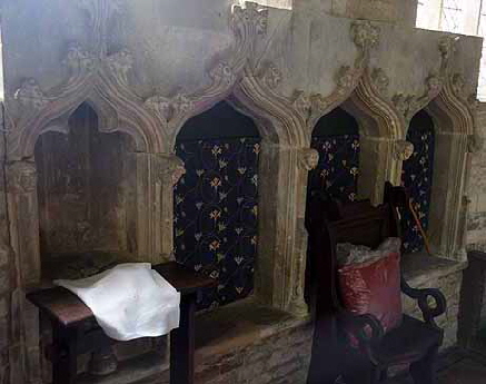
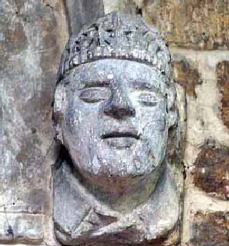
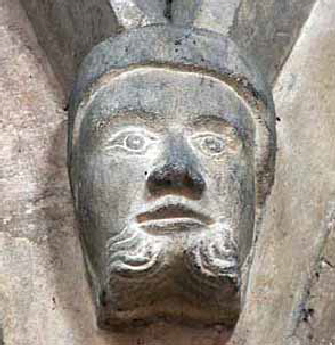
Left: A terrible picture of the very impressive triple sedilia. Centre and Right: Spandrel carvings between the arcade arches. Is the centre on a bishop? |
|||||||||||||||||||||||||||||||||||||||||||||||||||||||||||||||||||||||||||||
 |
 |
||||||||||||||||||||||||||||||||||||||||||||||||||||||||||||||||||||||||||||
|
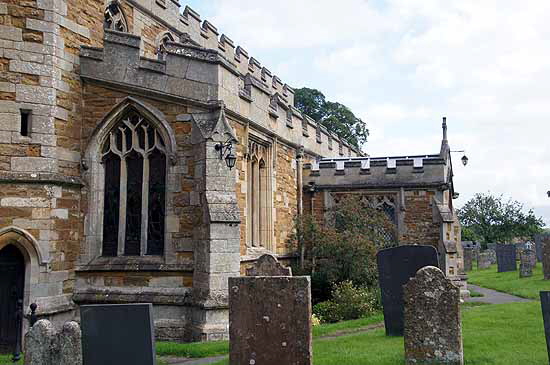
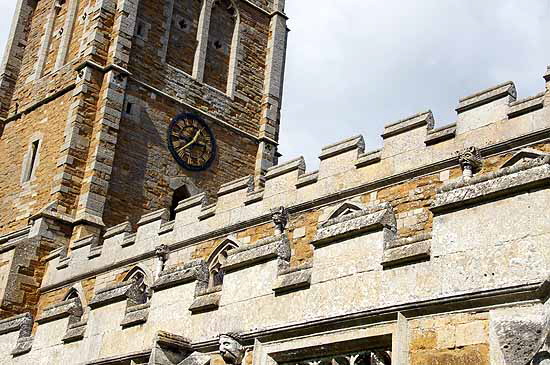
Left: The west end of the south aisle. It is very narrow so I think this must be the original structure of Early English vintage. The west window, however, is clearly later in the Perpendicular style and its height suggests that the pitch of the roof was raised during the John Oakham program of work. The south porch is quite a deep one and its parapets and battlementing are as one with the rest of the church. This suggests that the church preferred a deeper porch (an important place of church business in mediaeval times) to a widened aisle. You can see label stops on every window. Right: Again we can see the commonality in design of the parapets of south aisle and clerestory. Note also the array of flush gargoyles by John Oakham. |
 |
 |
|||||||||||
|
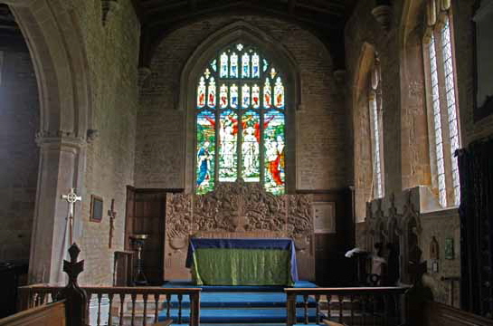
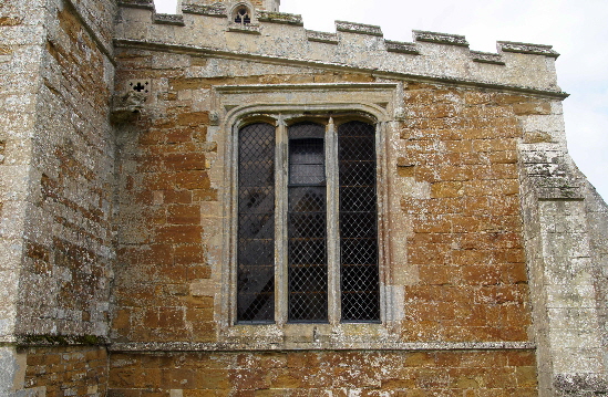
Left: The chancel, Right: The east end of the south aisle where a rectangular three light window replaced an Early English triple lancet. |
||||||||||||
 |
 |
|||||||||||
 |
||||||||||||
|
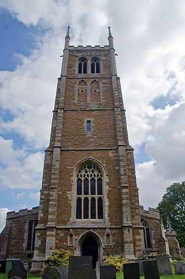
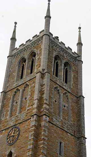
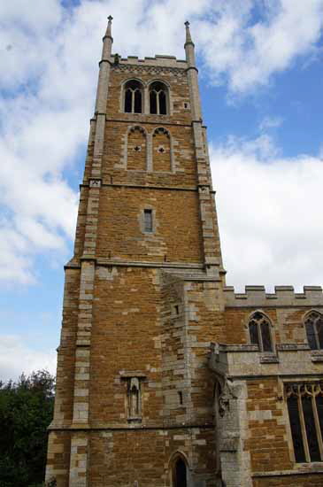
Left: The west end of the tower, It is a very fine construction. The west window is, as previously, discussed an exceptionally large one. There is a west door and there are empty now-niches to either side. That it was constructed as a piece - much more frequently stages were added gradually - only serves to enhance its handsome appearance. Centre: The top stages of the tower. The pinnacles are plain. Right: The tower from the south.. |
||||||||||||
 |
||||||||||||
|
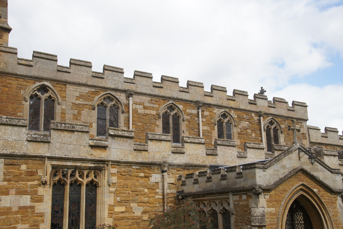
Apologies for one final view of the south aisle and clerestory. The reason it is here is to emphasise the amount of sculpture on the church. Each window has two label stop carvings. We can see flush gargoyles to aisle and clerestory. On the porch we can see corner sculptures there just for the hell of it. Interestingly, if I were to put the same photograph of the north side you would not be seeing much of the clerestory and only the tops of the label stops and even then only where there are gaps in the battlements. That aisle is built on a very steep slope (see picture top of page) and it makes visibility darned near impossible. I haven’t often wished I was six and a half feet tall! |
||||||||||||
