Please sign my Guestbook and leave feedback

Recent Addition

Sapperton (Gloucestershire)

Little Kimble (Buckinghamshire)

Wellingborough, St Mary (Northants)

Checkley (Staffordshire)

North Leigh (Oxfordshire)

Slapton   (Northants)

Turvey (Bedfordshire)

Ruardean (Gloucesterhire)

Great Kimble (Buckinghamshire)

Carlton (Bedfordshire)

Gosforth   (Cumbria)

Stamford Church Trail (Various)

Middleton (Yorkshire)

Harby (Leicestershire)

Worth Matravers (Dorest)

Kingston on Soar (Nottinghamshire


Crosscanonby

Dedication : St John             Simon Jenkins: Excluded                                  Principal Features : Pretty Church of Norman Origins; Unusual Alabaster Font

Crosscanonby Web

Close to the west coast of Cumbria, Crosscanonby is an out-of-the-way little place. It’s a turning off the A596 road between Carlisle and the old shipbuilding town of Maryport.  I always feel that Cumbria - a county with which I am very well acquainted - is one of great contrasts. If you mention Cumbria people immediately conjure up a vision of the Lake District, fell walking and Arthur Ransome. The National Park is indeed a beautiful and thriving place. Yet the Cumbrian coast is another world. The shipbuilding industry and its associated trades has all but vanished, leaving an area struggling to create new job opportunities and conspicuously poorer than the tourist area.

The church crawler or student of  history will, however, find much of interest. This is a land of Romans, of early Celtic Christianity and of border skirmishes. Indeed, the churches outside the National Park are very much more interesting, on the whole, than those within it, the latter  having been “discovered” by the well-intentioned but often hopelessly misguided Victorians.

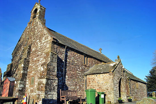
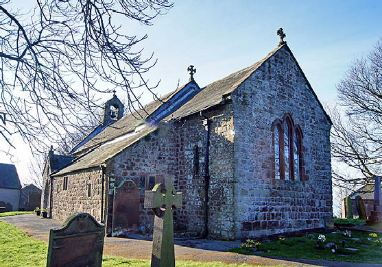
Crosscanonby, as the name implies, was an outpost for canons of Carlisle Cathedral. The present building dates from around AD1130 but the presence of Anglo-Saxon and Viking fragments suggest that this was probably not the first. The red sandstone blocks, as is common hereabouts, were probably pilfered from an abandoned Roman building. The south aisle was added in the thirteenth century with a tiny chapel to the east.. The very unusual font may also date from that time although Pevsner favoured the fourteenth century.

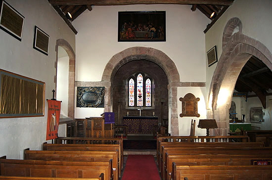
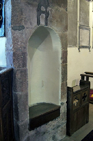
As Pevsner put it, “the interior is full of good things”. The unadorned round chancel arch is conceivably Roman in origin. Its impost blocks continue throughout the width of the nave. Very unusually, there are niches with seats set into both sides of the archway. What were they for? Perhaps the very shallow chancel was just too small to accommodate the canonical clergy? They have a very classical look to them. Were they part of the putative original Roman archway?

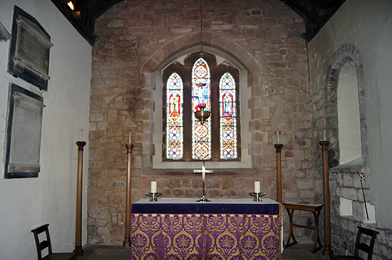
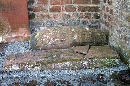
The aisle is separated from the nave by a single wide arch with crude grotesque faces at each of its springers.. Above it are the remains of a  Norman window. The south window of the chancel is also Norman. The east window of faux Early English design presumably dates from the restoration of 1880. The porch houses a hogs back tomb of Viking provenance and the battered remains of a tenth century cross.

Crosscanonby (4) Crosscanonby (5)

Left: Looking east. The chancel arch is Norman but may have been recycled from an abandoned Roman building. ”Romanesque” indeed! Note the way the impost blocks are extended to the north and south walls. To the right is the hefty single arch to the thirteenth century south aisle. Note the remains of a Norman window above this arch. Right: The tiny chancel. Note the original Norman window to the right. To either side of the Victorian east window you can see the remains of the original Norman window group.

Crosscanonby (11) Crosscanonby (16)

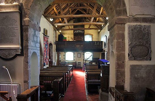
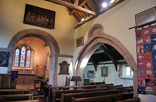
Left: looking through the chancel arch to the west end of the church. Note the unusual - maybe unique - niche seats set within the chancel arch itself. The west gallery has survived. In the west wall there is a rather curious arrangement of three rectangular windows set within slightly arched rebates. Right: A single wide arch consitutes the “arcade” through to the south aisle. Above the chancel arch is a painting of “The Last Supper”, believed to have painted by Mathias Read in 1717.

Crosscanonby (6) Crosscanonby (7)

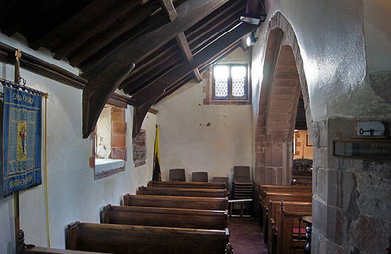
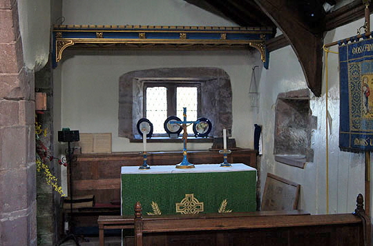
Left: The shallow south aisle. Most church aisles were enlarged during the fourteenth and fifteenth centuries but a few like this one remain unchanged. The width of aisles at this time were constrained by the angle of the roof slope. Winters at this time were much more severe than they are today. If the pitch of the roof was too shallow then snow would settle for long periods weakening the structure and allowing ingress of meltwater. The height of the nave walls would limit the actual height of the aisle roof. If the height of the aisle roof was thus constrained, and the pitch of the roof was constrained by considerations of snow then the width of the aisle was by geometric necessity similarly constrained. Think about it! What changed the game was the greater availability of lead which was much more weatherproof. Mediaeval lead sheets were much thicker than we have today. Whereas timber roofs needed a steep pitch, lead roofs needed a shallow one so that the lead did not “creep” down the roof under its own weight. Thus lead and wider aisles went happily hand in hand during the later mediaeval period. Right: The tiny east chapel at the end of the south aisle. The many rectangular windows give the church a somewhat “domestic” look. I find these small unpretentious leaded windows much more aesthetically satisfying than the late Gothic (and Victorian Gothic) rectangular windows with their tracery. Tracery never looks “right” on a rectangular window in my view and many a mediaeval church has been disfigured by the insertion of such a window in a wall with a run of arched windows.

Crosscanonby (14) Crosscanonby (15)

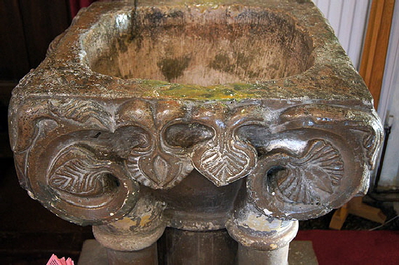
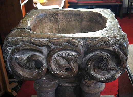
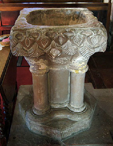
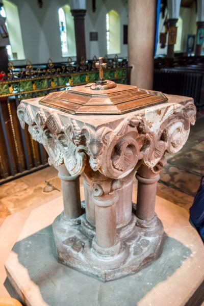
Left and Right: The font is made of alabaster. It’s a curious design and I have never another quite like it. On all four sides are these deeply undercut foliate decorations. The bowl itself has been crudely scooped out yet the decoration is, albeit chunky, very nicely executed. the consensus seems to be that it is thirteenth century. Pevsner puts it at fourteenth century but I’m with the consensus for once. The stiff leaf carving is reminiscent of that found on Norman capitals although it is clearly not Norman. It seems to inhabit some kind of transitional zone between the exuberant anarchy of Norman font design and the altogether much too well-mannered (for my taste) designs that characterised the High Gothic period. This font, though, is a mystery (and I do so love those!). See the footnote below.

crosscanonby cross
Crosscanonby (13)
Crosscanonby (8)

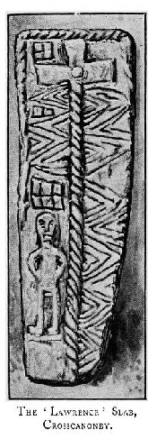
Left: Another view of the font. Centre: One of the niches of the chancel arch, complete with seat. It doesn’t look very comfortable. Right: This is a print from a Victorian book (out of copyright) that has an artist’s impression of the pre-Conquest “Lawrence” grave slab that is housed in the porch here - and whose design is very hard to distinguish in the flesh, as it were. It is called the Lawrence slab because it is believed to be the image of St Lawrence who was martyred by being cooked on a griddle, an image of which is above the man’s head. The ingenuity of those executing early Christian martyrs knew no bounds it seems. It was certainly dead useful for carvers in wood and stone who could thus depict their otherwise anonymous saints in a way thate people could supposedly recognise.

Crosscanonby (3) Crosscanonby (2)

Left: The hogs back gravestone. Right: The church from the south west.

Footnote - The Alabaster Font

I confess that I didn’t even notice on my first visit that the font was made of alabaster rather than of stone. It really is not obvious at all. Both Pevsner and the Carlisle Diocese website say that it is so I’m sure it’s a fact.  I do not remember ever seeing a mediaeval alabaster font before so I did a bit of digging. As I suspected, it is vanishingly rare. I consulted the font collectors oracle - Francis Bond’s “Fonts and Font Covers” - and he has a section on materials other than stone. He mentions lead, pewter, gold, silver and brick - but not alabaster which does not even have an entry in the index. In fact I haven’t been able to unearth a single example anywhere - which is not to say there aren’t any but if there are then nobody is shouting it from the rooftops. I emphasise here that I am talking of pukka mediaeval fonts, not sixteenth century and later.

We are all used to seeing alabaster monuments in churches but these generally post-date the supposed date of Crosscanonby font by a century or two. Its use only became fairly common in the fourteenth century and I think it fair to say that it’s main use in churches has been for effigies of the great and the good and, therefore, the well-heeled. There is no shortage of stone in Cumbria, to put it mildly, so why on earth was alabaster used in this out of the way spot? Most monumental alabaster - “a hydrous sulphate of calcium”  - in this country is found in Derbyshire, Nottinghamshire and Staffordshire in what are known as the Keuper beds and it’s darned expensive. That’s before you take into account the cost of transportation to Cumbria.

However, it turns out that alabaster was also found in Cumbria itself. There are remains of workings at a place called Barrowmouth which is close to Whitehaven on the Cumbrian coast. Whitehaven is just seventeen miles from Crosscanonby and most of the route could be by sea. Interestingly, there seems to be considerable vagueness about when it was operational. Certainly I have seen no source that suggests that alabaster or gypsum was being extracted as early as the thirteenth or fourteenth centuries. Yet it seems almost inconceivable that the alabaster at Crosscanonby came from anywhere else.With great economy, Pevsner noted that the Crosscanonby font was “C14 like Aspatria”. Why did he mention Aspatria? Well,  Aspatria, whose church is considerably bigger, is only six miles away so that could have been the reason. Much more likely in my view, was that Pevsner was drawing attention to the stylistic similarity of the two fonts. Without saying so, he implies that Asptaria’s font too is of alabaster. Just to confuse us though he doesn’t mention it in Aspatria’s entry and then goes on to say “c13 (my italics) like the one at Crosscanonby...”. Thanks for all that Nicky, baby.

In 2023 I had the pleasure of meeting with Ray State, author of the monumental work “The Alabaster Carvers”. Ray’s local church is Ratcliffe-on-Soar in Nottinghamshire and it boasts several alabaster monuments and this prompted him to do an exhaustive study of the use of alabaster in English churches. Appendices list every known usage of the material, but he does not list the fonts at Crosscanonby or Aspatria. The “problem”, if that is the right word, is that they may well predate any other use of alabaster inside English churches. Ray awards “first use” to a thirteenth century monument at Dorchester-on-Thames in Oxfordshire. The first he can positively date is at Gloucester Cathedral between 1327-30. However. he acknowledges that alabaster was used on the decidedly Norman  west doorway of Tutbury Church in Staffordshire.

We know, then, that alabaster was in use by church builders in England in the Norman period, albeit on what we might call an experimental basis. So the Crosscanonby and Aspatria fonts are not quite the aberration they might at first seem. However, there is no record of alabaster quarrying in Cumbria before the eighteenth century. We must counter this by saying that the lack of records from a twelfth century attempt at quarrying is hardly surprising. And alabaster can occur as outcrops or as part of cliffs that do not require extensive quarrying, although the blocks used here would be large by any standards. The Cumbrian alabaster deposits are near Workington. But we need to be careful. It is impossible to know  where small uncommercial quantities might  been found all those hundreds of years ago.

Ray State was sceptical about the dating of these fonts, feeling that a fourteenth century date would be much more plausible. To which I can only say “no way”! Both fonts with their extravagant foliate designs are stylistically capable as being dated to the thirteentth century, especially as it is reasonable to suggest  that the extreme north west of England might have been a little behind in adopting new styles. If so, however, I would postulate them as very early thirteenth century. The Aspatria font has a huge grotesque animal figure, quite out of keeping with early Gothic style. I have seen 1160 suggested, The Corpus of Romanesque Architecture in Britain and Ireland believes, as do I, that both fonts were possibly carved by the same hand. They believe them to be late twelfth or early thirteenth century, according with my own view. Pevsner’s dating of the fourteenth century seems perverse and I can only assume that he was influenced by the contemporary view of when alabaster was first used in English churches.

 I found a reference in the records of Holm Cultram Abbey - an important Cistercian house on the Solway Firth - this entry : “Alice de Romelye, daughter of William f. Duncan, in her widowhood grants to Holmcoltran a quarry in a field called Sandwath in Aspatric for building purposes, with right of way, three acres of her demesne in Aspatrik in Northcroft between the crofts formerly of Henry and of Geoffrey, and common pasture for ten oxen, ten cows, one bull, two horses and 40 (or in one MS. 60) sheep” Intriguingly, then, there was an extant  quarry near Aspatria itself as early as 1223! What is more it was passed into ecclesiastical ownership. I have not been able to discover what was quarried there but it is near enough to the Workington keuper marl beds (where alabaster is found) to beg the question whether this was the source of the alabaster for the two fonts? We might postulate that a monastic establishment might have been better placed to commission such fine work. Again, though, it needs to be said that Crosscanonby is extremely close to another important monastic site at St Bees which is a coastal site. The mystery remains. Either way, as far as I can tell, these two fonts are the earliest uses of alabaster in English church furnishings. Which is very exciting!        


Aspatria Font 1


Aspatria Font