|
Alphabetical List |
|
|
|
|
|
|
|
County List and Topics |
|
|
|
Please sign my Guestbook and leave feedback |
|
|
||||||||||||||||||||
|
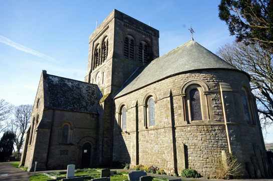
located at the east end of the south transept. It is an impressive building in my view, but severe in aspect. Driving around the towns in the area there is or has been a strong non-conformist tradition in the area and doubtless this culture of austerity influenced the builders here. It is the font, however, that it what people came to see, and it is no surprise that there is no Church Guide available, only a rather tattered description of the font. It is unlike any font I have seen elsewhere. It is square in plan, each side divided into two or three lateral decorative panels. Sadly, the font is located just inside the south door and so close to the wall that one side cannot properly be seen. With an ultra wide angle lens I managed to capture most of it, but it frustrating that nobody has seen fit to move it to a place where all of it can be seen. This page is largely about that font but the church does have a certain grandeur of its own. |
 |
 |
||||||||||||||||||||||||
 |
|||||||||||||||||||||||||
 |
 |
||||||||||||||||||||||||
|
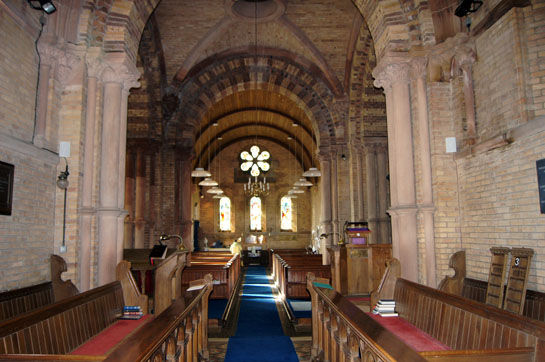
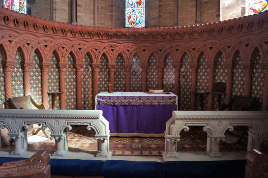
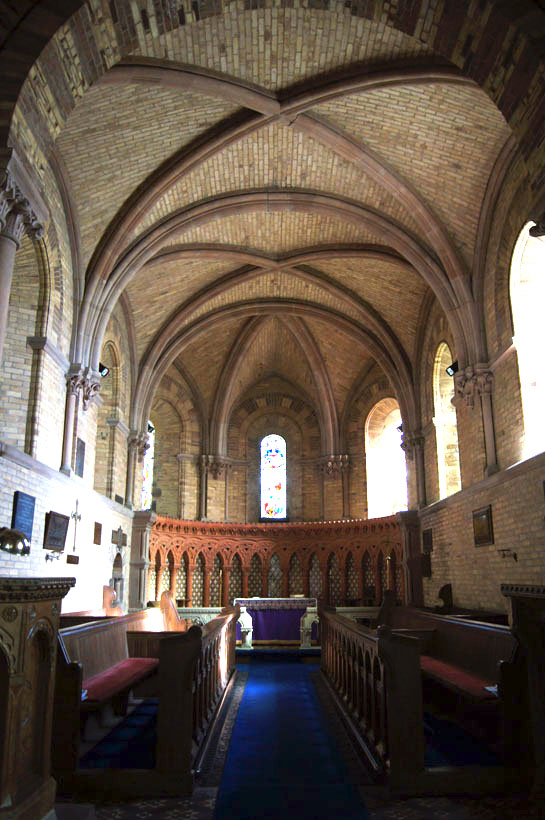
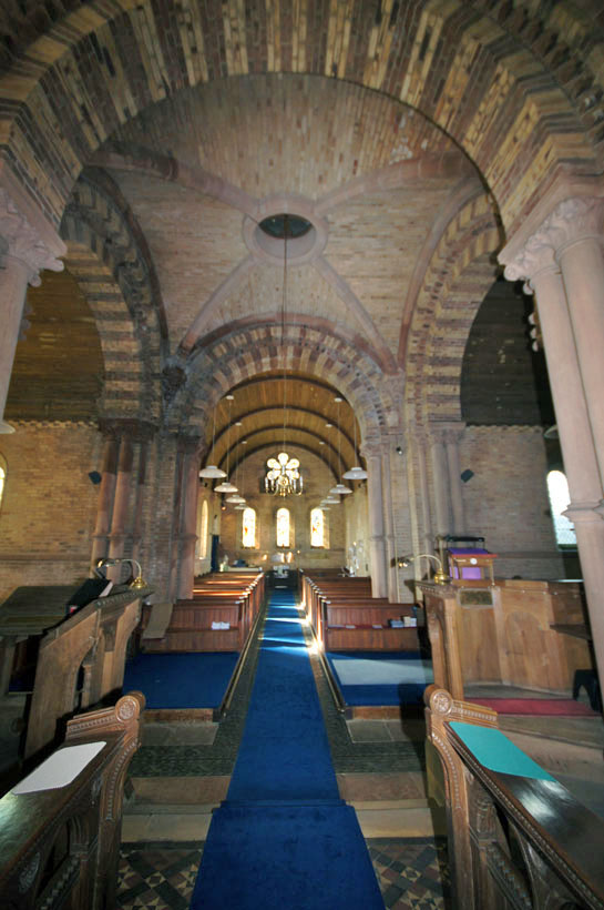
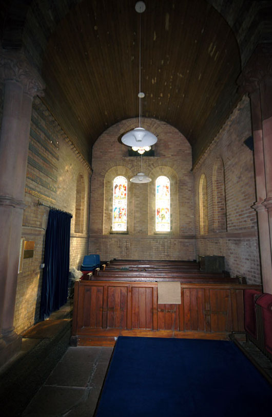
Top Left: Looking from the choir towards the west end. Top Right: The reredos is a beautiful course of blind arcading carved in what looks like red sandstone. The patterned infill is very effective. This is a neo-Norman church, not an original one, and the builders have, to my eyes, created something very striking and we should not underestimate the challenge of building it to an apsidal profile. Above Left: The choir and chancel. The rib faults are also finely executed although the builders have avoided putting Norman dogtooth or chevron patterns to the ribs. I guess it’s a matter of taste but to my eyes, again, there would be nothing to be gained in trying to pretend this was an original Norman building. Above Centre: Looking through the crossing to the west end. It is interesting that the builders used alternate colours of brick in building the arches. It gives them a rather Moorish look such as one sees at the mosque in Cordoba, Spain. Above Right: One of the transepts. |
|||||||||||||||||||||||||
 |
|||||||||||||||||||||||||
 |
|||||||||||||||||||||||||
|
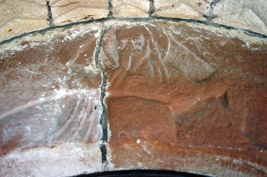
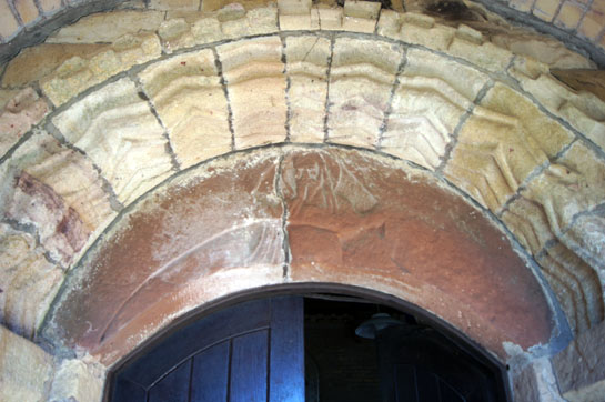
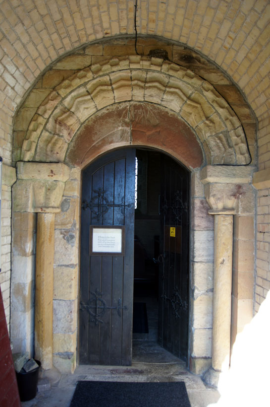
Left and Right: The south doorway is from the original Norman structure and it has a carving on its tympanum. It seems pretty clear that the figure is Christ as his halo is easy to see but it is hard to make out any more detail. A crescent shaped tympanum is unusual, although not unique, and one wonders whether it has been re-shaped during the rebuilding. |
|||||||||||||||||||||||||
 |
|||||||||||||||||||||||||
 |
 |
||||||||||||||||||||||||
|
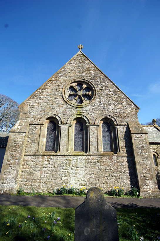
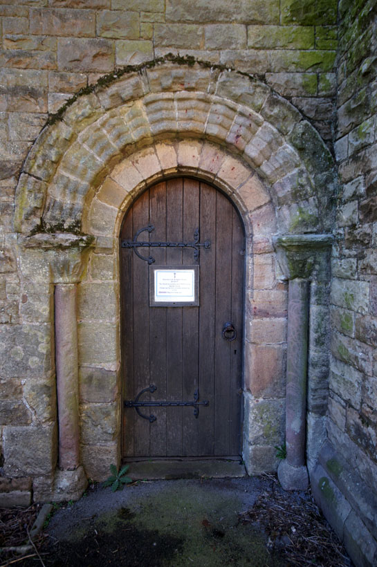
Left: The south doorway. Centre: The east end, complete with wheel window. It should be noted, of course, that the windows on this Victorian church are considerably larger than Norman ones would have been. My photographs interior photographers have been doctored a little to improve the light so that you can make our more detail. In fact it is much darker than it appears in spite of the enlarged windows. Right: The Norman doorway on the eatsern side of the south transept. |
|||||||||||||||||||||||||
 |
 |
||||||||||||||||||||||||
|
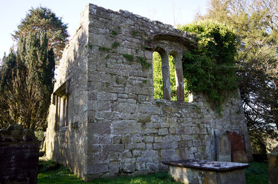
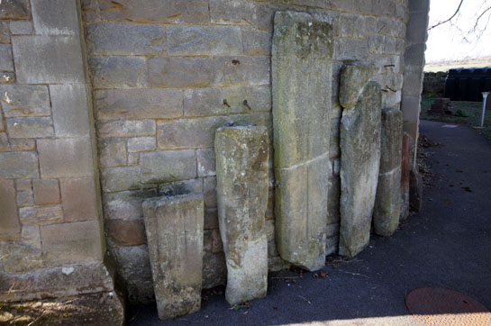
Left: Remains of the original church. Right: The new church has a number of ancient coffin lids, presumably found during the rebuilding. |
 |
||||||
 |
||||||
 |
 |
|||||
|
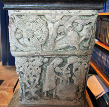
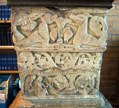
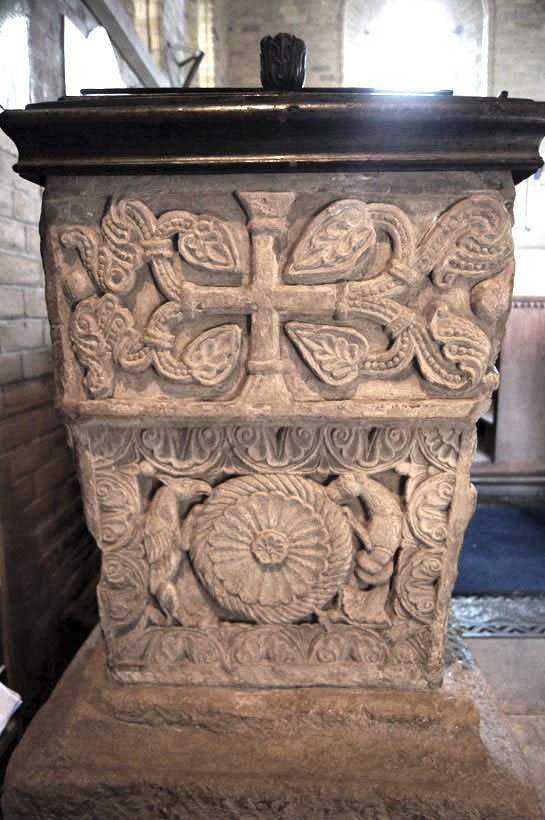
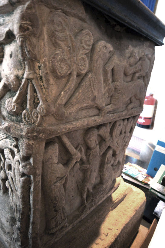
The four faces of the font clockwise from the top left: east face, north face, west face (view restricted by closeness to wall) and south face. |
|
The East Face |
|
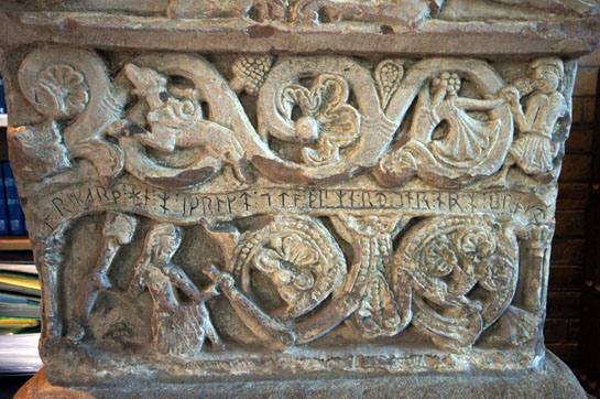
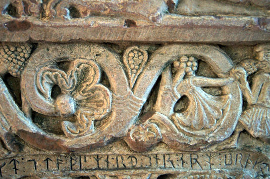
The east face is the one that excites historians because it has clearly legible writing in runic script and is perhaps the best surviving example in England. An approximate translation is “Rikarth (or Ricard) he made me and brought me to this splendour”. So we know of the man who made the font! Runes are a Germanic script form and so would have been known and used by the Angles, Jutes some and the other tribes that invaded Britain after AD430 - but not by the Saxons. The same is true of many of the Norsemen so it is hardly surprising that runes became the common script for communication amongst the non-scholars of England. This font is believed to date from around 1150, so this is a very late example emphasising Bridekirk’s “far flung” nature 90 years after the Conquest. |
|||||
 |
|||||
 |
|||||
|
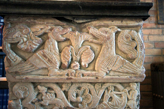
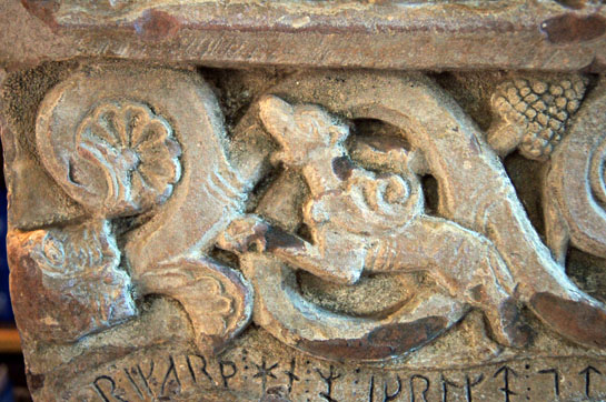
Left: The top panel. The church’s own guide to the font talks of “two affronted dragons” or alternatively “senmurvs” - dog headed griffins from Mesopotamian mythology. Right: Here we can see the runic script separating the central and lower panels. Runes tend towards vertical symbols thus allowing users to carve along the grain of wood or stone. The centre panel has a mass of grape vines.. On the left a wolf or dog appears to be leaping out. On the right a man eats a bunch of grapes. In the lower panel we see on the right an unusual image of a mason at work, presumably based upon Rikarth himself. Note the size of the mallet and chisel that he holds. It is eloquent testimony to the crudeness of the tools with which early masons created their miracles. Left and Right Below: Close ups of the lower bottom course and the runes |
 |
 |
|||||||||||
|
The North Face |
||||||||||||
 |
 |
|||||||||||
|
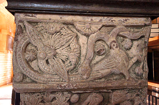
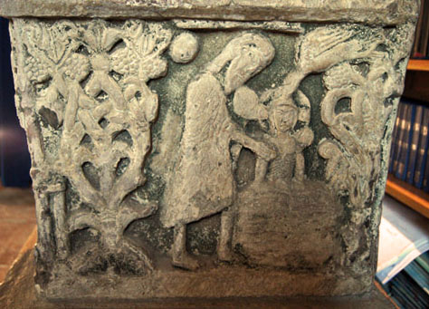
There are two panels to this side of the font. The upper portion (left) has a monster with two serpent-like heads, the left of which is biting the creature’s own body. By contrast, the lower panel (right) shows John the Baptist immersing a somewhat peeved-looking Christ while the Holy Ghost in the form of a dove touches his head. The remainder of the composition is of the usual tangled vines and grapes. |
||||||||||||
|
The South Face |
||||||||||||
 |
||||||||||||
 |
||||||||||||
|
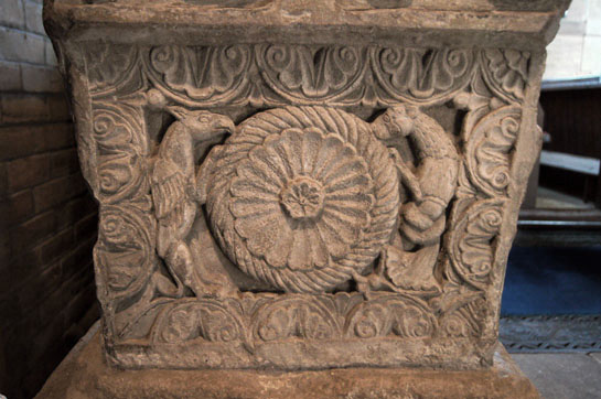
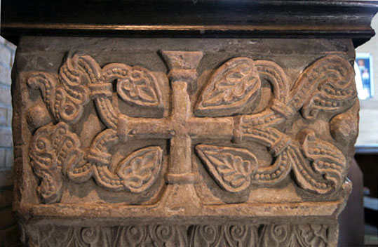
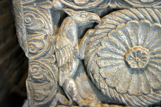
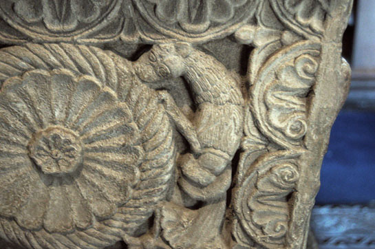
Left: A Greek cross bedecked with acanthus leaves. The church suggests that this derived from the Easter rite whereby a plain cross was taken into the church to be replaced by one with jewels and leaves to represent Christ risen. Right: The lower panel is quite classical. Two types of griffin flank a large floral roundel. |
 |
 |
||||||||||||
|
The two griffins. The right hand one is clearly a vegetarian and a bit peckish! |
|||||||||||||
|
The West Face |
|||||||||||||
 |
|||||||||||||
 |
|||||||||||||
|
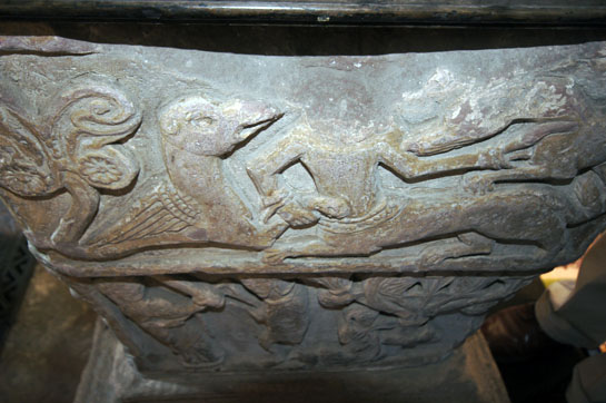
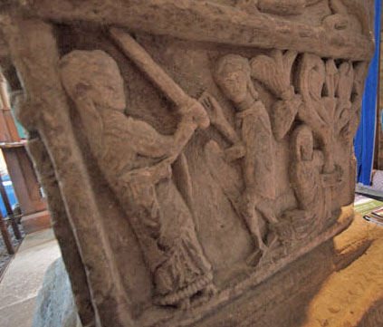
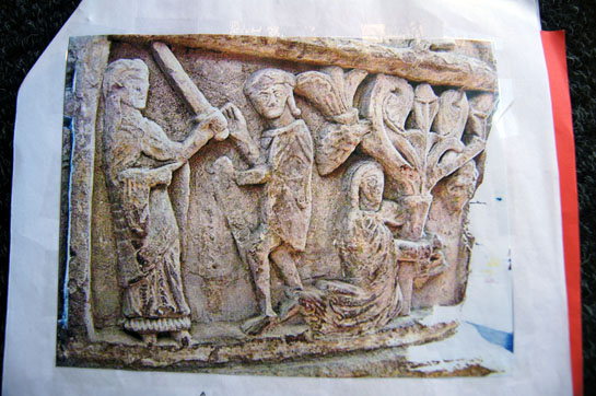
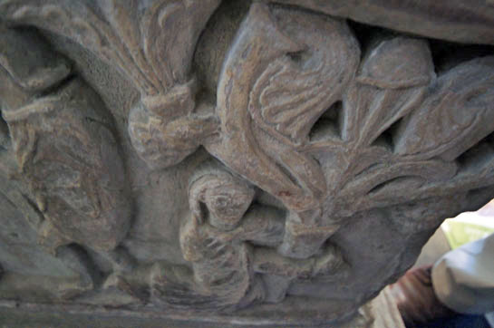
Apologies for the indifferent quality of these pictures. This side of the font is all but inaccessible and I had to a 12mm lens and long arms to get even these pictures. Left: The top panel. There is a magnificent centaur on the right, now sadly without a head! He is grappling with another beast in the left and seems to have hold of his foreleg. He is simultaneously under attack from an eagle on his right. Right: The lower panel has what is believed to be an image of Adam and Ever being expelled from Eden by an angry God wielding a sword. However, as the guide book rightly points out, Adam and Eve are not normally wearing clothes in this way. |
|||||||||||||
 |
|||||||||||||
 |
|||||||||||||
|
Left: This is Eve, presumably at the foot of the tree. No serpent, which is a bit odd. Indeed, the church’s own descriptive booklet invites visitors to suggest another interpretation. I’ve my own doubts but can’t think of an alternative. Can you? Right: This the church’s own photograph of the west face. How they got something this complete I can’t imagine! |
|||||||||||||
|
|
|||||||||||||
