|
Alphabetical List |
|
|
|
|
|
|
|
County List and Topics |
|
|
|
Please sign my Guestbook and leave feedback |
|
|
||||||||||||||||
|
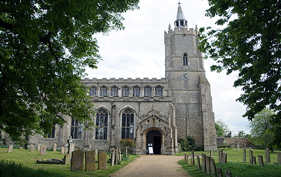
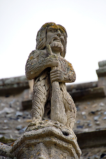
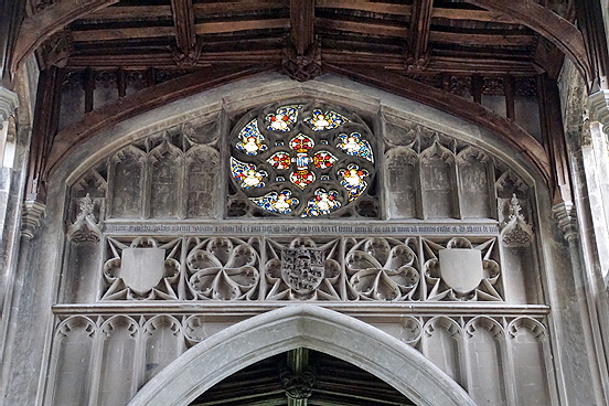
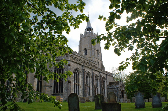
openings give the game away. Few late mediaeval masons or patrons were keen on the idea of demolishing and replacing a substantial Norman tower base although, as ever, one wonders how much they really know about how deep were the footings were that their predecessors had laid down. Sophisticated higher levels were added later as well as an odd little lead spirelet of 1799 that Simon Jenkins labels “unnecessary”. It all stood up well so it seems that, as usual, the masons’ gamble on the footings paid off! To this can be added bits of fourteenth century work on the south side. All this is fairly academic, however, compared with the magnificence of Reginald’s creation in about 1464, slap bang in the Wars of the Roses. That timing is significant, in my view, when we look at the sculpted timber wall plates (that is, flat wooden laths just below the rooflines) that are the frequently-overlooked artistic joy of this church. It is a remarkable display of the mediaeval menagerie of animals known, suspected and imagined. Elephants, tigers, lions and camels of which the carpenters had never seen pictures let alone the real thing rub shoulders with innumerable unicorns and other monoceri that they were able perfectly to imagine. The pattern is almost invariable: two animals facing each other with some kind of device dividing them. And, given the times, I think it is no coincidence that these devices, amongst the flowers, plants and urns, are quite often crowns. The carpenters were clearly presenting the struggle for the crown of England in a graphic and judiciously unpartisan way. These wall plates are magnificent and I will be showing you nearly all of them. You lucky people! Whether Reginald himself was unpartisan is another matter. He was court architect to the Lancastrian King Henry VI and and had built Kings College Cambridge for Henry’s queen, Margaret of Anjou. One rather thinks Reginald’s allegiance would have been obvious. The joys of the timber roof do not end there. There are some beautifully-carved bosses and, hidden within the roof trusses, some sneaky pagan imagery. As at so many churches, the craftsmen here seemed to love to “do their own thing” either overtly or covertly and nobody saw any need to get in their way. The visitor will, however, be mainly struck by the sheer magnificence of the interior. The simple capital-less arches of the arcades soar upwards on the flimsiest of columns. This being a totally rebuilt church, the equally impressively-proportioned clerestory are integral parts of the walls of the nave rather than being later, and often clumsy, afterthoughts as at so many churches of this era. Panelled walling separates nave and clerestory. The church is a perfect exemplar of why Rickman coined the word “Perpendicular” for this style of architecture. The chancel arch perfectly complements this nave and above it is a sumptuous carved panelling and rose window. An inscription commemorates John Benet who “caused to be made this wall and all the carpentry work of this church AD 1464”. So we know that building work was in progress at that time. This must, however, have been a long term project and we don’t know the entire timespan. The church has two porches. The north porch is the main entrance today. It seems likely that this was always so because it is vaulted whereas the north porch is not. Not least of the charms of the north porch are a rather weathered St George & The Dragon and a much more entertaining and better-preserved woodwose - old man of the woods - keeping guard, lethal cudgel in hand. The apparent pre-eminence of the north porch reinforces the notion that the old fear of the “devil’s door” was less of an issue in areas with, perhaps, more sophisticated congregation and clergy. |
 |
 |
||||||||||||||||||||||||||||||||||||||||||||||||||||||||||||||||
|
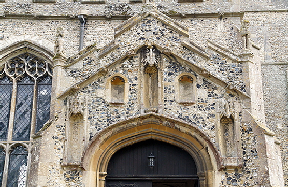
Left: The battlemented north porch with its five empty. Note the sculpted frieze of the clerestory. Right: The carved frieze on the north porch. Sculpted cornice friezes such as this are the focus of my “Bums, Fleas and Hitchhikers” narrative with a focus on the East Midlands, especially Rutland, Leicestershire and south Lincolnshire. Stonemasons were not constrained in their activities by county boundaries, however, and there was a certain amount of spill-over into adjacent counties. Northern Oxfordshire had its justly celebrated school of carving at, particularly, Bloxham, Adderbury and Hanwell. Cambridgeshire too, had examples such as here at Burwell and at Buckden. Burwell’s carving was anodyne and well-mannered by comparison with all of these others with their mooners, face-pullers, monsters and hounds. But it was surely part of the same tradition, albeit somewhat at the fag-end of it, some sixty years or more later than the work of what I called the Mooning Men Group of masons and perhaps a century after the Oxfordshire examples. |
|||||||||||||||||||||||||||||||||||||||||||||||||||||||||||||||||
 |
 |
 |
|||||||||||||||||||||||||||||||||||||||||||||||||||||||||||||||
|
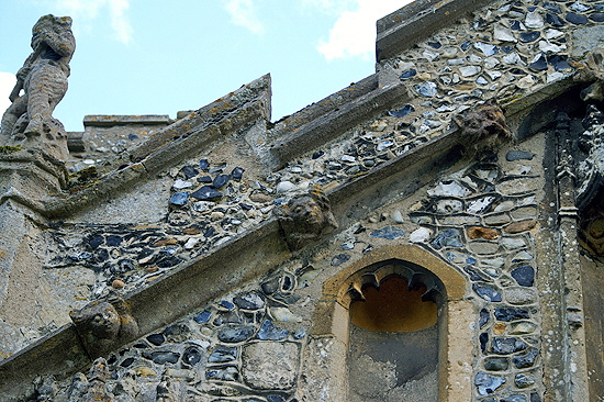
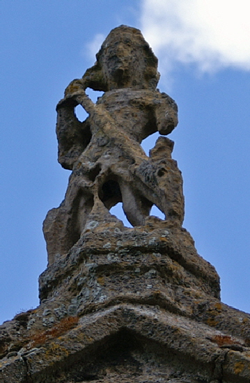
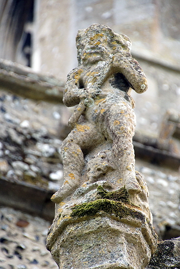
The cornice frieze may be unambitious, but these masons were capable of fine decorative work. There are three sculptures over the north porch. Left: The badly weathered George and Dragon over the gable. Centre: This, I think, is a woodwose - a wild man of the woods. This was an enduringly popular motif in the east of the country. Right: Well, this is definitely a woodwose with a very intimidating club! Given the weathering of the other two pieces, I am assuming this one is a very convincing replacement for what was here originally. |
|||||||||||||||||||||||||||||||||||||||||||||||||||||||||||||||||
 |
|||||||||||||||||||||||||||||||||||||||||||||||||||||||||||||||||
|
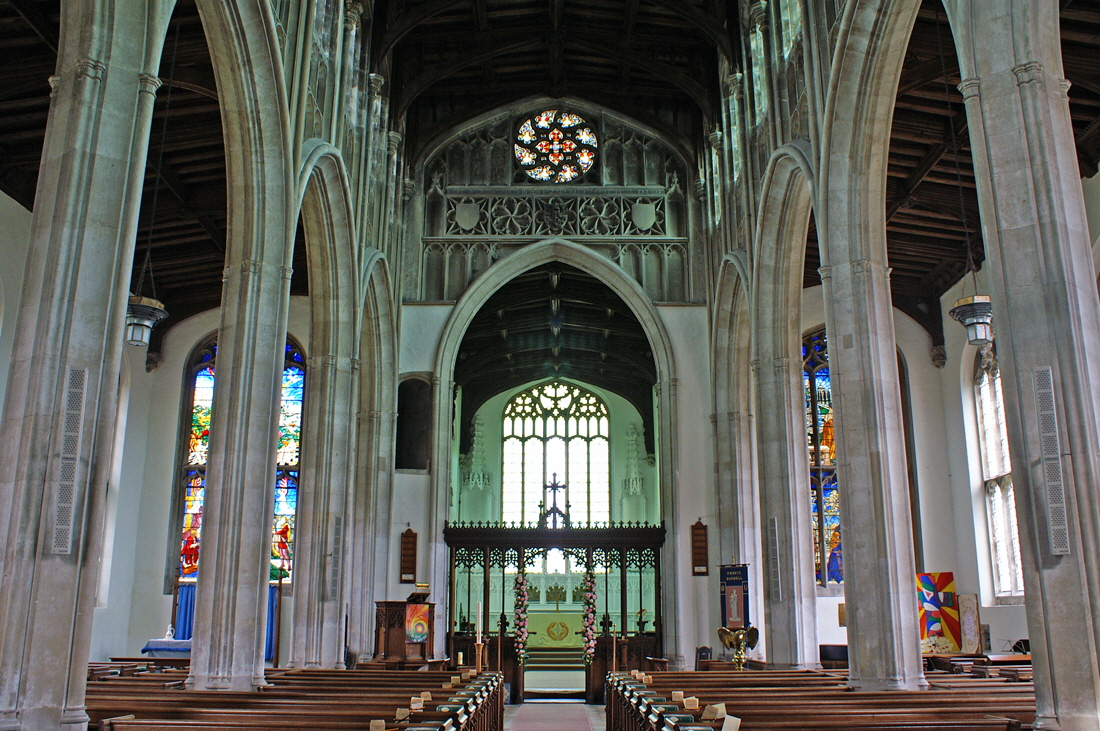
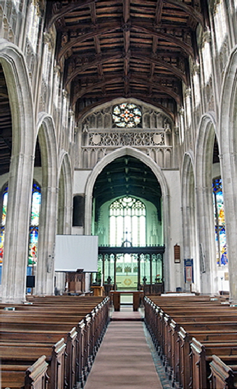
Looking east from the nave. Note the lofty arches, Perpendicular in both style and appearance. Note the carved panel above the rood chancel arch and the rose window - a rare luxury. The rood screen has its original bottom panels from the fifteenth century but the whole thing is nineteenth century to all intents and purposes. The rood loft doorway is very large and the original screen was presumably higher and very much more substantial than the rather token structure we see now. Note the loftiness and symmetry of the aisles. |
|||||||||||||||||||||||||||||||||||||||||||||||||||||||||||||||||
 |
 |
 |
|||||||||||||||||||||||||||||||||||||||||||||||||||||||||||||||
|
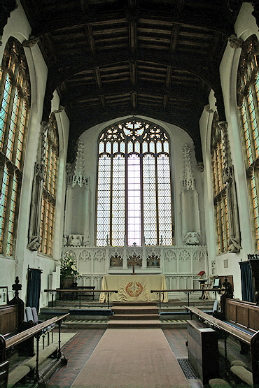
Left: I have deliberately changed the exposure of this view towards the east end to emphasise the quality of the timber roof, of which much more later. The west wall has two lancet windows and a fragment of string course which attest to the towers Norman origins. The tower arch, of course, was altered to conform with the look of the fifteenth century rebuilding. Centre: Another view towards the east. Right: The chancel. No, my camera has not been fooled by the light. As can be seen in other eastward-looking pictures, the chancel has a strange green light. This is caused by the rather odd decision at some point to fill the chancel windows with green-tinted glass! The fine reredos is from 1877. The niches look particularly forlorn without their statues. We know that the notorious and zealot seventeenth century iconoclast, William Dowsing, was here in January 1643 to finish off any “idolatrous” decoration that had survived the Reformation. Dowsing took pride in performing “God’s Work” and left records of his many depredations. |
|||||||||||||||||||||||||||||||||||||||||||||||||||||||||||||||||
 |
 |
||||||||||||||||||||||||||||||||||||||||||||||||||||||||||||||||
|
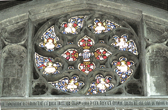
Left: Perhaps, this is the photograph that best shows the lavishness of the church. Note the empty niches. The royal arms in the centre were an eighteenth century addition. The inscription is in memory of John Benet and his family. Right: The rose window. |
|||||||||||||||||||||||||||||||||||||||||||||||||||||||||||||||||
 |
 |
 |
|||||||||||||||||||||||||||||||||||||||||||||||||||||||||||||||
|
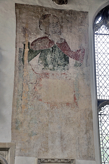
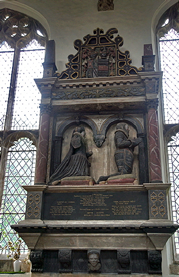
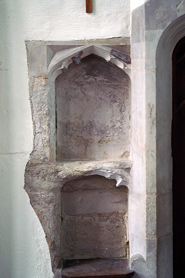
Left: A wall painting of St Christopher sits in its traditional place opposite the south door where travellers could poke their heads inside and pray for a safe journey. It is interesting that this was still the case when the north door seems to have been the principal one. Centre: This monument in the north aisle commemorates Thomas Gerard who died in 1613 and his wife who pre-deceased him by five years. It was moved from the chancel. Right: An unusual double-stacked piscina in the chancel - the more usual configuration being side-by-side. |
|||||||||||||||||||||||||||||||||||||||||||||||||||||||||||||||||
 |
 |
||||||||||||||||||||||||||||||||||||||||||||||||||||||||||||||||
|
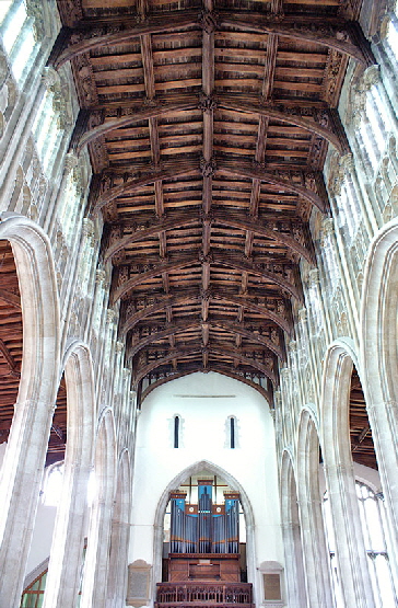
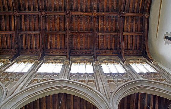
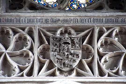
Left: A section of the arcade and clerestory. Take particular note of the carved wall plates where the roof joins the walls. Right: The royal arms above the chancel arch. |
|||||||||||||||||||||||||||||||||||||||||||||||||||||||||||||||||
 |
 |
 |
|||||||||||||||||||||||||||||||||||||||||||||||||||||||||||||||
|
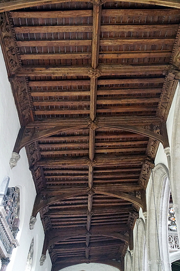
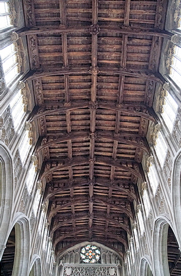
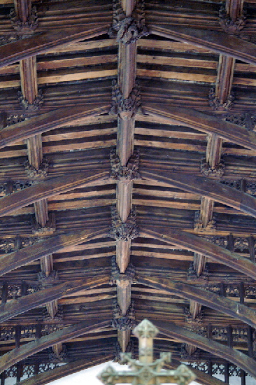
Sections of Ceiling. Left: The north aisle. Centre and Right: The nave. |
|||||||||||||||||||||||||||||||||||||||||||||||||||||||||||||||||
 |
 |
 |
|||||||||||||||||||||||||||||||||||||||||||||||||||||||||||||||
|
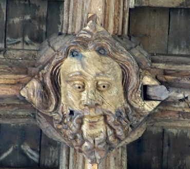
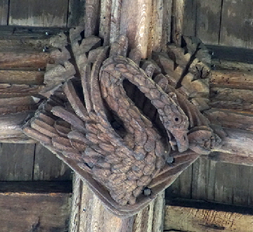
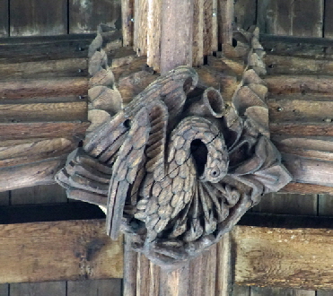
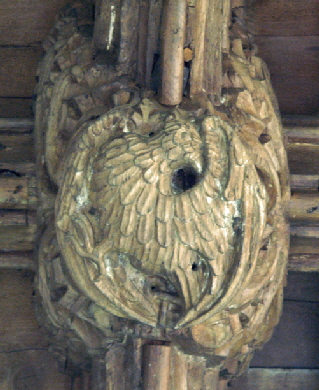
Most of the roof bosses are stylised fleuron designs but these nine are magnificent historiated ones. Left: This looks like a real man. A man of substance from the flowing locks and beard. I would quite like to imagine it to be Reginald Ely himself. Centre: This is a swan, I think, who has a fish in his beak. I imagine that would have been an everyday sight in the wetlands around Burwell. Right: The carpenter’s perennial: the Pelican in her Piety. If you are a regular reader of these pages you will have seen dozens of these and I am not going to waste my time and yours in explaining the imagery yet again. It is not just the frequency of the pelican in our mediaeval churches: it is the fact that it often - as here - stands out as a single or at least as part of a minority of religious imagery amongst a range of apparently secular ones. No matter how rumbustious are the designs on a range of mediaeval misericords, for example, the carpenter will almost invariably find room for the pelican. It is also the ubiquitous design chosen to adorn the tops of the tall wooden font covers so popular in East Anglia (see, for example, Ufford in Suffolk). Why it has this special resonance is hard to understand but it is a fact. Carpenters, like masons, usually seemed to be able to carve more or less whatever they chose. Did the pelican have some special symbolism for the carpentry craft? |
|||||||||||||||||||||||||||||||||||||||||||||||||||||||||||||||||
 |
 |
 |
|||||||||||||||||||||||||||||||||||||||||||||||||||||||||||||||
|
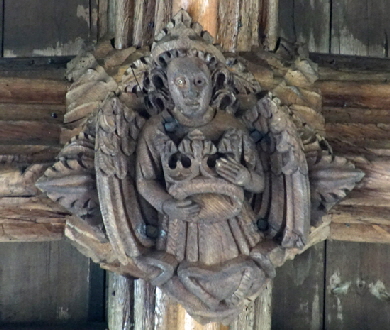
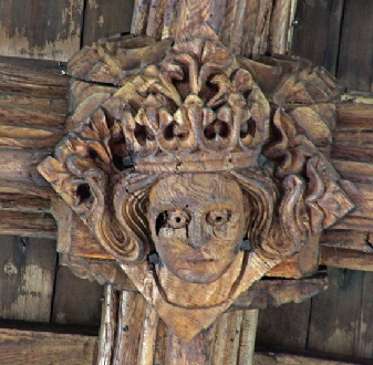
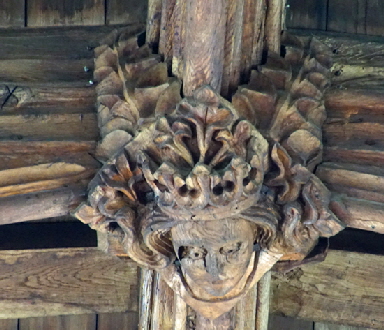
Left: An angel bearing a crown. Centre and Right: Two pictures of the same crowned head. It is quite a detailed crown, suggesting specific royal allusion. Yet the head and crown emanate from a background of foliage. This suggests pagan rather than royal imagery. |
|||||||||||||||||||||||||||||||||||||||||||||||||||||||||||||||||
 |
 |
 |
|||||||||||||||||||||||||||||||||||||||||||||||||||||||||||||||
|
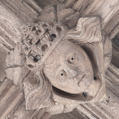
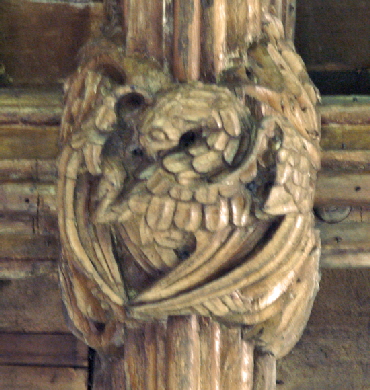
Left: A Queen to the King. (Photo courtesy of Bonnie Killingback) Centre and Right: Two more birds - eagles perhaps. |
|||||||||||||||||||||||||||||||||||||||||||||||||||||||||||||||||
 |
 |
||||||||||||||||||||||||||||||||||||||||||||||||||||||||||||||||
|
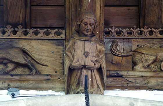
Left: I will be getting to the carved wall plates shortly but this is a sneak preview in order to show you this lovely carved figure. Right: The church from the north east, showing that even the aisles are lofty and fine. |
|||||||||||||||||||||||||||||||||||||||||||||||||||||||||||||||||
 |
 |
||||||||||||||||||||||||||||||||||||||||||||||||||||||||||||||||
|
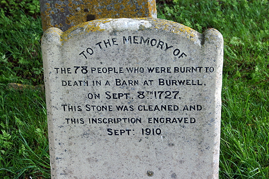
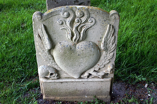
The Barn Fire Grave. In 1727 a travelling company of players performed at a nearby barn. With echoes of similar tragedies that still happen today around the world, the doors were nailed shut to stop people entering without payment after the performance had started. When fire broke out in a timber and thatch the bar, there could be only one outcome. |
|||||||||||||||||||||||||||||||||||||||||||||||||||||||||||||||||
 |
 |
||||||||||||||||||||||||||||||||||||||||||||||||||||||||||||||||
|
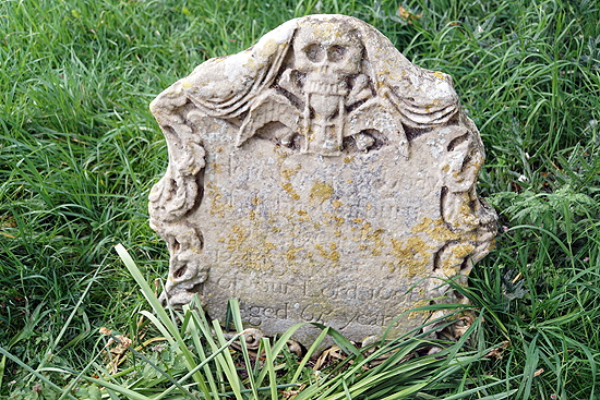
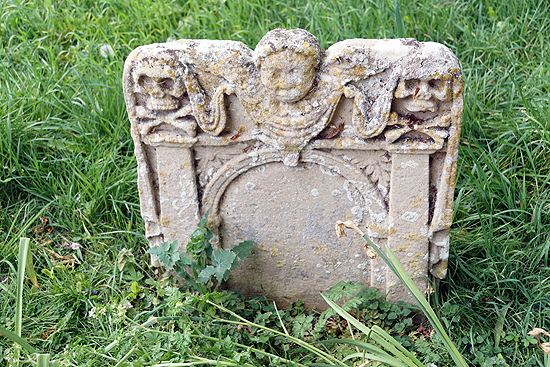
I am not much of a gravestones fan, but my sometime church crawling comrade-in-arms Bonnie Herrick is and has what I have told her is a morbid and possibly psychopathic love of skulls and skeletons on memorials. She, however, was once a psychiatric nurse and assured me that my diagnosis was incorrect before battering me senseless with her tripod for my cheek. So in a gesture of peace, here are a couple of fine ones that she pointed out to me and which, I have to admit, are rather good fun! Note, the one on the left has a skull eating an hour glass! Is it just myself that finds the display of skeletons and skulls on funerary monuments a bit bizarre, considering Christianity rests on a belief in eternal life and resurrection? I suppose it is all about the corruptibility of the flesh and the incorruptibility of the soul but it does seem it was a weird minority that wanted to celebrate the decomposition of their loved ones in this way. It takes all kinds to make a heaven, I suppose. Anyway, beware Yanks bearing unlicensed tripods, as Cassandra nearly said. |
|||||||||||||||||||||||||||||||||||||||||||||||||||||||||||||||||
 |
 |
 |
|||||||||||||||||||||||||||||||||||||||||||||||||||||||||||||||
|
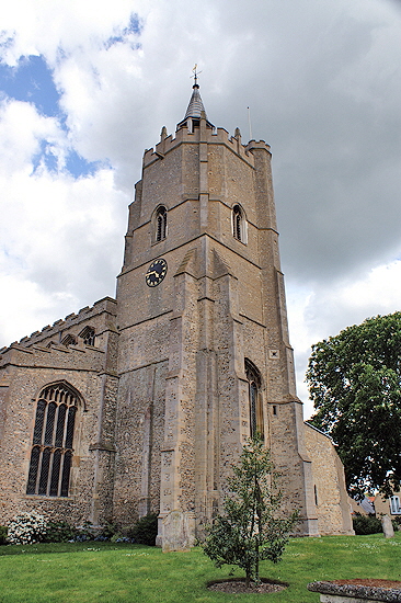
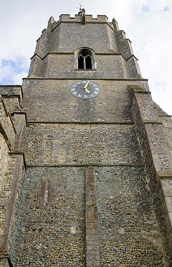
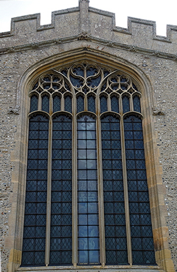
Left: and Centre: The west tower. The decorative irregular octagonal fifteenth century sections have been seamlessly wedded to the rectangular Norman base sections. The right hand picture shows clearly the filled-in Norman openings. What I find interesting but apparently nobody else does!) is the double lancet on the upper level. This would have been an unusual configuration and in a rather unusual position. The outer stones of these are also extremely finely carved. Right: The east window. It is not a dramatic composition. If you look carefully, however, the masons have revived some Decorated style curvilinear tracery in the top lights to good effect. Some have mourned the omission of Victorian industrial stained glass but I don’t! I am sure there was mediaeval stained glass here originally and that would indeed have been worth seeing. Note the continuation of the cornice frieze even to the east end, which is not very common. |
|||||||||||||||||||||||||||||||||||||||||||||||||||||||||||||||||
|
The Wall Plates |
|||||||||||||||||||||||||||||||||||||||||||||||||||||||||||||||||
|
Did I hear someone say “And about time too”? Anyway, this is just half a dozen as a taster. You can see the rest of them by following a link to a separate page. In the footnote below I explain first why the photographs of such different shades and textures. There is little under the sun that is unique so I am not going to claim these are the “most” or the “best” or anything like that. But they are pretty amazing. Moreover, they are not part of a wider decorative scheme but with the bosses and roof trusses they are the main event. While you are pondering what they all mean, it is worth asking why the carpenters would bother with decoration that is so high that it is barely visible in any kind of detail with the naked eye? I would also postulate it as even more proof that somehow the cost of such decoration was likely to have been just lost somewhere in the overall contract price. I can’t imagine patrons wanting to pay a lot extra for something they would not even be able to enjoy and, moreover, for things that are probably more entertaining to modern eyes than to mediaeval ones. That, I feel is one of the big mysteries of mediaeval art: not just “what did it mean?” but “who wanted it and why?”. Consumer-led or producer-led? You decide! The Church Guide suggests that religious themes are more prevalent towards the east and that makes sense. Equally it could be coincidence. |
|||||||||||||||||||||||||||||||||||||||||||||||||||||||||||||||||
 |
 |
||||||||||||||||||||||||||||||||||||||||||||||||||||||||||||||||
 |
|||||||||||||||||||||||||||||||||||||||||||||||||||||||||||||||||
 |
|||||||||||||||||||||||||||||||||||||||||||||||||||||||||||||||||
 |
|||||||||||||||||||||||||||||||||||||||||||||||||||||||||||||||||
 |
|||||||||||||||||||||||||||||||||||||||||||||||||||||||||||||||||
|
Top Left: The most famous and entertaining of them all. In the centre is a monkey holding a flask. That flask, in the mediaeval mind, would have been full of his urine that he would then be selling to sick people: a scathing and probably justifiable attack on the nation’s apothecaries. This is a frequent theme - see Boston in Lincolnshire. To his left is the ubiquitous mermaid with her comb and mirror and a particularly long fishy tail The figure to the right is a fox. In his mouth is a hen, his body draped over the fox’s back. So, as the Church Guide suggests, the three cartoon villains of the mediaeval world are all shown juxtaposed. Top Right: One of several pairs of unicorns either side of a rose. This pair are couchant rather than rampant. Centre Left: I know you are not going to believe it, but this is a pair of tigers each admiring itself in a mirror! They do not look remotely like tigers because no English carpenter had ever seen one! It is the mirrors that tell us that they are tigers. The mediaeval Bestiaries explained that when a hunter steals a tiger cub and is pursued by an angry parent he should cast down something shiny so that the tiger sees his own reflection and stops to tend to what he thinks is his cub. Centre Right: A hardy perennial of the misericord world (see Cartmel and Boston) here making an appearance on a wall plate. It hardly needs saying that the carpenter had not seen an elephant either. The faces are crocodile-like, the ears like a dragon’s wings. Although elephants were not completely unknown in England - Henry III was gifted one by the King of France (it died because the court fed the unfortunate creature on meat!) - their real appearance was well beyond the ken of mediaeval folk and this mash-up reflects those contained within the Bestiaries. Elephants were seen as being so strong they could carry castles on their backs. They were seen as loyal and virtuous. So this image could be seen as religio-allegorical although I personally think it was carved for entertainment value by a carpenter who was enjoying himself. Bottom Left: Here we have two implausible accurate male lions facing a rather modern looking crown. This must make us suspicious that this wall plate, and perhaps some others besides, have been replaced. Bottom Right: a monkey (or is it a woodwose?) leading an antelope with a rope. |
|||||||||||||||||||||||||||||||||||||||||||||||||||||||||||||||||
|
Footnote - Photographing the Wall Plates |
|||||||||||||||||||||||||||||||||||||||||||||||||||||||||||||||||
|
If you look at the pictures of the nave you will see it is a very lofty church indeed. To get the images of the wall plates requires a telephoto lens. Mine is 270 mm focal length which the photographers amongst you will know is sufficient for most purposes - even in dimly-lit churches. However, dim light and long lenses are a lethal combination. Getting sufficient light into the camera through an appropriate combination of wide aperture and long exposure is a real challenge even if your camera is equipped - as mine is - with superb capability to eliminate the inevitable camera shake. So what modern cameras like to do is to push the so-called ISO number to the absolute limit which on my camera is a very high limit indeed. In film cameras you used “faster” (that is, more sensitive and commensurately more expensive) film. ISO settings on film-less cameras today are the digital equivalents of this - except no film could get remotely near the ISO settings of a high-end digital camera. To put it into perspective a low light film would have had ISO 400. My camera can simulate ISO 32800! The consequence of these high limits is that cameras like mine can take pictures almost in the dark such is their light sensitivity. There is a trade-off, however. Photographs taken with very high ISOs become grainier. This can make images look fuzzy or, at first glance, out of focus. |
|||||||||||||||||||||||||||||||||||||||||||||||||||||||||||||||||
