|
Alphabetical List |
|
|
|
|
|
|
|
County List and Topics |
|
|
|
Please sign my Guestbook and leave feedback |
|
|
||||||||||||||||||||||
|
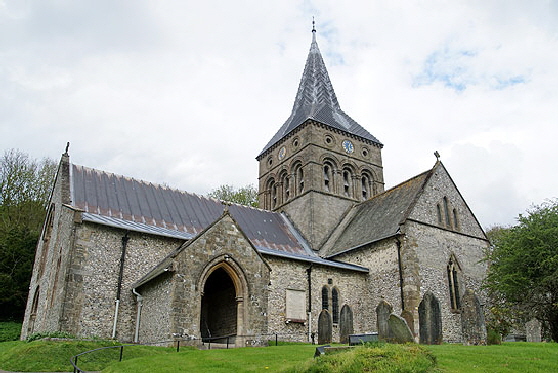
its rebuilding was probably ordered by Bishop Wakelin in the late eleventh century. The Church Guide deduces from the stylistic changes that it may have been built over as long a period of 1080-1150, starting with the west .They don’t elaborate on how this might have worked. It doesn’t really seem feasible for a church of this size and in any event a church was normally built from east to west, not west to east. The church was cruciform with nave, chancel, two transepts and an axial tower. A tower of this nature requires huge crossing arches and deep foundations so it was surely not an afterthought. In 1230 a south aisle was added. So too a Lady Chapel on the south side that sits parallel to the chancel from which it is divided by two Early English arches. The upper windows of the south transept is a triple lancet also very much in the Early English style and I assume they were also added at this time. Since 1230 little has changed here. Inevitably, a few Gothic style windows have crept in. There was some fifteenth century remodelling of the chancel and lady chapel in the f The chancel was remodelled in the nineteenth century with some some windows, an altar a various other artifacts by the renowned Ninian Comper. So to the font. The Hampshire group of four are all thought to have been imported by Henry de Blois (1096-1171). Henry was Archbishop of Winchester from 1129 until his death. He was also the brother of the future King Stephen and nephew to Henry I, so a man of means and influence. This is not, though, to imply that he was a religious man in title only. Far from it; and he was renowned for his generosity to churches. Yet he was certainly ambitious. He tried to persuade Henry I to make the bishopric of Winchester the equivalent of Canterbury. He failed but on the accession to the throne by his brother he became the King’s advisor and one of the richest men in England. Moreover, he trumped the Archbishop of Canterbury by securing the post of Papal Legate. His political loyalty wavered, however, and he briefly defected to Maud’s camp during the Great Anarchy. He returned to Stephen’s camp, however, and his defence of Winchester against Maud was seen as the turning point in the war which ended in 1153 after eighteen years of changing fortunes. Henry of Blois was Lord of the Manor in East Meon and had a home (one assumes he had many) in what is known as the Court House in East Meon. Thus the location of such a magnificent font in a quite small location is easily understandable : far more so than that of the tiny village of St Mary Bourne also in Hampshire and also imported by Henry. Tournai was in Flanders, part of modern Belgium. Its “marble” (like England’s own “Portland Marble”) is nothing of the sort; it is a blue-black carboniferous limestone that is capable of being given a high polish. There is some debate about how many fonts there are, but it is thought that about fifty exist in France and Belgium and two in Germany. They weight about two tons each so it was a considerable endeavour - and expense - to get them five hundred miles to Hampshire. The craftsmanship on all of these fonts is extremely high. The East Meon font is, in my view, second only to Winchester’s for quality and interest outshining even Lincoln Cathedral’s example although others may disagree. |
 |
 |
|||||||
|
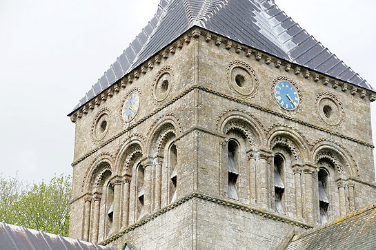
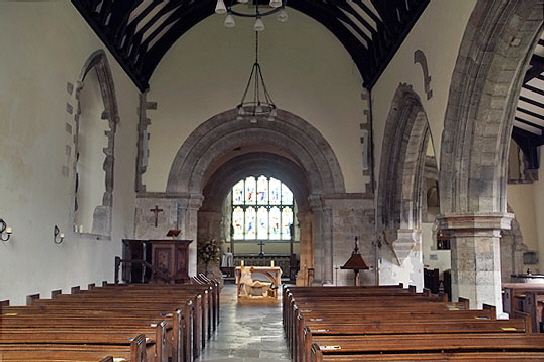
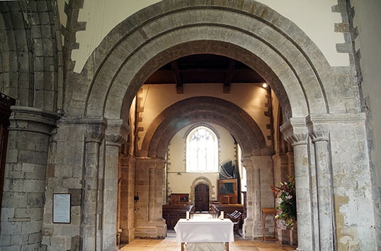
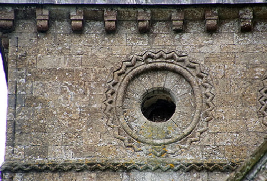
Left: The magnificent Norman tower. Particularly beguiling is the zig zag moulding round the roundels. It is an a early example and the quality of the masonry and the detail work shows a step improvement on the Anglo-Saxon era. Note also the “nook shafts” at the corners and the beautifully straight string courses. Right: Looking towards the east end we seem the chancel arch leading to the crossing beyond. Note the traces of a filled-in window at the east end of the arcade. Before the south aisle was added this would have been, of course, an external window. |
||||||||
 |
 |
|||||||
|
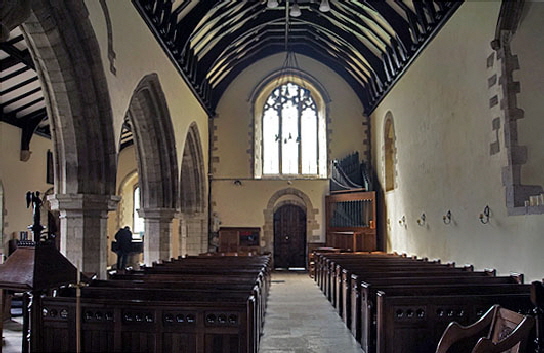
Left: The view to the west. The doorway is Norman, as it the nave window to the right near the west wall. Right: Looking from the chancel, through the tower crossing to the west end. |
||||||||
 |
 |
|||||||
|
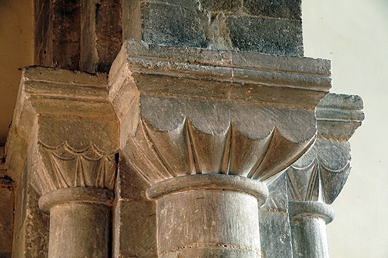
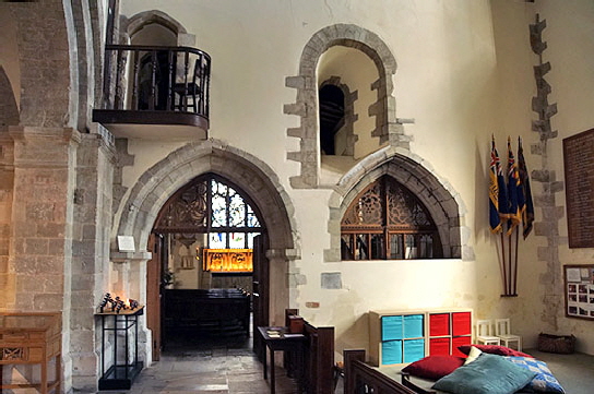
Left: The massive scalloped capitals of one of the crossing arches. Right: The post-Norman additions on the south side created some rather odd compromises.Here we are looking from the south transept, part of the original church, to the large lady chapel beyond. You can see how the Norman east window of this transept now gives onto the chapel rather than onto the outside of the building. A curious half arch has been neatly placed below it. |
 |
 |
||||||||||||||||||||
 |
|||||||||||||||||||||
|
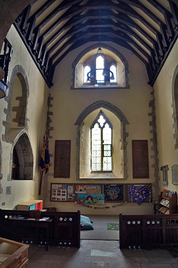
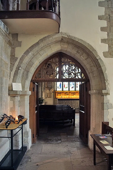
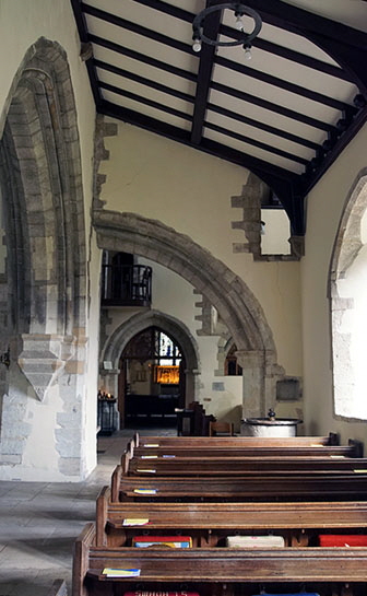
Left: Looking south into the south transept. The south window has obviously been re-cast. It is less obvious whether the same is true of the triple lancet at the top. Centre: The addition of the south aisle led to this rather ungainly half-arch. The sense of bodge-and-make-do is enhanced by the Norman window - originally an external window of course, being partly obliterated by the roof line. It is hard to avoid the sense that the death of Henry of Blois brought this churh down to earth financially and aesthetically. Right: The arch through to the lady chapel. |
|||||||||||||||||||||
 |
 |
||||||||||||||||||||
|
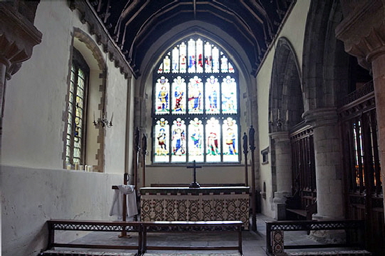
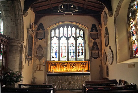
Left: The chancel has a rather austere feel about it and is perhaps a little outshone by the lady chapel to its right from which it is separated by two arches infilled with timber screens by Comper. The north window is nineteenth century. The east window is also by Ninian Comper but is a copy of the Perpendicular style original. Right: It is perhaps the lower roof that gives the lady chapel a more intimate feel than the chancel, although it is disfigured by some pretty ghastly wall tablets. Comper, again, provided the glass and the attractive reredos. |
|||||||||||||||||||||
 |
 |
 |
|||||||||||||||||||
|
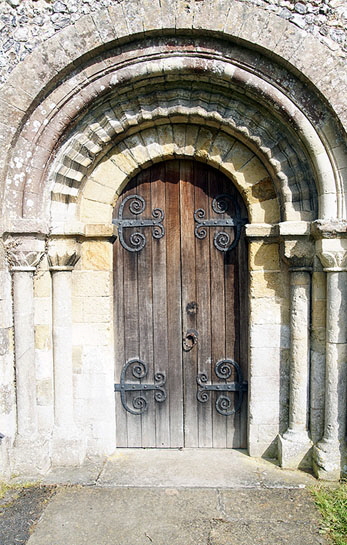
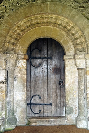
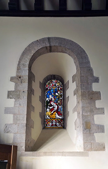
Left: The west door is in simple Norman style. Centre: The church also has a Norman south door, again very simple. Those of you who are still awake might wonder what a Norman south door is doing set in a south aisle of 1230. The answer, of course, is that it must have been reset here from the original nave south wall. Right: The Norman windows here are deeply splayed and show the great thickness of the masonry. One of the less-considered changes wrought by the Norman masons was a preference for thicker masonry than that employed by their Anglo-Saxon predecessors who rarely went above thirty inches in breadth. In an era where the West hadn’t yet cottoned on to the strengths, physically and aesthetically, of the pointed arch one presumes that this thicker stonework was employed to offset some of the more ambitious structures. Certainly at East Meon - and at other cruciform churches - one can only wonder at the stresses and strains imposed by an imposing central tower. |
|||||||||||||||||||||
 |
|||||||||||||||||||||
 |
|||||||||||||||||||||
|
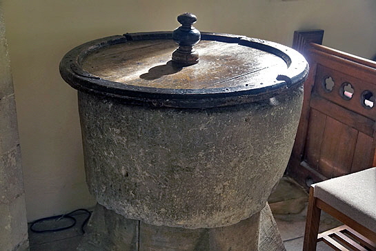
Left: One of the tower roundels. The stonework is very neat in every way although if you look carefully the masons did not succeed in the tricky task of making the chevron moulding completely regular, not the roundel completely round. Still, it is a step up from the previous generation. Indeed this whole composition is a step up in sophistication, not least the nook shaft to the left that gives the corners a “finished” look - a little like those mouldings you might put along the outermost course of ceramic tiles in your bathroom! Right: No, this is decidedly not the Tournai marble font. This plain tub in the south aisle was rescued from the uined chapel of St Nicholas near Westbury House.Nobody knows how old it is but it looks older than the Tournai font itself. |
|||||||||||||||||||||
 |
|||||||||||||||||||||
 |
|||||||||||||||||||||
|
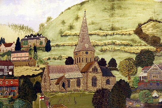
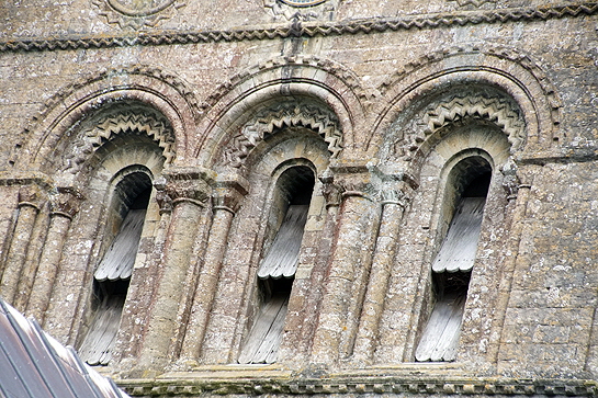
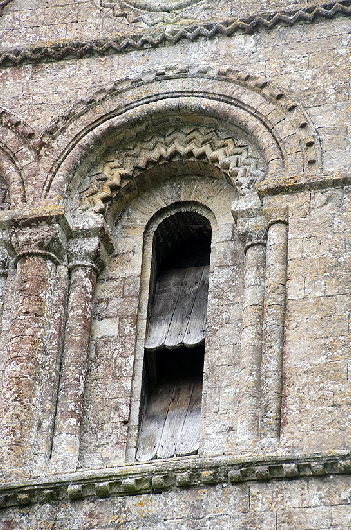
Left: One of the impressive triple bell openings on the tower. Right: Many churches felt the need to commemorate the Millennium in some way, and an embroidered tapestry was no means unique to East Meon. Theirs is particularly impressive, however, and I was very taken with this representation of the church itself. Whoever did this managed to capture the whole “feel” of the church perfectly, not least its texture. Craftsmanship (probably craftswomanship in this case, still lives |
 |
 |
||||||||||||||
|
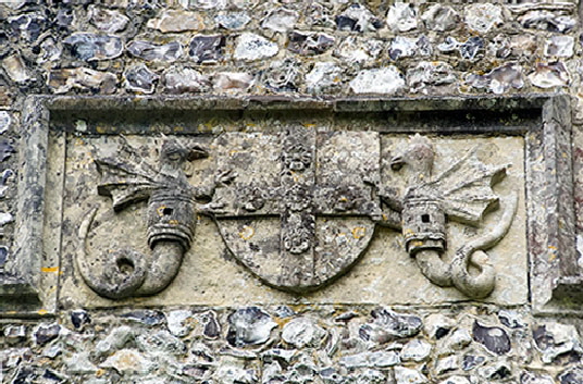
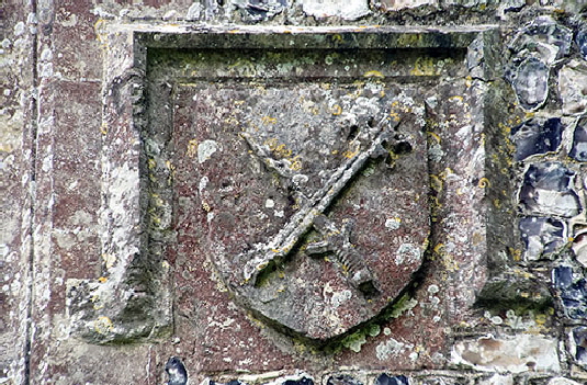
The arms of (left) Bishop Langton of Winchester and Prior Hinton who were responsible for the fifteenth century remodelling of the chancel and lady chapel. |
|||||||||||||||
 |
|||||||||||||||
 |
|||||||||||||||
 |
|||||||||||||||
|
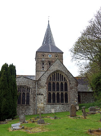
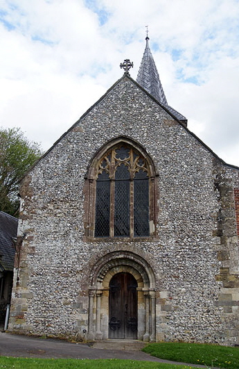
Left: The east end showing amongst other things the challenges of building on a hill! Centre: The west end with its Norman doorway and large Gothic west window. Right: Close up of one of arches on the tower. |
|||||||||||||||
 |
 |
||||||||||||||
|
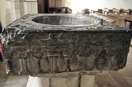
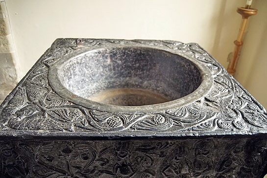
The Tournai marble font - “and about time too”, I hear you say. Well, I was brought up on that old tradition that you couldn’t have cake until you’d eaten all of your bread, so there. The font, like so many showpiece fonts, sits at the south west corner of the church with a window behind its western face and sometimes (although not here) a spotlight that comes on when it senses you are there and can’t be turned off! This can make fonts a real challenge to photograph - especially those with reflective surfaces!. At East Meon we were there late afternoon and the sun was streaming through the aisle’s west window making it almost impossible to get a decent shot of the east face of the font. Many of you will know what I mean when I say that each face had different light conditions. So there’s been a lot of Photoshopping and swearing before I settled on these pictures as being the best I could manage. By the way, I encountered a woman with a child, hurrying around the church with the mother making a really good fist of getting the child interested. Then they walked straight past the font until, in my importunate way, I called “have you looked at the font”? To my great joy the two of them spent ages looking at it, taking pictures on their mobiles before calling Dad in to have a look. It just needs a bit of passion to get people interested, you see? Anyway...Left: The south face of the font near the door. The font is about one metre square and 47cm wide from top to bottom. This is perhaps the most accurate of my pictures for colour. Right: Looking across the font from the north side you can see that the top of the font is also richly decorated. This is also true of a very few stone fonts but the elaborate designs afforded by the stone puts the Tournai fonts into a class of their own. The bowl is lead lined and 67cm in diameter. The hapless babies were immersed in those days. None of that wimpish making crosses on the forehead back then! |
|||||||||||||||
 |
|||||||||||||||
|
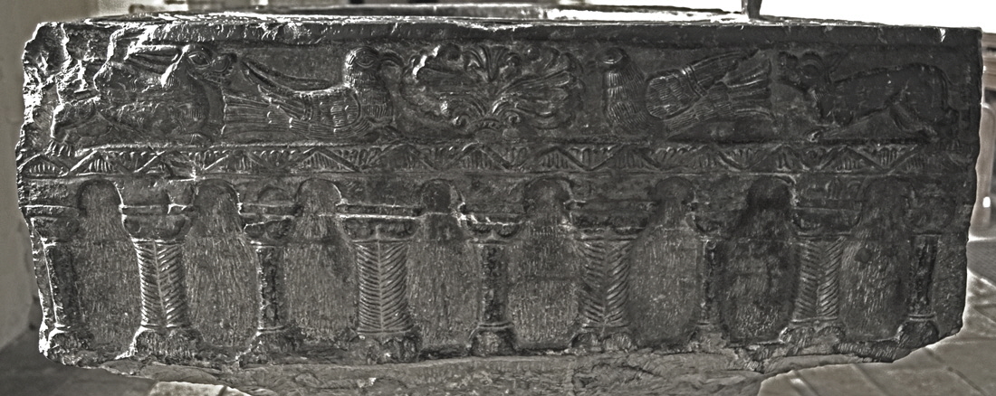
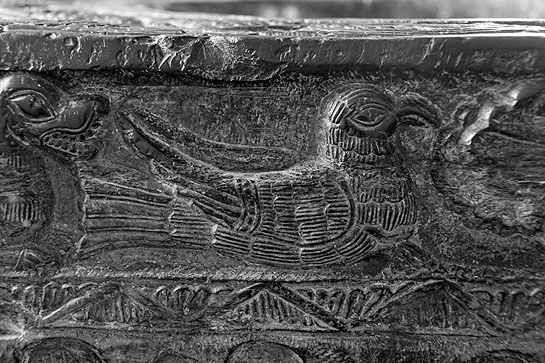
Looking at the south side in detail we have a line of carved Norman arcading topped by a frieze showing what the Church Guide describes as “doves of peace being pursued (on each side) by the dogs of war”. The arcading symbolises the earth shown, of course, as being flat and it is repeated on the west face.. St Mary Bourne’s font also has two panels showing this representation of the world, one surmounted by the fleur de lys - the symbol of the the Virgin Mary - and the other by doves. Winchester Cathedral does not have this motif at all. |
|||||||||||||||
 |
|||||||||||||||
|
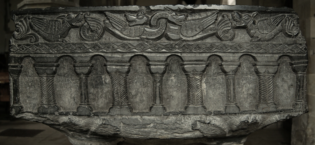
The west side. The arcade motif is nearly identical to the south. The imagery above it, however, is this time of four monsters, all with feathered wings. The middle pair appear to be dragons and have their necks intertwined in true Scandinavian style. The carving is slightly “flatter” than on the south side. The wings are similar to those on the the doves of the south side so we have to suspect the same carver. I think this is one of the purest Scandinavian images I have seen in an English church and I agree with the Church Guide that the dragons could have come straight off the prow of a Viking longship. If Tournai had been part of the Duchy of Normandy - never forget that the Normans were “Norse-men” - then this would have been understandable. As matters stand, it is an indication of how embedded Scandinavian symbolism had become in Northern Europe. It is simply stunning. |
|||||||||||||||
 |
|||||||||||||||
|
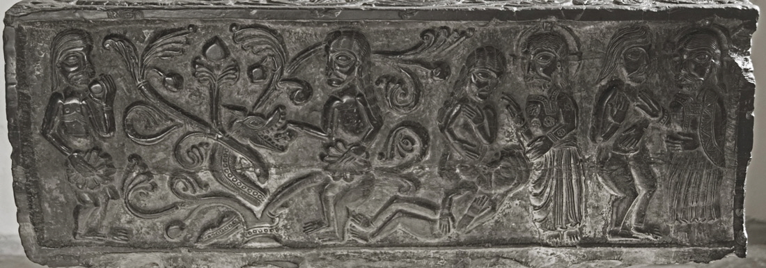
This is the north side and with the east side forms a narrative on that favourite early Christian theme - the story of Adam and Eve. On the right God is creating Adam. To the left of that He is creating Eve from the rib of a sleeping and unsuspecting Adam. Then Eve - the little minx - gets tempted by the serpent who has been lurking in the foliage of the apple tree and who, apart from the the absence of wings, bears a remarkable resemblance to the dragons on the west side. Her fig leaf is already in place to cover her naughty bits in deference to mediaeval sensibilities. On the left Adam, also showing his new modesty is partaking of the fatal apple. There are no human faces on St Mary Bourne’s font, but the faces on the Winchester font are unmistakably in the same style as these at East Meon. Note the remarkable detail here, especially God’s robes. |
|||||||||||||||
 |
|||||||||||||||
|
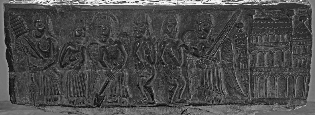
The east side continues the Adam and Eve narrative. On the right we have the unfortunate pair, fig leaves still desperately held in place, being expelled from the Garden of Eden represented as a Romanesque church, albeit with some distinctly eastern looking towers that are perhaps further proof of the new awareness of eastern styles gained during the Crusades. The conflation of a church building with the Garden is no coincidence, of course and hints at the ultimate penalty of excommunication for those still on earth. An angel with huge wings and a hefty sword is playing the role of bouncer. Note the beautiful decoration on the blade of the sword. This was an aristocratic blade. We then see Adam being taught by the angel to dig while on the far left Eve to has learned to spin. By now they are clothed which is just as well as it is hard to dig or spin when you are holding a fig leaf. Or so I am told. Note again the detail, especially of the spade and the spinning paraphernalia. |
|
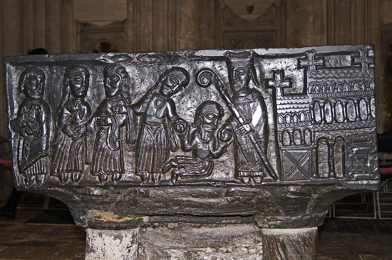
The Winchester font depicts the life of St Nicholas. One of the panels shows a nobleman kneeling in front of St Nick distraught because he cannot afford to give his three daughters a dowry. Rather than asking him how the hell he expects non-noble fathers to manage and telling him to stop his snivelling and cut down on the banquets and TV subscriptions - which is rather what I think Jesus would have told him - Nick gives him three bags of gold with a show of largesse that presaged his future career as Santa Claus. Which was very nice for the suitors. The interesting thing is that St Nicholas is also standing in front of a Romanesque church of very similar design (minus the towers and with crosses) that you see above. The same carver, I think you will agree. |
|||||||||||||
 |
|||||||||||||
 |
|||||||||||||
|
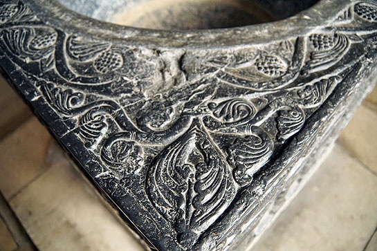
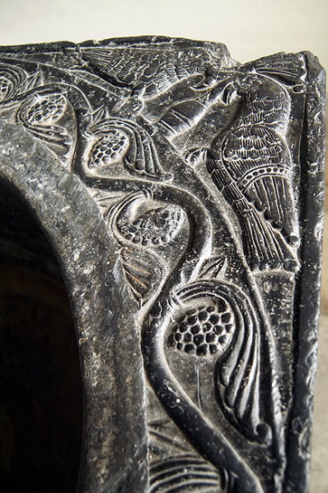
Left: The Winchester font with St Nicholas (with a superb bishop’s crozier) in front of a Romanesque church like that seen on the font at East Meon (above). Note that East Meon’s font seems the bigger of the two. Right: Vine leaves and grapes - the perpetual symbol of eternal life decorate the upper surface. On two of the corners, including this one, tongues of fire symbolise the Holy Spirit. |
|||||||||||||
 |
 |
||||||||||||
 |
|||||||||||||
|
Left: Two of the corners show doves drinking of the water of life. Right Upper: The intertwined dragons. Right Lower: A dove with a somewhat accipitrine beak (that is, hawk-like. Pretentious? Moi?) |
|||||||||||||
|
|
|||||||||||||
